如何在IE(以及其他浏览器)中保持行内SVG的纵横比?

5
以下代码片段展示了我的问题:
<style>
div {
  background-color: #00FF00;
  width: 80px;
}
svg {
  background-color: #FF0000;
  vertical-align: top;
  width: 100%;
  height: auto; // PROBLEM
}
rect { fill: #0000FF; }
</style>
<div>
  <svg
    xmlns="http://www.w3.org/2000/svg"
    viewBox="0 0 100 100"
    shape-rendering="geometricPrecision"
    text-rendering="geometricPrecision"
    image-rendering="optimizeQuality"
    fill-rule="evenodd"
    clip-rule="evenodd"
    preserveAspectRatio="xMidYMid meet"
    width="100"
    height="100"
    >
    <rect width="90" height="90" x="5" y="5" />
  </svg>
</div>

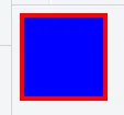
SVG应该是一个红色的正方形(里面画了一个蓝色的正方形),在保持其宽高比的同时,随着父级div标签的缩小而缩小。上述示例在Firefox、Chrome(桌面版和Android版)、Safari和Edge中都可以正常工作。它呈现出一个80x80像素的红色正方形:

Correctly displayed in Firefox, Chrome, Safari, Edge

只有Internet Explorer 10和11会将SVG垂直拉伸到其预期高度的两倍左右,因此为80x160px:

Incorrectly displayed in IE 10 and 11

如果我在样式表中删除/注释“height: auto”语句,则SVG将缩放为80x100px。然而,这会破坏Chrome,在这种情况下,Chrome也会将SVG缩放为80x100px。Firefox和Edge似乎能够处理删除此语句的情况。
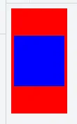
有趣的是,SVG中多边形等的纵横比始终保持完美,检查蓝色正方形,而多边形通常绘制在被拉伸的SVG的垂直中心。这是“SVG-container”/SVG标记引起的问题,并消耗了比它应该更多的空间。
如何跨浏览器解决这个问题?
我建立了一个小的JSFiddle来演示这个问题。

有一个相关的问题,标题为“SVGs not scaling properly in IE - has extra space”。主要区别在于我实际上在svg标签中直接提供了宽度和高度,这是我需要做的为了兼容Android浏览器。IE仍然会出现问题。Paul LeBeau描述的画布方法似乎遵循不同的假设。

这个问题是以下旧问题的变体,但不完全相同:

下面的gist很有趣,但也没有帮助:

这里有一种称为“填充hack”的方法,可以在这里找到详细介绍:

2个回答

4

此答案仅供参考-我仍在寻找更好、更简单(也更不愚蠢)的方法来完成这个任务。

好的,沿着“填充hack”的思路,以下方法似乎可以跨浏览器使用:

<style>
div#outer {
  background-color: #00FF00;
  width: 80px;
}
div#container {
  position: relative; 
  height: 0; 
  width: 100%; 
  padding: 0;
  padding-bottom: 100%; /* 100% * height/width */
}
svg {
  background-color: #FF0000;
  position: absolute; 
  height: 100%; 
  width: 100%; 
  left: 0; 
  top: 0;
}
rect { fill: #0000FF; }
</style>
<div id="outer">
  <div id="container">
    <svg
      xmlns="http://www.w3.org/2000/svg"
      viewBox="0 0 100 100"
      shape-rendering="geometricPrecision"
      text-rendering="geometricPrecision"
      image-rendering="optimizeQuality"
      fill-rule="evenodd"
      clip-rule="evenodd"
      preserveAspectRatio="xMidYMid meet"
      width="100"
      height="100"
      >
      <rect width="90" height="90" x="5" y="5" />
    </svg>
  </div>
</div>

这里还有一个更新的JSFiddle


0

另一种解决方案是使用Padding-Bottom Hack(Padding-Bottom: Width/Height*100)。 以下是一个具有响应式svg-clippath和ie11以上支持的示例

<svg class="clipper" width="0" height="0">
    <defs>
        <clipPath id="clippath" clipPathUnits="objectBoundingBox" transform="scale(0.01, 0.01136364)">
            <path d="M78.24,5.09S75.53.46,70.15.46H29.85s-5.38,0-8.09,4.63L1.66,39.37S-1,44,1.66,48.63l20.1,34.28s2.71,4.63,8.09,4.63h40.3s5.38,0,8.09-4.63l20.1-34.28s2.71-4.63,0-9.26Z"></path>
        </clipPath>
    </defs>
</svg>      

  <svg xmlns="http://www.w3.org/2000/svg" viewBox="0 0 100 88" preserveAspectRatio="xMidYMin slice" style="width: 100%; padding-bottom: 88%; height: 1px; overflow: visible">>
      <image xlink:href="http://www.domain.de/image-with-aspect-ratio-100-88.jpg" x="0" y="0" height="100%" width="100%" style="clip-path: url(#clippath);">
      </image>
  </svg>

网页内容由stack overflow 提供, 点击上面的
可以查看英文原文,
原文链接