我正在尝试创建一个带有背景图像和白色矩形“窗口”的落地页。
我无法正确配置CSS。在Figma中,我使用“窗口”矩形作为白色矩形的遮罩,以显示页面背景,但是我不知道这种相同的遮罩技术在html css中是否也能起作用(我想可能需要更多的技巧,比如对齐背景图像和窗口背景图像,让它看起来像是透明的?)。
我已经尝试了几种实现方式,但都没有多大成功。
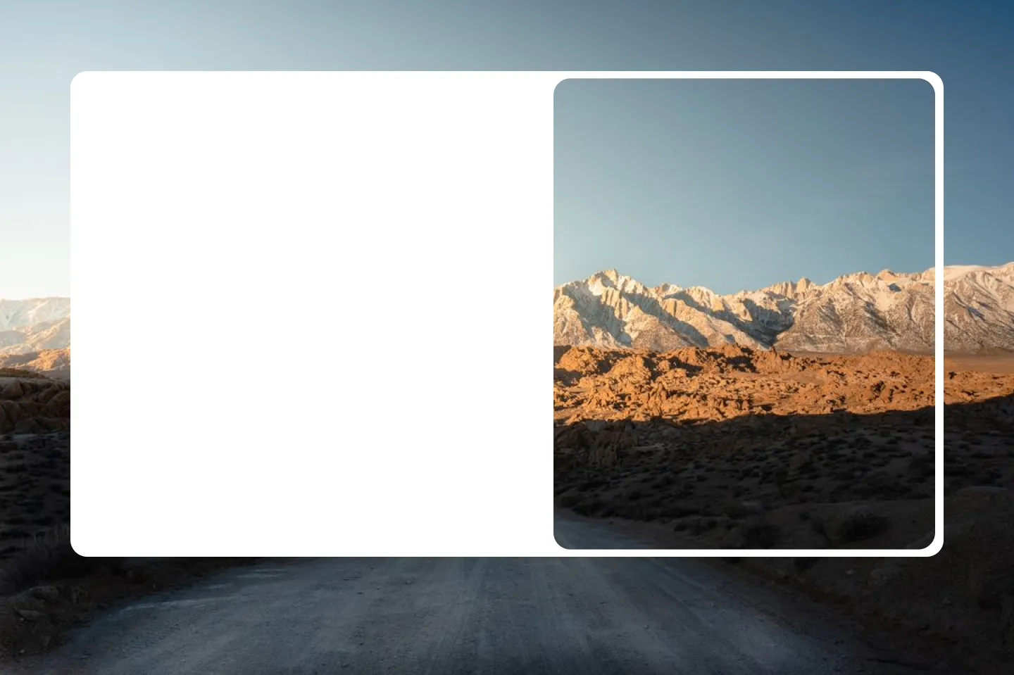
现在它的样子是这样的:
这很接近,但是你会发现“窗口”中的图像是居中的,而我想让它与页面背景对齐。
页面需要响应式,并且图像应保持其纵横比。
.backgroundImage {
  background-image: url('../../public/alabama-hills.jpg');
  background-size: cover;
  background-position: center;
  background-repeat: no-repeat;
  background-attachment: fixed;
  position: absolute;
  top: 0;
  left: 0;
  width: 100%;
  height: 100%;
}


/* Create the white rectangle */

.whiteRectangle {
  position: absolute;
  border-radius: $border-radius;
  top: 50%;
  left: 50%;
  transform: translate(-50%, -50%);
  background-color: white;
  width: 80%;
  height: 80%;
  display: flex;
  align-items: center;
  padding: 1rem;
  justify-content: space-between;
}


/* Create the nested rectangle acting as a mask */

.mask {
  position: relative;
  width: 50%;
  height: 100%;
  border-radius: $border-radius;
  overflow: hidden;
}


/* Position the pseudo-element to match the background image */

.mask::before {
  content: "";
  background-image: url('../../public/alabama-hills.jpg');
  background-size: cover;
  background-position: center;
  background-repeat: no-repeat;
  background-attachment: fixed;
  position: absolute;
  top: 0%;
  right: 0%;
  width: 100%;
  height: 100%;
}<div className={styles.backgroundImage}></div>
<div className={styles.whiteRectangle}>
<div />
<div className={styles.mask}></div>
</div>