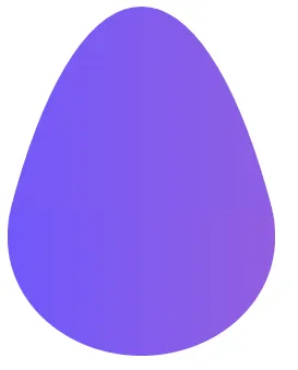
如何使用CSS创建“梨形”形状

3

我想用CSS创建这个形状。

enter image description here

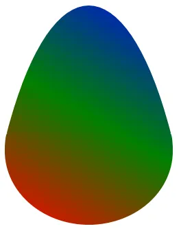
我尝试使用border-radius,但无法做到与上面完全相同。

这是我能用border-radius属性做出的最接近的效果fiddle

.mybox {
  background-image: linear-gradient(to top, #7158FB, #925FE0);
  width: 245px;
  height: 320px;
  border-top-left-radius: 60% 75%;
  border-top-right-radius: 60% 75%;
  border-bottom-right-radius: 50% 30%;
  border-bottom-left-radius: 50% 30%;
}
<div class="mybox"></div>


10
你可以使用这个小巧精致的工具:https://9elements.github.io/fancy-border-radius/ :) - VilleKoo
@VilleKoo 哇! :) - akinuri
2个回答

5
使用两个不同的元素制作,以实现更好的渲染效果:

.box {
  width: 245px;
  height: 320px;
  position: relative;
  z-index:0;
}

.box:before,
.box:after {
  content: "";
  position: absolute;
  background-image:linear-gradient(to right,#7158FB, #925FE0);
  z-index:-1;
}

.box:before {
  top: 0;
  height: 180%;
  right: -16.5%;
  left: -16.5%;
  background-size:100% 32.5%;
  background-repeat: no-repeat;
  border-top-left-radius: 50% 100%;
  border-top-right-radius: 50% 100%;
}

.box:after {
  bottom: 0;
  height: 42%;
  left: 0;
  right: 0;
  border-bottom-right-radius: 50% 80%;
  border-bottom-left-radius: 50% 80%;
  border-top-right-radius: 4px 25px;
  border-top-left-radius: 4px 25px;
}
<div class="box"></div>

梨形CSS

要生成随机渐变,您需要按以下方式调整代码:

.box {
  --h:320px;
  width: 245px;
  height: var(--h);
  position: relative;
  z-index:0;
}

.box:before,
.box:after {
  content: "";
  position: absolute;
  background-image:linear-gradient(30deg,red,green,blue);
  z-index:-1;
}

.box:before {
  top: 0;
  height: calc(var(--h) * 1.8);
  box-sizing:border-box;
  padding-bottom:calc((1.8 - 1 + 0.42) * var(--h));
  right: -16.5%;
  left: -16.5%;
  background-size:100% calc(100%/1.8);
  background-clip:content-box;
  background-repeat: no-repeat;
  border-top-left-radius: 50% 100%;
  border-top-right-radius: 50% 100%;
}

.box:after {
  bottom: 0;
  height: calc(var(--h) * 0.42);
  left: 0;
  right: 0;
  border-bottom-right-radius: 50% 80%;
  border-bottom-left-radius: 50% 80%;
  border-top-right-radius: 4px 25px;
  border-top-left-radius: 4px 25px;
  background-size:100% calc(100%/0.42);
  background-position:bottom;
}
<div class="box"></div>

Pear shape CSS


3
尝试使用 border-radius

.mybox {
  background-image: linear-gradient(to top, #7158FB, #925FE0);
  width: 245px;
  height: 320px;
  border-radius: 48% 52% 50% 50% / 69% 68% 32% 31%;
}
<div class="mybox"></div>


谢谢回复。这很接近,但我认为它并不完全正确。我认为仅使用border-radius属性无法实现的是... - klido

网页内容由stack overflow 提供, 点击上面的
可以查看英文原文,
原文链接