如何处理垂直RecyclerView时间轴?

12
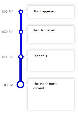
我想创建一个垂直动态时间轴,左侧为发生时间,右侧为事件内容,两者之间有一条线,每个事件在线上都有一个气泡。时间、事件和事件数量都是动态的。
我的想法是在静态垂直线上放置一个RecyclerView。列表项包含时间、气泡图像和事件视图。在写这篇文章之前,我认为我会遇到将气泡与垂直线对齐的问题。有没有更好的方法来解决这个问题,或者有人可以指出如何保证气泡在不同屏幕密度和尺寸上位于线的中心?

enter image description here

2个回答

3

我一直在寻找在我的应用程序中实现类似视图的方法。

个人而言,我不喜欢静态行。我的想法是使用具有3列的布局 - 对于您的示例;一个用于时间,一个用于点和垂直线的图像(或仅在最后一个项目上的顶部线)和第三列带有cardview

我发布的布局非常粗糙,但我只是在几分钟内拼凑起来,你应该能够理解。需要调整以确保图标上的垂直线到达布局的边缘(在我的示例中它们之间会有间隙)。

<?xml version="1.0" encoding="utf-8"?>
<LinearLayout xmlns:android="http://schemas.android.com/apk/res/android"
    android:layout_width="match_parent"
    android:layout_height="match_parent"
    android:orientation="vertical"
    android:weightSum="1">

    <LinearLayout
        android:layout_width="match_parent"
        android:layout_height="wrap_content"
        android:orientation="horizontal"
        android:padding="10dp"
        android:layout_weight="0.06">

        <LinearLayout
            android:layout_width="wrap_content"
            android:layout_height="wrap_content"
            android:padding="10dp"
            android:layout_gravity="center">

            <TextView
                android:layout_width="wrap_content"
                android:layout_height="wrap_content"
                android:text="1:45 PM" />

        </LinearLayout>

        <LinearLayout
            android:layout_width="wrap_content"
            android:layout_height="wrap_content"
            android:padding="10dp"
            android:layout_gravity="center">

            <ImageView
                android:layout_width="30dp"
                android:layout_height="30dp"
                android:src="@drawable/ic_test" />

        </LinearLayout>

        <LinearLayout
            android:layout_width="match_parent"
            android:layout_height="match_parent"
            android:padding="10dp">

            <android.support.v7.widget.CardView
                android:layout_width="match_parent"
                android:layout_height="match_parent">

                <TextView
                    android:layout_width="fill_parent"
                    android:layout_height="wrap_content"
                    android:text="Hello there"
                    android:padding="10dp"/>
            </android.support.v7.widget.CardView>

        </LinearLayout>

    </LinearLayout>

</LinearLayout>

结果看起来如下图所示;

示例

我还发现了一个,看起来不错——虽然图标需要改进,但我想很多工作已经完成。

我也知道这种布局类型在 Material Design Guidelines 中被官方认可为步进器(stepper)。尽管我无法在“Develop”文档中找到任何参考资料,但当你搜索适当的库时,这可能会对你有所帮助。


1

在编辑了Jonny Wright的回答之后,我首先创建了一个card_item,如下所示:

<?xml version="1.0" encoding="utf-8"?>
<LinearLayout xmlns:android="http://schemas.android.com/apk/res/android"
    android:layout_width="match_parent"
    android:layout_height="wrap_content"
    xmlns:app="http://schemas.android.com/apk/res-auto"
    android:orientation="horizontal"
    android:layout_marginEnd="8dp"
    android:layout_marginRight="8dp"
    >

    <LinearLayout
        android:layout_weight="1"
        android:layout_width="0dp"
        android:layout_height="match_parent"
        android:orientation="horizontal"
        >

        <LinearLayout

            android:layout_width="wrap_content"
            android:layout_height="wrap_content"
            android:padding="10dp"
            android:layout_gravity="top">

            <TextView
                android:layout_width="wrap_content"
                android:layout_height="wrap_content"
                android:text="1:45 PM" />

        </LinearLayout>

        <android.support.design.widget.CoordinatorLayout
            android:layout_width="wrap_content"
            android:layout_height="match_parent"
            android:layout_gravity="center">
            <View
                android:id="@+id/first"
        android:layout_gravity="center"
                android:background="@color/material_green_500"
                android:layout_width="2dp"
                android:layout_height="wrap_content"/>
            <ImageView
                app:layout_anchor="@id/first"
                app:layout_anchorGravity="top"
                android:layout_gravity="top"
                android:layout_width="40dp"
                android:layout_height="40dp"
                android:src="@drawable/ic_test" />


        </android.support.design.widget.CoordinatorLayout>


    </LinearLayout>
    <LinearLayout

        android:layout_weight="1"

        android:layout_width="match_parent"
        android:layout_height="wrap_content"
        >

        <LinearLayout
            android:background="@drawable/chat_bubble"

            android:layout_marginRight="114dp"
            android:layout_marginEnd="114dp"
            android:layout_gravity="center"
            android:layout_width="match_parent"
            android:layout_height="wrap_content">

            <TextView

                android:layout_width="fill_parent"
                android:layout_height="wrap_content"
                android:text="Hello there, how are you doing. Hello there, how are you doing. Hello there, how are you doing. Hello there, how are you doingHello there, how are you doing"
                android:padding="12dp"/>
        </LinearLayout>

    </LinearLayout>

</LinearLayout>

然后在drawable文件夹中添加两个附加文件。一个用于聊天气泡背景的9 patch图像,另一个是circle.xml:

<?xml version="1.0" encoding="utf-8"?>
<shape xmlns:android="http://schemas.android.com/apk/res/android"
android:shape="ring"
    android:useLevel="false"
    android:innerRadius="0dp"
    >
<size android:width="100dp"
    android:height="100dp"/>
    <solid android:color="@color/material_green_500"/>
</shape>

这是结果。 示例用法 不要忘记添加bubble.png。

网页内容由stack overflow 提供, 点击上面的
可以查看英文原文,
原文链接