如何让geom_map显示地图的所有部分?

7

我刚开始使用 ggplot2 中的 geom_map 函数。在阅读了这里能找到的 29 篇关于 geom_map 的帖子之后,我仍然遇到了同样的问题。

我的数据框非常大,包含超过 2000 行。基本上,它是从世界卫生组织编制的有关特定基因(TP53)的数据。

请从这里下载。

标题如下:

> head(ARCTP53_SOExample)
  Mutation_ID MUT_ID hg18_Chr17_coordinates hg19_Chr17_coordinates ExonIntron Genomic_nt Codon_number
1          16   1789                7519192                7578467     5-exon      12451          155
2          13   1741                7519200                7578475     5-exon      12443          152
3          17   2143                7519131                7578406     5-exon      12512          175
4          14   2143                7519131                7578406     5-exon      12512          175
5          15   2168                7519128                7578403     5-exon      12515          176
6          12   3737                7517845                7577120     8-exon      13798          273
  Description c_description g_description       g_description_hg18 WT_nucleotide Mutant_nucleotide
1         A>G      c.463A>G  g.7578467T>C NC_000017.9:g.7519192T>C           A                   G
2         C>T      c.455C>T  g.7578475G>A NC_000017.9:g.7519200G>A           C                   T
3         G>A      c.524G>A  g.7578406C>T NC_000017.9:g.7519131C>T           G                   A
4         G>A      c.524G>A  g.7578406C>T NC_000017.9:g.7519131C>T           G                   A
5         G>T      c.527G>T  g.7578403C>A NC_000017.9:g.7519128C>A           G                   T
6         G>A      c.818G>A  g.7577120C>T NC_000017.9:g.7517845C>T           G                   A
  Splice_site CpG_site           Type Mut_rate WT_codon Mutant_codon WT_AA Mutant_AA ProtDescription
1          no       no        A:T>G:C    0.170      ACC          GCC   Thr       Ala         p.T155A
2          no      yes G:C>A:T at CpG    1.243      CCG          CTG   Pro       Leu         p.P152L
3          no      yes G:C>A:T at CpG    1.280      CGC          CAC   Arg       His         p.R175H
4          no      yes G:C>A:T at CpG    1.280      CGC          CAC   Arg       His         p.R175H
5          no       no        G:C>T:A    0.054      TGC          TTC   Cys       Phe         p.C176F
6          no      yes G:C>A:T at CpG    1.335      CGT          CAT   Arg       His         p.R273H
  Mut_rateAA   Effect Structural_motif Putative_stop Sample_Name Sample_ID Sample_source Tumor_origin Grade
1      0.170 missense NDBL/beta-sheets             0    CAS91-19        17       surgery      primary      
2      1.243 missense NDBL/beta-sheets             0     CAS91-4        14       surgery      primary      
3      1.280 missense            L2/L3             0    CAS91-13        12       surgery      primary      
4      1.280 missense            L2/L3             0     CAS91-5        15       surgery      primary      
5      0.054 missense            L2/L3             0     CAS91-1        16       surgery      primary      
6      1.335 missense          L1/S/H2             0     CAS91-3        13       surgery      primary      
  Stage TNM p53_IHC KRAS_status Other_mutations Other_associations
1              <NA>        <NA>            <NA>                   
2              <NA>        <NA>            <NA>                   
3              <NA>        <NA>            <NA>                   
4              <NA>        <NA>            <NA>                   
5              <NA>        <NA>            <NA>                   
6              <NA>        <NA>            <NA>                   
                                                                 Add_Info Individual_ID  Sex Age Ethnicity
1 Mutation only present in adjacent dysplastic area (Barrett's esophagus)            17 <NA>  NA          
2 Mutation only present in adjacent dysplastic area (Barrett's esophagus)            14 <NA>  NA          
3 Mutation only present in adjacent dysplastic area (Barrett's esophagus)            12 <NA>  NA          
4 Mutation only present in adjacent dysplastic area (Barrett's esophagus)            15 <NA>  NA          
5                                                                                    16 <NA>  NA          
6      Mutation absent from adjacent dysplasia area (Barrett's esophagus)            13 <NA>  NA          
  Geo_area Country            Development       Population   Region TP53polymorphism Germline_mutation
1              USA More developed regions Northern America Americas                                 NA
2              USA More developed regions Northern America Americas                                 NA
3              USA More developed regions Northern America Americas                                 NA
4              USA More developed regions Northern America Americas                                 NA
5              USA More developed regions Northern America Americas                                 NA
6              USA More developed regions Northern America Americas                                 NA
  Family_history Tobacco Alcohol Exposure Infectious_agent Ref_ID Cross_Ref_ID  PubMed Exclude_analysis
1                   <NA>    <NA>     <NA>             <NA>      4           NA 1868473            False
2                   <NA>    <NA>     <NA>             <NA>      4           NA 1868473            False
3                   <NA>    <NA>     <NA>             <NA>      4           NA 1868473            False
4                   <NA>    <NA>     <NA>             <NA>      4           NA 1868473            False
5                   <NA>    <NA>     <NA>             <NA>      4           NA 1868473            False
6                   <NA>    <NA>     <NA>             <NA>      4           NA 1868473            False
  WGS_WXS
1      No
2      No
3      No
4      No
5      No
6      No

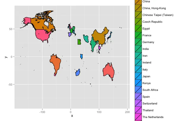
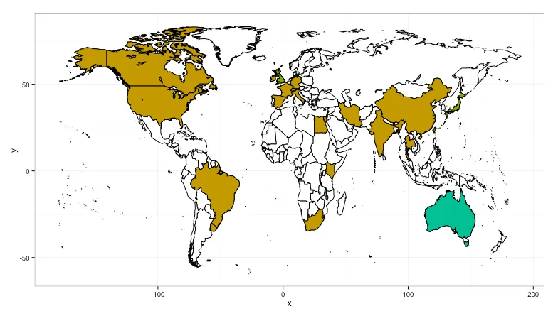
无论如何,我想创建一个简单的世界地图,着重标注进行过这种突变研究的国家,并在这些国家中有更多或更少的“突变特征”。如果您能看到这个链接,您可能会更好地理解我的意图:
summary(ARCTP53_SOExample$Country)
Australia                  Brazil                  Canada                   China 
                      1                     127                      76                     519 
       China, Hong-Kong Chinese Taipei (Taiwan)          Czech Republic                   Egypt 
                     52                      36                       9                       9 
                 France                 Germany                   India                    Iran 
                    195                      10                      63                     112 
                Ireland                   Italy                   Japan                   Kenya 
                     25                      30                     414                      11 
           South Africa                   Spain             Switzerland                Thailand 
                     13                       2                      24                      35 
        The Netherlands                      UK                 Uruguay                     USA 
                      6                      17                       6                     189 
                   NA's 
                     30 

我的数据框中有一些国家出现了多次。

所以为了获得我想要的地图,我做了以下操作:

library(ggplot2)
library(maps)
world_map<-map_data("world")
ggplot(ARCTP53_SOExample)+geom_map(map = world_map, aes(map_id = Country,fill = Country),
+ colour = "black") +
+ expand_limits(x = world_map$long, y = world_map$lat)

这是我得到的结果: This map only contains the countries in my list...。请问有人能提供我做错了什么吗?
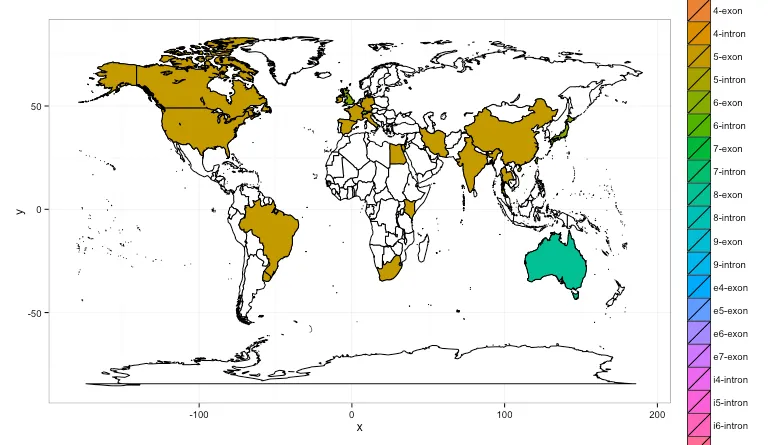
此外,未来我想在不同国家之间添加ExonIntron列的geom_bar()。但首先我想尝试生成正确的地图。谢谢!
1个回答

13
< p > ARC...数据框中缺失的国家 == 地图上缺失的地区,可以通过使用由world_map数据框制作的基础层来补偿:

library(maps)

world_map<-map_data("world")

gg <- ggplot(ARCTP53_SOExample)

# need one layer with ALL THE THINGS (well, all the regions)
gg <- gg + geom_map(dat=world_map, map = world_map, 
                    aes(map_id=region), fill="white", color="black")

# now we can put the layer we really want
gg <- gg + geom_map(map = world_map, 
                    aes(map_id = Country, fill = Country), colour = "black")

gg <- gg + expand_limits(x = world_map$long, y = world_map$lat)
gg <- gg + theme(legend.position="none")
gg

map1

由于使用区域着色图假定人们知道地理位置,因此我删除了图例。

注意:对于每个地区(国家)使用不同的颜色实际上并不是一个好主意。因为你只是想突出突变研究的区域,一个颜色就足够了:

gg <- ggplot(ARCTP53_SOExample)
gg <- gg + geom_map(dat=world_map, map = world_map, aes(map_id=region), 
                    fill="white", color="black")
gg <- gg + geom_map(map = world_map, aes(map_id = Country), 
                    fill = "steelblue", colour = "black")
gg <- gg + expand_limits(x = world_map$long, y = world_map$lat)
gg <- gg + theme(legend.position="none")
gg

map2

由于你最终想要讲述的是 ExonIntron 的故事,因此你可能考虑使用该颜色作为区域分级图的颜色。我不了解基因,所以我不知道渐变是否有意义,或者是否采用不同的颜色更合适。我会提出以下代码创建的大量不同颜色使我认为你可能需要为 intronextron 分别设置一个渐变比例尺。再次强调,我不是一个基因专家。

gg <- ggplot(ARCTP53_SOExample)
gg <- gg + geom_map(dat=world_map, map = world_map, aes(map_id=region), 
                    fill="white", color="black")
gg <- gg + geom_map(map = world_map, aes(map_id = Country, fill = ExonIntron), 
                    colour = "black")
gg <- gg + expand_limits(x = world_map$long, y = world_map$lat)
gg

map3

一些颜色要么位于非常小的区域,要么位于其名称与world_map$region中的名称不匹配的区域。您可能需要查看一下这个问题。这个:

wm.reg <- unique(as.character(world_map$region))
arc.reg <- unique(as.character(ARCTP53_SOExample$Country))

arc.reg %in% wm.reg
##  [1]  TRUE  TRUE FALSE  TRUE  TRUE  TRUE  TRUE  TRUE FALSE  TRUE  TRUE  TRUE  TRUE
## [14]  TRUE  TRUE  TRUE  TRUE  TRUE  TRUE FALSE  TRUE FALSE FALSE  TRUE  TRUE

有点显示有些内容缺失。

如果您选择使用图例而不是自己构建结果表,则可能需要考虑以不同的方式呈现图例(例如将其放在底部)。

更新

我差点忘了。由于您(很可能)不需要南极洲,所以应该将其删除,因为它占用了相当多的有价值的空间:

world_map <- subset(world_map, region!="Antarctica")

gg <- ggplot(ARCTP53_SOExample)
gg <- gg + geom_map(dat=world_map, map = world_map, aes(map_id=region), 
                    fill="white", color="black")
gg <- gg + geom_map(map = world_map, aes(map_id = Country, fill = ExonIntron), 
                    colour = "black")
gg <- gg + expand_limits(x = world_map$long, y = world_map$lat)
gg <- gg + theme(legend.position="none")
gg

map4

注意:我删除了图例,因为我认为您应该重新考虑地图上的颜色,然后使用额外的表格或图形作为图例。


最终更新(根据下面评论中的OP请求)

library(ggplot2)
library(maps)
library(plyr)
library(gridExtra)

ARCTP53_SOExample <- read.csv("dat.csv")

# reduce all the distinct exon/introns to just exon or intron

ARCTP53_SOExample$EorI <- factor(ifelse(grepl("exon", 
                                              ARCTP53_SOExample$ExonIntron, 
                                              ignore.case = TRUE), 
                                        "exon", "intron"))

# extract summary data for the two variables we care about for the map

arc.combined <- count(ARCTP53_SOExample, .(Country, EorI))
colnames(arc.combined) <- c("region", "EorI", "ei.ct")

# get total for country (region) and add to the summary info

arc.combined <- merge(arc.combined, count(arc.combined, .(region), wt_var=.(ei.ct)))
colnames(arc.combined) <- c("region", "EorI", "ei.ct", "region.total")

# it wasn't specified if the "EorI" is going to be used on the map so 
# we won't use it below (but we could, now)

# get map and intercourse Antarctica

world_map <- map_data("world")
world_map <- subset(world_map, region!="Antarctica")

# this will show the counts by country with all of the "chart junk" removed
# and the "counts" scaled as a gradient, and with the legend at the top

gg <- ggplot(arc.combined)
gg <- gg + geom_map(dat=world_map, map = world_map, aes(map_id=region), 
                    fill="white", color="#7f7f7f", size=0.25)
gg <- gg + geom_map(map = world_map, aes(map_id = region, fill = region.total), size=0.25)
gg <- gg + scale_fill_gradient(low="#fff7bc", high="#cc4c02", name="Tumor counts")
gg <- gg + expand_limits(x = world_map$long, y = world_map$lat)
gg <- gg + labs(x="", y="", title="Tumor contribution by country")
gg <- gg + theme(panel.grid=element_blank(), panel.border=element_blank())
gg <- gg + theme(axis.ticks=element_blank(), axis.text=element_blank())
gg <- gg + theme(legend.position="top")
gg

mapb

# BUT you might want to show the counts by intron/exon by country
# SO we do a separate map for each factor and combine them
# with some grid magic. This provides more granular control over
# each choropleth (in the event one wanted to tweak one or the other)

# exon

gg <- ggplot(arc.combined[arc.combined$EorI=="exon",])
gg <- gg + geom_map(dat=world_map, map = world_map, aes(map_id=region), 
                    fill="white", color="#7f7f7f", size=0.25)
gg <- gg + geom_map(map = world_map, aes(map_id = region, fill = ei.ct), size=0.25)
gg <- gg + scale_fill_gradient(low="#f7fcb9", high="#238443", name="Tumor counts")
gg <- gg + expand_limits(x = world_map$long, y = world_map$lat)
gg <- gg + labs(x="", y="", title="Tumor contribution by 'exon' & country")
gg <- gg + theme(panel.grid=element_blank(), panel.border=element_blank())
gg <- gg + theme(axis.ticks=element_blank(), axis.text=element_blank())
gg <- gg + theme(legend.position="top")
gg.exon <- gg

# intron

gg <- ggplot(arc.combined[arc.combined$EorI=="intron",])
gg <- gg + geom_map(dat=world_map, map = world_map, aes(map_id=region), 
                    fill="white", color="#7f7f7f", size=0.25)
gg <- gg + geom_map(map = world_map, aes(map_id = region, fill = ei.ct), 
                    colour = "#7f7f7f", size=0.25)
gg <- gg + scale_fill_gradient(low="#ece7f2", high="#0570b0", name="Tumor counts")
gg <- gg + expand_limits(x = world_map$long, y = world_map$lat)
gg <- gg + labs(x="", y="", title="Tumor contribution by 'intron' & country")
gg <- gg + theme(panel.grid=element_blank(), panel.border=element_blank())
gg <- gg + theme(axis.ticks=element_blank(), axis.text=element_blank())
gg <- gg + theme(legend.position="top")
gg.intron <- gg

# use some grid magic to combine them into one plot

grid.arrange(gg.exon, gg.intron, ncol=1)

mapb


亲爱的先生,您是一个绝对的天才!非常感谢您。现在我已经学会了如何构建地图,当然还有一些进一步的问题。首先,正如您在摘要(国家)中所看到的那样,一些国家贡献的肿瘤研究比其他国家多(这就是摘要告诉您的)。如何使用“Country”变量的“计数”作为颜色来填充相应的区域?此外 - 这是一个语法问题 - 如何定义ExonIntron只计算为“Exon”或“Intron”,就像您提出的那样?非常感谢!真的很棒! - OFish
1
完成。你应该已经走上了制作分级统计地图的大师之路 :-) - hrbrmstr
1
忘了提醒,我并没有“解决”你的错误国家/地区名称问题,所以在完成区域分布图之前,你真的需要解决这个问题。 - hrbrmstr
1
很高兴能帮到你!'grid.arrange'函数在
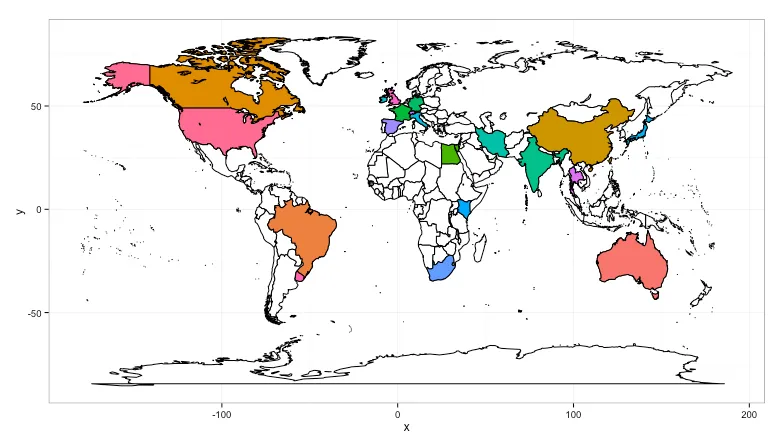
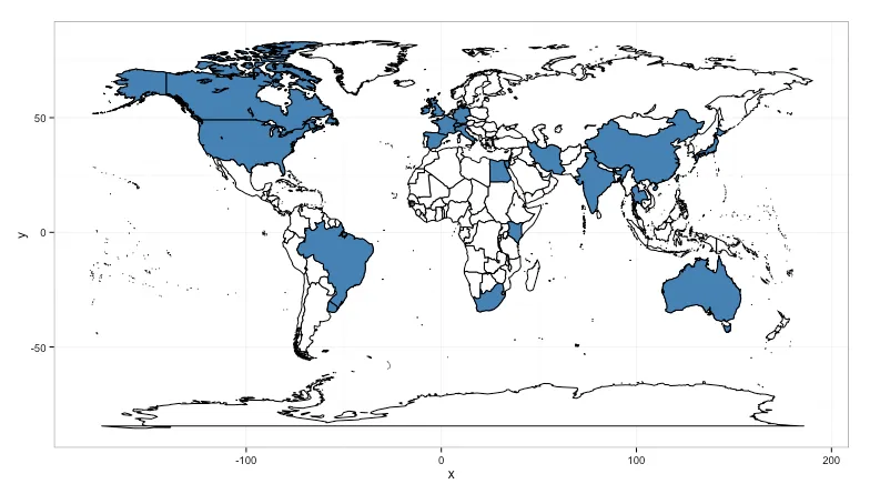
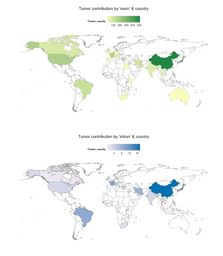
gridExtra包中。我将代码放在了github上,以便更容易地获取:https://gist.github.com/hrbrmstr/0a330b212b46517ffee9,并包含了一个片段,展示如何查看错误的区域名称。您可以使用基本R包中的`aggregate`而不是`plyr`中的`count`,但我认为`count`语法更清晰。 - hrbrmstr
1
:-) 所以 .(region) 语法是 plyr 包中用于指定列名的语法糖。它等同于 c("region")(而且 c() 不是必需的,但这是我的习惯)。您可以随时通过 bob at rudis dot net 联系我获取更多信息(在 SO 上进行后续操作有点困难,反正我很乐意帮忙)。 - hrbrmstr
显示剩余4条评论

网页内容由stack overflow 提供, 点击上面的
可以查看英文原文,
原文链接