我知道这听起来像是又一个关于flexbox的问题,但我在谷歌或stackoverflow的现有帖子中找不到解决方案。
问题很简单。
我有一个父div内部有3个子div,其中一个包含比其最终尺寸大的内容。我想让每个子元素都是其父元素的1/3,而不管其内容如何。
这是jsfiddle链接: http://jsfiddle.net/xeqo0msq/
这是HTML:
<div class="parent">
   <div class="child red">
       <div class="content">1</div>
   </div>
   <div class="child blue">2</div>
   <div class="child green">3</div>
</div>
并且相关的CSS:
.parent {
   display: flex;
   flex-direction: column; /*or row*/
   height: 100%;
   width: 100%;
}

.child {
   flex: 1;
}

.content{
   width: 800px;
   height: 100px;
}

.red {background: red;}
.blue {background: blue;}
.green {background: green;}
对于
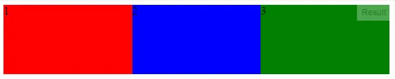
flex-direction: row;,它的效果如预期:每个子元素都是其父元素的1/3,尽管第一个内容要大得多。宽度的表现就像与内容无关一样。
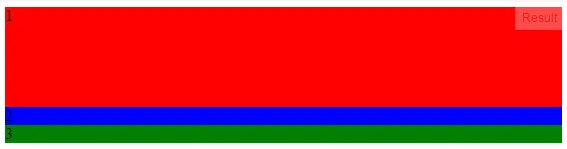
flex-direction: column;,第一个子元素比其他两个子元素要大得多。
使用flexbox和flex-direction: column;能否实现这一点?