已经找到如何隐藏左侧的抓握点,现在要如何隐藏右侧的添加/删除按钮下拉箭头?
5个回答
24
谷歌上有很多关于这个问题的答案:
private void ToolBar_Loaded(object sender, RoutedEventArgs e)
{
    ToolBar toolBar = sender as ToolBar;
    var overflowGrid = toolBar.Template.FindName("OverflowGrid", toolBar) as FrameworkElement;
    if (overflowGrid != null)
    {
            overflowGrid.Visibility = Visibility.Collapsed;
    }

    var mainPanelBorder = toolBar.Template.FindName("MainPanelBorder", toolBar) as FrameworkElement;
    if (mainPanelBorder != null)
    {
        mainPanelBorder.Margin = new Thickness(0);
    }
}
将此方法分配给您的工具栏“已加载”事件。
- Andrei Pana
7
尝试搜索 Google,但未找到。这会留下右侧的空白,原本应该是按钮的位置...有什么办法可以修复吗? - mpen
@Andrei:这是哪个属性?我在哪里设置它?编辑:算了,我找到了。但它并没有去除间隙。 - mpen
哦,对不起,一开始我没有意识到你具体指的是哪个间隙。当我为自己移除了溢出时,我没有注意到那个间隙,所以我并没有在意它。我目前看不到简单的方法来消除那个间隙,因此重新设计整个工具栏(就像H.B.回答的那样)可能是唯一的选择。 - Andrei Pana
2我已更新我的回答,以去除空隙,该空隙是由于主面板的边距所致。 - Andrei Pana
1哦,这个哲学理论认为这确实是一种hacky的做法,但是移除溢出按钮并没有通过属性暴露(就像左侧手柄一样)。这意味着为工具栏设计的外观不打算缺少溢出组件。要摆脱它,您需要为工具栏定义一个新的样式/外观,一个没有溢出的外观,这意味着重写整个控件模板(正如H.B.所建议的那样),但您必须在模板中包含所有工具栏的功能。FindName本身并不是hacky的(事实上,在自定义控件开发中经常使用)。 - Andrei Pana
显示剩余2条评论
6
将以下方法分配给您的工具栏SizeChanged事件。
    private void ToolBar_SizeChanged(object sender, SizeChangedEventArgs e)
    {
        ToolBar toolBar = sender as ToolBar;
        var overflowGrid = toolBar.Template.FindName("OverflowGrid", toolBar) as FrameworkElement;
        if (overflowGrid != null)
        {
            overflowGrid.Visibility = toolBar.HasOverflowItems ? Visibility.Visible : Visibility.Collapsed;
        }

        var mainPanelBorder = toolBar.Template.FindName("MainPanelBorder", toolBar) as FrameworkElement;
        if (mainPanelBorder != null)
        {
            var defaultMargin = new Thickness(0, 0, 11, 0);
            mainPanelBorder.Margin = toolBar.HasOverflowItems ?defaultMargin: new Thickness(0);
        }
    }
- Amit Pawar
2
这对于水平工具栏非常完美。对于垂直工具栏,箭头不会出现在最后一个按钮下方,而是在其旁边(如果工具栏位于窗口左侧,则在右侧)。 - char m
如果方向为垂直,则边距应为Thickness(0, 0, 0, 11)。 - char m
5
编辑: 已经修复了缝隙。
编辑2: 修复了缺失的资源。
或者您可以使用早期提到的可见性更改和右侧边距移除的样式/模板副本,所有这些资源都属于样式/模板:
    <LinearGradientBrush x:Key="ToolBarHorizontalBackground" EndPoint="0,1" StartPoint="0,0">
        <GradientStop Color="#FFFFFF" Offset="0"/>
        <GradientStop Color="#FFFBFF" Offset="0.5"/>
        <GradientStop Color="#F7F7F7" Offset="1"/>
    </LinearGradientBrush>
    <LinearGradientBrush x:Key="ToolBarToggleButtonVerticalBackground" EndPoint="1,0" StartPoint="0,0">
        <GradientStop Color="#ECECEC" Offset="0"/>
        <GradientStop Color="#DDDDDD" Offset="0.5"/>
        <GradientStop Color="#A0A0A0" Offset="1"/>
    </LinearGradientBrush>
    <SolidColorBrush x:Key="ToolBarButtonHover" Color="#C2E0FF"/>
    <SolidColorBrush x:Key="ToolBarGripper" Color="#C6C3C6"/>
    <Style x:Key="ToolBarVerticalOverflowButtonStyle" TargetType="{x:Type ToggleButton}">
        <Setter Property="Background" Value="{StaticResource ToolBarToggleButtonVerticalBackground}"/>
        <Setter Property="MinHeight" Value="0"/>
        <Setter Property="MinWidth" Value="0"/>
        <Setter Property="Template">
            <Setter.Value>
                <ControlTemplate TargetType="{x:Type ToggleButton}">
                    <Border x:Name="Bd" Background="{TemplateBinding Background}" CornerRadius="0,0,3,3" SnapsToDevicePixels="true">
                        <Canvas HorizontalAlignment="Right" Height="6" Margin="2,7,2,2" SnapsToDevicePixels="true" VerticalAlignment="Bottom" Width="7">
                            <Path Data="M 1.5 1 L 1.5 6" Stroke="White"/>
                            <Path Data="M 0.5 0 L 0.5 5" Stroke="{TemplateBinding Foreground}"/>
                            <Path Data="M 3.5 0.5 L 7 3.5 L 4 6.5 Z" Fill="White"/>
                            <Path Data="M 3 -0.5 L 6 2.5 L 3 5.5 Z" Fill="{TemplateBinding Foreground}"/>
                        </Canvas>
                    </Border>
                    <ControlTemplate.Triggers>
                        <Trigger Property="IsMouseOver" Value="true">
                            <Setter Property="Background" TargetName="Bd" Value="{StaticResource ToolBarButtonHover}"/>
                        </Trigger>
                        <Trigger Property="IsKeyboardFocused" Value="true">
                            <Setter Property="Background" TargetName="Bd" Value="{StaticResource ToolBarButtonHover}"/>
                        </Trigger>
                        <Trigger Property="IsEnabled" Value="false">
                            <Setter Property="Foreground" Value="{StaticResource ToolBarGripper}"/>
                        </Trigger>
                    </ControlTemplate.Triggers>
                </ControlTemplate>
            </Setter.Value>
        </Setter>
        <Style.Triggers>
            <DataTrigger Binding="{Binding Source={x:Static SystemParameters.HighContrast}}" Value="true">
                <Setter Property="Background" Value="{DynamicResource {x:Static SystemColors.ControlBrushKey}}"/>
            </DataTrigger>
        </Style.Triggers>
    </Style>
    <LinearGradientBrush x:Key="ToolBarVerticalBackground" EndPoint="1,0" StartPoint="0,0">
        <GradientStop Color="#FFFFFF" Offset="0"/>
        <GradientStop Color="#FFFBFF" Offset="0.5"/>
        <GradientStop Color="#F7F7F7" Offset="1"/>
    </LinearGradientBrush>
    <LinearGradientBrush x:Key="ToolBarToggleButtonHorizontalBackground" EndPoint="0,1" StartPoint="0,0">
        <GradientStop Color="#ECECEC" Offset="0"/>
        <GradientStop Color="#DDDDDD" Offset="0.5"/>
        <GradientStop Color="#A0A0A0" Offset="1"/>
    </LinearGradientBrush>
    <Style x:Key="ToolBarHorizontalOverflowButtonStyle" TargetType="{x:Type ToggleButton}">
        <Setter Property="Background" Value="{StaticResource ToolBarToggleButtonHorizontalBackground}"/>
        <Setter Property="MinHeight" Value="0"/>
        <Setter Property="MinWidth" Value="0"/>
        <Setter Property="Template">
            <Setter.Value>
                <ControlTemplate TargetType="{x:Type ToggleButton}">
                    <Border x:Name="Bd" Background="{TemplateBinding Background}" CornerRadius="0,3,3,0" SnapsToDevicePixels="true">
                        <Canvas HorizontalAlignment="Right" Height="7" Margin="7,2,2,2" SnapsToDevicePixels="true" VerticalAlignment="Bottom" Width="6">
                            <Path Data="M 1 1.5 L 6 1.5" Stroke="White"/>
                            <Path Data="M 0 0.5 L 5 0.5" Stroke="{TemplateBinding Foreground}"/>
                            <Path Data="M 0.5 4 L 6.5 4 L 3.5 7 Z" Fill="White"/>
                            <Path Data="M -0.5 3 L 5.5 3 L 2.5 6 Z" Fill="{TemplateBinding Foreground}"/>
                        </Canvas>
                    </Border>
                    <ControlTemplate.Triggers>
                        <Trigger Property="IsMouseOver" Value="true">
                            <Setter Property="Background" TargetName="Bd" Value="{StaticResource ToolBarButtonHover}"/>
                        </Trigger>
                        <Trigger Property="IsKeyboardFocused" Value="true">
                            <Setter Property="Background" TargetName="Bd" Value="{StaticResource ToolBarButtonHover}"/>
                        </Trigger>
                        <Trigger Property="IsEnabled" Value="false">
                            <Setter Property="Foreground" Value="{StaticResource ToolBarGripper}"/>
                        </Trigger>
                    </ControlTemplate.Triggers>
                </ControlTemplate>
            </Setter.Value>
        </Setter>
        <Style.Triggers>
            <DataTrigger Binding="{Binding Source={x:Static SystemParameters.HighContrast}}" Value="true">
                <Setter Property="Background" Value="{DynamicResource {x:Static SystemColors.ControlBrushKey}}"/>
            </DataTrigger>
        </Style.Triggers>
    </Style>
    <SolidColorBrush x:Key="ToolBarMenuBorder" Color="#808080"/>
    <SolidColorBrush x:Key="ToolBarSubMenuBackground" Color="#FDFDFD"/>
    <Style x:Key="ToolBarThumbStyle" TargetType="{x:Type Thumb}">
        <Setter Property="Template">
            <Setter.Value>
                <ControlTemplate TargetType="{x:Type Thumb}">
                    <Border Background="Transparent" Padding="{TemplateBinding Padding}" SnapsToDevicePixels="True">
                        <Rectangle>
                            <Rectangle.Fill>
                                <DrawingBrush TileMode="Tile" Viewbox="0,0,4,4" Viewport="0,0,4,4" ViewportUnits="Absolute" ViewboxUnits="Absolute">
                                    <DrawingBrush.Drawing>
                                        <DrawingGroup>
                                            <GeometryDrawing Brush="White" Geometry="M 1 1 L 1 3 L 3 3 L 3 1 z"/>
                                            <GeometryDrawing Brush="{StaticResource ToolBarGripper}" Geometry="M 0 0 L 0 2 L 2 2 L 2 0 z"/>
                                        </DrawingGroup>
                                    </DrawingBrush.Drawing>
                                </DrawingBrush>
                            </Rectangle.Fill>
                        </Rectangle>
                    </Border>
                    <ControlTemplate.Triggers>
                        <Trigger Property="IsMouseOver" Value="true">
                            <Setter Property="Cursor" Value="SizeAll"/>
                        </Trigger>
                    </ControlTemplate.Triggers>
                </ControlTemplate>
            </Setter.Value>
        </Setter>
    </Style>
    <Style x:Key="ToolBarMainPanelBorderStyle" TargetType="{x:Type Border}">
        <Setter Property="Margin" Value="0,0,11,0"/>
        <Setter Property="CornerRadius" Value="3,3,3,3"/>
        <Style.Triggers>
            <DataTrigger Binding="{Binding Source={x:Static SystemParameters.HighContrast}}" Value="true">
                <Setter Property="CornerRadius" Value="0,0,0,0"/>
            </DataTrigger>
        </Style.Triggers>
    </Style>
    <Style x:Key="ToolBarWithoutOverflowBarStyle" TargetType="{x:Type ToolBar}">
        <Setter Property="Background" Value="{StaticResource ToolBarHorizontalBackground}"/>
        <Setter Property="Template">
            <Setter.Value>
                <ControlTemplate TargetType="{x:Type ToolBar}">
                    <Grid x:Name="Grid" Margin="3,1,1,1" SnapsToDevicePixels="true">
                        <Grid x:Name="OverflowGrid" HorizontalAlignment="Right" Visibility="Hidden">
                            <ToggleButton x:Name="OverflowButton" ClickMode="Press" FocusVisualStyle="{x:Null}" IsChecked="{Binding IsOverflowOpen, Mode=TwoWay, RelativeSource={RelativeSource TemplatedParent}}" IsEnabled="{TemplateBinding HasOverflowItems}" Style="{StaticResource ToolBarHorizontalOverflowButtonStyle}"/>
                            <Popup x:Name="OverflowPopup" AllowsTransparency="true" Focusable="false" IsOpen="{Binding IsOverflowOpen, RelativeSource={RelativeSource TemplatedParent}}" PopupAnimation="{DynamicResource {x:Static SystemParameters.ComboBoxPopupAnimationKey}}" Placement="Bottom" StaysOpen="false">
                                <Microsoft_Windows_Themes:SystemDropShadowChrome x:Name="Shdw" Color="Transparent">
                                    <Border x:Name="ToolBarSubMenuBorder" BorderBrush="{StaticResource ToolBarMenuBorder}" BorderThickness="1" Background="{StaticResource ToolBarSubMenuBackground}" RenderOptions.ClearTypeHint="Enabled">
                                        <ToolBarOverflowPanel x:Name="PART_ToolBarOverflowPanel" KeyboardNavigation.DirectionalNavigation="Cycle" FocusVisualStyle="{x:Null}" Focusable="true" Margin="2" SnapsToDevicePixels="{TemplateBinding SnapsToDevicePixels}" KeyboardNavigation.TabNavigation="Cycle" WrapWidth="200"/>
                                    </Border>
                                </Microsoft_Windows_Themes:SystemDropShadowChrome>
                            </Popup>
                        </Grid>
                        <Border x:Name="MainPanelBorder" BorderBrush="{TemplateBinding BorderBrush}" BorderThickness="{TemplateBinding BorderThickness}" Background="{TemplateBinding Background}" Padding="{TemplateBinding Padding}" Style="{StaticResource ToolBarMainPanelBorderStyle}" Margin="0">
                            <DockPanel KeyboardNavigation.TabIndex="1" KeyboardNavigation.TabNavigation="Local">
                                <Thumb x:Name="ToolBarThumb" Margin="-3,-1,0,0" Padding="6,5,1,6" Style="{StaticResource ToolBarThumbStyle}" Width="10"/>
                                <ContentPresenter x:Name="ToolBarHeader" ContentSource="Header" HorizontalAlignment="Center" Margin="4,0,4,0" SnapsToDevicePixels="{TemplateBinding SnapsToDevicePixels}" VerticalAlignment="Center"/>
                                <ToolBarPanel x:Name="PART_ToolBarPanel" IsItemsHost="true" Margin="0,1,2,2" SnapsToDevicePixels="{TemplateBinding SnapsToDevicePixels}"/>
                            </DockPanel>
                        </Border>
                    </Grid>
                    <ControlTemplate.Triggers>
                        <Trigger Property="IsOverflowOpen" Value="true">
                            <Setter Property="IsEnabled" TargetName="ToolBarThumb" Value="false"/>
                        </Trigger>
                        <Trigger Property="Header" Value="{x:Null}">
                            <Setter Property="Visibility" TargetName="ToolBarHeader" Value="Collapsed"/>
                        </Trigger>
                        <Trigger Property="ToolBarTray.IsLocked" Value="true">
                            <Setter Property="Visibility" TargetName="ToolBarThumb" Value="Collapsed"/>
                        </Trigger>
                        <Trigger Property="HasDropShadow" SourceName="OverflowPopup" Value="true">
                            <Setter Property="Margin" TargetName="Shdw" Value="0,0,5,5"/>
                            <Setter Property="SnapsToDevicePixels" TargetName="Shdw" Value="true"/>
                            <Setter Property="Color" TargetName="Shdw" Value="#71000000"/>
                        </Trigger>
                        <Trigger Property="Orientation" Value="Vertical">
                            <Setter Property="Margin" TargetName="Grid" Value="1,3,1,1"/>
                            <Setter Property="Style" TargetName="OverflowButton" Value="{StaticResource ToolBarVerticalOverflowButtonStyle}"/>
                            <Setter Property="Height" TargetName="ToolBarThumb" Value="10"/>
                            <Setter Property="Width" TargetName="ToolBarThumb" Value="Auto"/>
                            <Setter Property="Margin" TargetName="ToolBarThumb" Value="-1,-3,0,0"/>
                            <Setter Property="Padding" TargetName="ToolBarThumb" Value="5,6,6,1"/>
                            <Setter Property="Margin" TargetName="ToolBarHeader" Value="0,0,0,4"/>
                            <Setter Property="Margin" TargetName="PART_ToolBarPanel" Value="1,0,2,2"/>
                            <Setter Property="DockPanel.Dock" TargetName="ToolBarThumb" Value="Top"/>
                            <Setter Property="DockPanel.Dock" TargetName="ToolBarHeader" Value="Top"/>
                            <Setter Property="HorizontalAlignment" TargetName="OverflowGrid" Value="Stretch"/>
                            <Setter Property="VerticalAlignment" TargetName="OverflowGrid" Value="Bottom"/>
                            <Setter Property="Placement" TargetName="OverflowPopup" Value="Right"/>
                            <Setter Property="Margin" TargetName="MainPanelBorder" Value="0,0,0,11"/>
                            <Setter Property="Background" Value="{StaticResource ToolBarVerticalBackground}"/>
                        </Trigger>
                        <Trigger Property="IsEnabled" Value="false">
                            <Setter Property="Foreground" Value="{DynamicResource {x:Static SystemColors.GrayTextBrushKey}}"/>
                        </Trigger>
                    </ControlTemplate.Triggers>
                </ControlTemplate>
            </Setter.Value>
        </Setter>
        <Style.Triggers>
            <DataTrigger Binding="{Binding Source={x:Static SystemParameters.HighContrast}}" Value="true">
                <Setter Property="Background" Value="{DynamicResource {x:Static SystemColors.ControlBrushKey}}"/>
            </DataTrigger>
        </Style.Triggers>
    </Style>
在您将其嵌入某个位置之后,您可以设置工具栏的样式:
<ToolBar Style="{DynamicResource ToolBarWithoutOverflowBarStyle}"/>
- H.B.
3
5哇...难以置信为了拥有一个简单的工具栏需要那么多的工作。 - mpen
如果你不想要手柄和下拉菜单,为什么还要使用工具栏呢?你可以直接使用某种面板。 - Robert Rossney
1@Ralph:如果你有Expression Blend,这并不需要太多的工作,它可以提取默认模板,这就是我在这里所做的。Blend对于模板、样式等方面非常有用。 - H.B.
3
我已经寻找四个小时,用MVVM(所以没有代码后台)才能正确地完成这项任务。
最重要的是在ToggleButton和ToolBarOverflowPanel之后设置“visibility collapsed”(我已经为我的导航示例将背景颜色设置为黑色)。
这里是你可以在工具栏上设置的代码:"<toolbar Style="{StaticResource ToolBar}" Background="Black">...</ToolBar>
这里是样式的代码:
    <Style x:Key="Toolbar" TargetType="{x:Type ToolBar}">
        <Setter Property="SnapsToDevicePixels" Value="true"/>
        <Setter Property="OverridesDefaultStyle" Value="true"/>
        <Setter Property="Template">
            <Setter.Value>
                <ControlTemplate TargetType="{x:Type ToolBar}">
                <Border x:Name="Border"  CornerRadius="2" BorderThickness="1" Background="Black" BorderBrush="Black">
                    <DockPanel >
                        <ToggleButton Visibility="Collapsed"  DockPanel.Dock="Right" IsEnabled="False" IsChecked="False" ClickMode="Press">
                            <Popup x:Name="OverflowPopup" AllowsTransparency="true" Placement="Bottom" IsOpen="{Binding Path=IsOverflowOpen,RelativeSource={RelativeSource TemplatedParent}}" StaysOpen="false" Focusable="false" PopupAnimation="Slide">
                                <Border x:Name="DropDownBorder" Background="pink" BorderThickness="1" BorderBrush="pink">
                                    <ToolBarOverflowPanel x:Name="PART_ToolBarOverflowPanel" Margin="2" WrapWidth="200" Focusable="true"  FocusVisualStyle="{x:Null}" KeyboardNavigation.TabNavigation="Cycle" KeyboardNavigation.DirectionalNavigation="Cycle" Visibility="Collapsed"/>
                                </Border>
                            </Popup>
                        </ToggleButton>
                        <ToolBarPanel x:Name="PART_ToolBarPanel" IsItemsHost="true" Margin="0,1,2,2"/>
                    </DockPanel>
                </Border>
            </ControlTemplate>
            </Setter.Value>
        </Setter>
    </Style>
- AxelPauwels
2
我也找了一段时间,没有找到一个优雅的XAML解决方案,这个很好用,非常感谢! - JEllery
感谢您的帮助,我已经移除了x:Key="Toolbar"并将其放置在资源部分,以简化<toolbar…声明。同时,我还移除了背景和边框笔刷设置。 - Moon Waxing
2
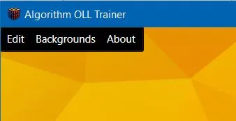
我不太确定你是否真的需要一个工具栏或类似菜单栏的组件。这里只是我想要的:
<Grid>
    <Grid.RowDefinitions>
        <RowDefinition Height="Auto"/>
        <RowDefinition Height="*"/>
    </Grid.RowDefinitions>
    <Menu Grid.Row="0">
        <MenuItem Header="Menu1" Padding="10 4">
            <MenuItem Header="MenuItem1"/>
            <MenuItem Header="MenuItem2"/>
        </MenuItem>
        <MenuItem Header="Menu2" Padding="10 4">
            <MenuItem Header="MenuItem1"/>
            <MenuItem Header="MenuItem2"/>
        </MenuItem>
    </Menu>
    <...>
 </Grid>
也许不完全适用于你的情况,但我想分享我的经验。
- Raye
网页内容由stack overflow 提供, 点击上面的可以查看英文原文,
原文链接
原文链接