WPF 样式/模板继承

6

我目前正在尝试学习WPF,并通过使用样式来使默认的.Net控件看起来不同。虽然所有下面的代码都是WPF标记,但我选择使用C#作为首选语言。

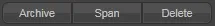
今天我设置了新主题的gmail(请参见下面的图片),因此给自己设定了一个挑战:是否可以在WPF中实现。

New GMail buttons

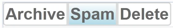
我已经成功创建了中间的按钮Spam,通过使用带有控件模板和触发器的样式。

左侧和右侧的按钮非常相似,但只有两个区别。它们的角半径为1,左侧或右侧的边距为15,而中间按钮将它们都设置为0。

问题!

Q1. 与其复制整个样式并仅更改这两个属性,是否可以通过某种继承方式完成?右侧和左侧的按钮基于现有样式,但进行了这两个可视化更改。我已经尝试使用BasedOn属性创建新样式,但无法编辑所需的属性。

Q2. 样式是解决WPF中此问题的正确方法吗? 在WinForms中,您将尝试创建自定义控件,该控件具有与枚举关联的可见属性,即单击按钮后,样式选项可能是Left、Middle、Right。

Q3. 最难的问题在最后。是否可以这样做:如果一个按钮应用了我的样式,则当您将其背景颜色设置为蓝色时,按钮仍保持渐变,但现在它们不是浅白色,而是一种蓝色。即背景线性渐变刷子是基于而不是覆盖已应用于按钮的背景颜色。还是需要定义不同的样式。个人而言,我无法想象在没有某种代码后台的情况下,如何通过WPF标记从单个刷子创建渐变刷子。

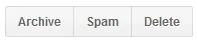
例如,下面是一个蓝色按钮和一个灰色/正常按钮:

Google buttons 2

MyStyle

<Style x:Key="GoogleMiddleButton" TargetType="{x:Type Button}">
        <Setter Property="Background">
            <Setter.Value>
                <LinearGradientBrush StartPoint="0,1" EndPoint="0,0">
                    <GradientStop Color="#F1F1F1" Offset="0"/>
                    <GradientStop Color="#F5F5F5" Offset="1"/>
                </LinearGradientBrush>
            </Setter.Value>
        </Setter>
        <Setter Property="Foreground" Value="#666666"/>
        <Setter Property="FontFamily" Value="Arial"/>
        <Setter Property="FontSize" Value="13"/>
        <Setter Property="FontWeight" Value="Bold"/>
        <Setter Property="Template">
            <Setter.Value>
                <ControlTemplate TargetType="Button">
                    <Border Name="dropShadowBorder"
                        BorderThickness="0,0,0,1"
                        CornerRadius="1"
                        >
                        <Border.BorderBrush>
                            <SolidColorBrush Color="#00000000"/>
                        </Border.BorderBrush>
                    <Border Name="border" 
                    BorderThickness="{TemplateBinding BorderThickness}"
                    Padding="{TemplateBinding Padding}" 
                    CornerRadius="0" 
                    Background="{TemplateBinding Background}">
                        <Border.BorderBrush>
                            <SolidColorBrush Color="#D8D8D8"/>
                        </Border.BorderBrush>
                        <ContentPresenter HorizontalAlignment="{TemplateBinding HorizontalContentAlignment}" 
                                  VerticalAlignment="{TemplateBinding VerticalContentAlignment}"/>
                        </Border>
                    </Border>
                    <ControlTemplate.Triggers>
                        <Trigger Property="IsMouseOver" Value="True">
                            <Setter Property="BorderBrush" TargetName="border">
                                <Setter.Value>
                                    <SolidColorBrush Color="#939393"/>
                                </Setter.Value>
                            </Setter>
                            <Setter Property="BorderBrush" TargetName="dropShadowBorder">
                                <Setter.Value>
                                    <SolidColorBrush Color="#EBEBEB"/>
                                </Setter.Value>
                            </Setter>
                        </Trigger>
                    </ControlTemplate.Triggers>
                </ControlTemplate>
            </Setter.Value>
        </Setter>
        <Style.Triggers>
            <Trigger Property="IsMouseOver" Value="True">
                <Setter Property="Foreground" Value="#333333"/>
            </Trigger>
            <Trigger Property="IsPressed" Value="True">
                <Setter Property="Background">
                    <Setter.Value>
                        <LinearGradientBrush StartPoint="0,1" EndPoint="0,0">
                            <GradientStop Color="#F1F1F1" Offset="1"/>
                            <GradientStop Color="#F5F5F5" Offset="0"/>
                        </LinearGradientBrush>
                    </Setter.Value>
                </Setter>
            </Trigger>
        </Style.Triggers>
    </Style>

顺便提一句,如果您在上述WPF中发现任何初学者常犯的错误,请随时指出。


关于1和2,我在WPF方面有类似的经验。有ControlTemplate,但我认为它应该用于更改控件的行为,而不是外观。请查看此问题以获取类似的讨论: https://dev59.com/N3A65IYBdhLWcg3wxRs8 - Amittai Shapira
谢谢,我会在午餐时阅读它。 - JonWillis
3个回答

8

我过去曾经通过定义一个名为ExtendedProperties.CornerRadius的附加属性来完成这个操作。然后我可以在我的样式中设置它:

<Style TargetType="Button">
    <Setter Property="local:ExtendedProperties.CornerRadius" Value="0"/>
    ...

并且可以在模板中使用:

<Border CornerRadius="{Binding Path=(local:ExtendedProperties.CornerRadius), RelativeSource={RelativeSource TemplatedParent}">

我可以用和覆盖其他属性相同的方式在本地覆盖它:

<Button Content="Archive" local:ExtendedProperties.CornerRadius="5,0,0,5"/>
<Button Content="Span"/>
<Button Content="Delete" local:ExtendedProperties.CornerRadius="0,5,5,0"/>

在我的情况下,这给了我一个(很明显,我的主题是暗色调):

enter image description here

通过调整我的主题的一些附加属性,我创建了这个效果:

enter image description here

这种方法的优点是不需要子类化 Button。您还可以使用相同的附加属性为其他控件(如 TextBox)定义角半径。当然,您不仅限于角半径。您可以为所有特定于主题但不存在于基本控件上的事物定义附加属性。

缺点是它是一个附加属性,因此更难发现。记录您的主题将有助于解决这个问题。

因此,回答您的具体问题:

Q1. 是的,请参见上面的答案。您可以在本地重写或定义覆盖该属性的新样式。

Q2. 这是一个灰色地带。在我看来,如果它纯粹是视觉效果(而不是行为),那么样式就是正确的选择。当然,如果情况失控,您可能希望子类化所有内置控件并添加您的特定属性。但这会使您的主题更难以重用,并且使应用程序更加繁琐(因为您需要使用自己的控件集而不是标准控件)。

问:我认为在代码中是可能的,但对于控件使用者来说并不直观。我认为最好定义额外的附加属性 - 例如ExtendedProperties.HoverBackgroundExtendedProperties.PressedBackground - 并以完全相同的方式在模板中使用它们。然后,当您的控件处于各种状态时,控件的消费者就可以更好地控制使用的画笔。我过去曾这样做,但使用了更通用的属性名称(SecondaryBackgroundTernaryBackground),因此我可以在其他上下文中重用这些属性。再次强调,记录您的主题是有帮助的。


小问题。你链接到了哪个本地命名空间?因为我的式样中没有定义 "local:ExtendedProperties.CornerRadius"。我已经在谷歌上搜索了,但是无法找到我应该使用哪个命名空间来定义 ExtendedProperties。 - JonWillis
ExtendedProperties 是我在主题程序集中定义的自己的类。它仅包含您需要支持主题的任何附加属性。因此,您将映射到的命名空间将是您自己的主题命名空间。 - Kent Boogaart
顺便说一下,我帖子中的图片非常不清晰,不够清晰。如果您复制图像位置并在另一个选项卡中打开它们,您可以看到它们更清晰。http://i.stack.imgur.com/4ZBaF.png 和 http://i.stack.imgur.com/01rBQ.png。 - Kent Boogaart
ExtendedProperties - 我喜欢它! - ColinE
尚未尝试并使其正常工作,但大多数人似乎都认为这是最好的方法。虽然渐变和自定义转换器的想法也非常有用。 - JonWillis

2

问题1:据我所知不是这样的。

问题2:我认为样式是最好的选择,你可以创建一个从按钮派生出来的自定义类,并根据其是否为左、中、右选择正确的角半径。

问题3:使用自定义值转换器和自己的样式应该是可行的。

总之,在这种情况下,我可能会尝试将背景渐变和角半径放在周围的堆栈面板上。按钮将是透明的,带有文本。然后您就不必处理单个按钮上的角半径了。

编辑:添加了上面Q3答案的代码和样式。对于OP;我不确定这是否完全符合您的要求,但也许这里有一些可以引起您兴趣的东西。

我的理解是您想将按钮背景设置为特定颜色,但应根据该颜色呈现为线性渐变。其他帖子提到了不透明度掩码,这也不是一个坏主意。我认为我可以展示如何使用自定义值转换器来完成它。

我的想法是创建一个自定义值转换器,将纯色画刷转换为线性渐变画刷。然后我使用此转换器将按钮背景颜色从纯色画刷转换为线性渐变画刷。

以下是自定义值转换器:

class SolidColorBrushToGradientConverter : IValueConverter
{
    const float DefaultLowColorScale = 0.95F;

    public object Convert (object value, Type targetType, object parameter, CultureInfo culture)
    {
        var solidColorBrush = value as SolidColorBrush;

        if (!targetType.IsAssignableFrom (typeof (LinearGradientBrush)) || solidColorBrush == null)
        {
            return Binding.DoNothing;
        }

        var lowColorScale = ParseParameterAsDouble (parameter);

        var highColor = solidColorBrush.Color;
        var lowColor = Color.Multiply (highColor, lowColorScale);
        lowColor.A = highColor.A;

        return new LinearGradientBrush (
            highColor,
            lowColor,
            new Point (0, 0),
            new Point (0, 1)
            );
    }

    static float ParseParameterAsDouble (object parameter)
    {
        if (parameter is float)
        {
            return (float)parameter;
        }
        else if (parameter is string)
        {
            float result;
            return float.TryParse(
                (string) parameter, 
                NumberStyles.Float, 
                CultureInfo.InvariantCulture, 
                out result
                        )
                        ? result
                        : DefaultLowColorScale
                ;
        }
        else
        {
            return DefaultLowColorScale;
        }
    }

    public object ConvertBack (object value, Type targetType, object parameter, CultureInfo culture)
    {
        return Binding.DoNothing;
    }
}

然后我在从你那里复制的样式中引用它(基本上相同,但我稍微重新构建了一下),重要的行部分是这个:

Background="{Binding Path=Background,Mode=OneWay,RelativeSource={RelativeSource Mode=TemplatedParent}, Converter={StaticResource SolidColorBrushToGradientConverter}, ConverterParameter=0.95}"

这意味着我们绑定到模板化的父背景(即Button.Background),我们使用SolidColorBrushToGradientConverter转换器,并使用参数0.95(这决定了“低”颜色与“高”颜色相比应该更暗多少)。

完整的样式:

<local:SolidColorBrushToGradientConverter x:Key="SolidColorBrushToGradientConverter" />

<Style x:Key="GoogleMiddleButton" TargetType="{x:Type Button}">
    <Setter Property="Background" Value="#F5F5F5" />
    <Setter Property="Foreground" Value="#666666"/>
    <Setter Property="FontFamily" Value="Arial"/>
    <Setter Property="FontSize" Value="13"/>
    <Setter Property="FontWeight" Value="Bold"/>
    <Setter Property="Template">
        <Setter.Value>
            <ControlTemplate TargetType="Button">
                <Border 
                    Name="dropShadowBorder"                        
                    BorderThickness="0,0,0,1"                        
                    CornerRadius="1"
                    >
                    <Border.BorderBrush>
                        <SolidColorBrush Color="#00000000"/>
                    </Border.BorderBrush>
                    <Border Name="border"                     
                            BorderThickness="{TemplateBinding BorderThickness}"                    
                            Padding="{TemplateBinding Padding}"                     
                            CornerRadius="0"                     
                            Background="{Binding Path=Background,Mode=OneWay,RelativeSource={RelativeSource Mode=TemplatedParent}, Converter={StaticResource SolidColorBrushToGradientConverter}, ConverterParameter=0.95}"
                            >
                        <Border.BorderBrush>
                            <SolidColorBrush Color="#D8D8D8"/>
                        </Border.BorderBrush>
                        <ContentPresenter 
                            HorizontalAlignment="{TemplateBinding HorizontalContentAlignment}"                                   
                            VerticalAlignment="{TemplateBinding VerticalContentAlignment}"
                            />
                    </Border>
                </Border>
                <ControlTemplate.Triggers>
                    <Trigger Property="IsMouseOver" Value="True">
                        <Setter Property="BorderBrush" TargetName="border">
                            <Setter.Value>
                                <SolidColorBrush Color="#939393"/>
                            </Setter.Value>
                        </Setter>
                        <Setter Property="BorderBrush" TargetName="dropShadowBorder">
                            <Setter.Value>
                                <SolidColorBrush Color="#EBEBEB"/>
                            </Setter.Value>
                        </Setter>
                    </Trigger>
                    <Trigger Property="IsPressed" Value="True">
                        <Setter Property="Background" Value="#4A8FF7" />
                        <Setter Property="Foreground" Value="#F5F5F5" />
                        <Setter Property="BorderBrush" TargetName="border">
                            <Setter.Value>
                                <SolidColorBrush Color="#5185D8"/>
                            </Setter.Value>
                        </Setter>
                    </Trigger>
                </ControlTemplate.Triggers>
            </ControlTemplate>
        </Setter.Value>
    </Setter>
</Style>

@FuleSnabel Q1. 我的WPF答案往往要么不可能,要么非常困难 :) Q2. 我以为应该是样式,但还是想确认一下。 Q3. 我知道值转换器是什么,但你能详细说明一下如何在样式中使用值转换器将单一颜色转换为渐变画刷吗? P.s. 这个样式不是我写的,是谷歌的。但谢谢。 - JonWillis
根据我的经验,在WPF中,如果一个解决方案感觉笨重,那么我做错了什么。我个人很喜欢WPF,但是需要花费很长时间来获取足够的知识以有效地使用它。 - Just another metaprogrammer
关于 q3,我稍后会回复你。 - Just another metaprogrammer

1

我喜欢这个挑战的样子!

Q1:其他评论/答案是正确的,模板不能被修改或继承。但是,有一些方法可以通过传递值到模板中来修改它们的外观。一个简单(但略微hacky的方法)是使用Tag属性将边框CornerRadius传递到模板中。更好的方法可能是子类化按钮以添加“位置”属性。

Q2:是的,您在样式/模板方面走在了正确的轨道上。

Q3:修改您的模板以包括具有所需渐变的OpacityMask。然后,您可以将元素放置在此遮罩后面,或者使遮罩元素自己采用背景颜色。下面是完整的示例:

enter image description here

<Window x:Class="WpfApplication1.MainWindow"
        xmlns="http://schemas.microsoft.com/winfx/2006/xaml/presentation"
        xmlns:x="http://schemas.microsoft.com/winfx/2006/xaml"
        Title="MainWindow" Height="350" Width="525">
  <Window.Resources>
    <Style x:Key="GoogleButton" TargetType="{x:Type Button}">      
      <Setter Property="Background" Value="White"/>
      <Setter Property="Foreground" Value="#666666"/>
      <Setter Property="Tag">
        <Setter.Value>
          <CornerRadius>0</CornerRadius>
        </Setter.Value>
      </Setter>
      <Setter Property="FontFamily" Value="Arial"/>
      <Setter Property="FontSize" Value="13"/>
      <Setter Property="FontWeight" Value="Bold"/>
      <Setter Property="Template">
        <Setter.Value>
          <ControlTemplate TargetType="Button">
            <Border Name="dropShadowBorder"
                    BorderThickness="0,0,0,1"
                    CornerRadius="1"
                    BorderBrush="Transparent"
                    Background="White">
              <Grid>
                <Border Name="backgroundFill" 
                        BorderBrush="Red"
                        Background="{TemplateBinding Background}"
                        CornerRadius="{TemplateBinding Tag}">
                  <Border.OpacityMask>
                    <LinearGradientBrush StartPoint="0,1" EndPoint="0,0">
                      <GradientStop Color="#FF000000" Offset="0"/>
                      <GradientStop Color="#00000000" Offset="1"/>
                    </LinearGradientBrush>
                  </Border.OpacityMask>
                </Border>
                <Border Name="border" 
                    BorderThickness="{TemplateBinding BorderThickness}"
                    Padding="{TemplateBinding Padding}" 
                    CornerRadius="{TemplateBinding Tag}" 
                    Background="Transparent">
                  <Border.BorderBrush>
                    <SolidColorBrush Color="#D8D8D8"/>
                  </Border.BorderBrush>
                  <ContentPresenter HorizontalAlignment="{TemplateBinding HorizontalContentAlignment}" 
                                  VerticalAlignment="{TemplateBinding VerticalContentAlignment}"/>
                </Border>
              </Grid>
            </Border>            
            <ControlTemplate.Triggers>
              <Trigger Property="IsMouseOver" Value="True">
                <Setter Property="BorderBrush" TargetName="border">
                  <Setter.Value>
                    <SolidColorBrush Color="#939393"/>
                  </Setter.Value>
                </Setter>
                <Setter Property="BorderBrush" TargetName="dropShadowBorder">
                  <Setter.Value>
                    <SolidColorBrush Color="#EBEBEB"/>
                  </Setter.Value>
                </Setter>
              </Trigger>
            </ControlTemplate.Triggers>
          </ControlTemplate>
        </Setter.Value>
      </Setter>
      <Style.Triggers>
        <Trigger Property="IsMouseOver" Value="True">
          <Setter Property="Foreground" Value="#333333"/>
        </Trigger>
        <Trigger Property="IsPressed" Value="True">
          <Setter Property="Background">
            <Setter.Value>
              <LinearGradientBrush StartPoint="0,1" EndPoint="0,0">
                <GradientStop Color="#F1F1F1" Offset="1"/>
                <GradientStop Color="#F5F5F5" Offset="0"/>
              </LinearGradientBrush>
            </Setter.Value>
          </Setter>
        </Trigger>
      </Style.Triggers>
    </Style>
  </Window.Resources>
  <Grid>
    <StackPanel Orientation="Horizontal"
                VerticalAlignment="Top">
      <Button Style="{StaticResource GoogleButton}" Content="Archive">
        <Button.Tag>
          <CornerRadius>2,0,0,2</CornerRadius>
        </Button.Tag>
      </Button>
      <Button Style="{StaticResource GoogleButton}" Content="Spam"
              Background="LightBlue"/>
      <Button Style="{StaticResource GoogleButton}" Content="Delete">
        <Button.Tag>
          <CornerRadius>0,2,2,0</CornerRadius>
        </Button.Tag>
      </Button>
    </StackPanel>
  </Grid>
</Window>

Q3的回答不错,尝试得很好。我试了一下,但没有看到我期望看到的效果。渐变从设置的背景颜色到白色。问题中的“搜索邮件”按钮从#4D90FE(顶部)到#4787ED(底部),这是从一种蓝色到另一种蓝色的渐变,而不是从蓝色到白色。外边框也从#4079D5(顶部)#4581E5(底部)渐变。我正在尝试修改您建议的透明渐变,以查看是否可以获得我想要的结果。 - JonWillis
是的 - 对于不透明度遮罩,您可能希望在遮罩后面放置一个实心填充的矩形,而不是将遮罩应用于填充元素。我本来想做更多的 - 但还有一些工作要做 ;-) - ColinE

网页内容由stack overflow 提供, 点击上面的
可以查看英文原文,
原文链接