CSS边框带有不同颜色的圆角

11

是否有可能用两种颜色制作圆角和点状的 div 边框,如果可以,如何实现?

目前我所做的是:

.container{
  position: relative;
  width: 100%;
  height: 100vh;
}
.years {
  display: block;
  position: absolute;
  width: 50px;
  height: 0px;
  top: 0;
  left: 0;
  right: 0;
  bottom: 0;
  margin: auto;
  background: #1c1e2e;
  z-index: 999;
  border-radius: 100%;
  text-align: center;
  padding: 60px 30px;
}
.years:before {
  content: '';
  position: absolute;
  width: 140px;
  height: 155px;
  top: -17px;
  left: -17px;
  border-radius: 100%;
  border-right: 3px dotted #000;
  border-top-left-radius: 100%;
  border-bottom-left-radius: 100%;
}
.years:after {
  content: '';
  position: absolute;
  width: 140px;
  height: 155px;
  top: -17px;
  left: -17px;
  border-radius: 100%;
  border-left: 3px dotted #dfbc82;
  border-top-left-radius: 100%;
  border-bottom-left-radius: 100%;
}
<div class="container">
  <div class="years"></div>
</div>

但我希望做成这样:enter image description here

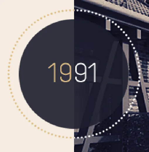
不需要任何平滑效果,并且无法弄清如何制作像屏幕截图中的普通点...

有什么想法吗?感谢任何建议.. :/

2个回答

14

你可以通过单独为底部、左侧、顶部和右侧边框上色,而无需任何伪元素的帮助,将常规元素的边框颜色分割成两个部分。

然而,如你所见,问题在于这种分割并非直接从上到下,而是倾斜了一点:

div {
  font-size: 24px;
  height: 192px;
  line-height: 192px;
  text-align: center;
  width: 192px;
  
  border-radius: 100%;
  border-style: dotted;
  border-width: 4px;
  
  border-bottom-color: blue;
  border-left-color: blue;
  border-right-color: red;
  border-top-color: red;
}
<div>
  Foobar
</div>

为了解决这个问题,我们可以简单地将元素旋转45度:

div {
  font-size: 24px;
  height: 192px;
  line-height: 192px;
  text-align: center;
  width: 192px;
  
  border-radius: 100%;
  border-style: dotted;
  border-width: 4px;
  
  border-bottom-color: blue;
  border-left-color: blue;
  border-right-color: red;
  border-top-color: red;
  
  transform: rotateZ(45deg);
}
<div>
  Foobar
</div>

现在唯一的问题是我们的内部内容也会旋转,因此您可以简单地将其包装在内部元素中,并将该元素相反地旋转:

现在唯一的问题是我们的内部内容也会旋转,因此您可以简单地将其包装在内部元素中,并将该元素相反地旋转:

div {
  font-size: 24px;
  height: 192px;
  line-height: 192px;
  text-align: center;
  width: 192px;
  
  border-radius: 100%;
  border-style: dotted;
  border-width: 4px;
  
  border-bottom-color: blue;
  border-left-color: blue;
  border-right-color: red;
  border-top-color: red;
  
  transform: rotateZ(45deg);
}

span {
  display: block;
  transform: rotateZ(-45deg);
}
<div>
  <span>Foobar</span>
</div>

CSS的transform属性在所有现代浏览器中都得到了支持,但在旧版浏览器中可能需要添加前缀。请查看http://caniuse.com/#feat=transforms2d获取更多详细信息。


哦哦哦,太好了!很简单!谢谢你!!!但是现在我发现div里面的背景颜色有问题。。。:/ - Scorpioniz
非常好,我喜欢解释和步骤。 - Pete

2
为了实现这个功能,您需要定义所有div的角落,并进行简单的旋转以使其垂直,可以参考以下示例:

要做到这一点,您必须定义所有div的角落,然后进行简单的旋转以获得垂直位置,跟随这个示例:

.container{
  position: relative;
  width: 100%;
  height: 100vh;
}
.years {
  display: block;
  position: absolute;
  width: 150px;
  height: 150px;
  top: 0;
  left: 0;
  right: 0;
  bottom: 0;
  margin: auto;
  background: #1c1e2e;
  z-index: 999;
  border-radius: 100%;
  text-align: center;
}
.years:before {
  content: '';
  position: absolute;
  top: -17px;
  left: -17px;
  bottom:-17px;
  right:-17px;
  border-radius: 100%;
  border-right: 3px dotted #000;
  border-bottom: 3px dotted #000;
  border-top: 3px dotted transparent;
  border-left: 3px dotted transparent;
  transform: rotate(-45deg);
}
.years:after {
  content: '';
  position: absolute;
  top: -17px;
  left: -17px;
  bottom:-17px;
  right:-17px;
  border-radius: 100%;
  border-left: 3px dotted #dfbc82;
  border-top: 3px dotted #dfbc82;
  border-bottom: 3px dotted transparent;
  border-right: 3px dotted transparent;
  transform: rotate(-45deg);
}
<div class="container">
  <div class="years"></div>
</div>


@Scorpioniz 你是对的!我犯了一个错误,它缺少了其他角落,所以我把它变成了透明。再次检查一下。 - Túlio Castro
是的!这正是我需要的.. :) 当然还有@james答案中的一些代码!很遗憾我不能为两个答案投票 :// 但你的对我来说更正确 :) - Scorpioniz
很好,我很高兴能够帮助!! - Túlio Castro

网页内容由stack overflow 提供, 点击上面的
可以查看英文原文,
原文链接