scikit-learn:如何使用拟合的概率模型?

3

所以我使用了scikit-learn的高斯混合模型(http://scikit-learn.org/stable/modules/mixture.html)来拟合我的数据,现在我想使用这个模型,我应该怎么做?具体而言:

  1. 如何绘制概率密度分布图?
  2. 如何计算拟合模型的均方误差?

以下是您可能需要的代码:

import numpy as np
import matplotlib.pyplot as plt
from matplotlib.colors import LogNorm
from sklearn import mixture
import matplotlib as mpl

from matplotlib.patches import Ellipse
%matplotlib inline

n_samples = 300

# generate random sample, two components
np.random.seed(0)
shifted_gaussian = np.random.randn(n_samples, 2) + np.array([20, 5])
sample= shifted_gaussian 

# fit a Gaussian Mixture Model with two components
clf = mixture.GMM(n_components=2, covariance_type='full')
clf.fit(sample)

# plot sample scatter
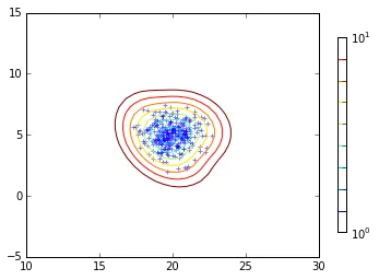
plt.scatter(sample[:, 0], sample[:, 1])

# 1. Plot the probobility density distribution
# 2. Calculate the mean square error of the fitting model

更新: 我可以通过以下方式绘制分布:
x = np.linspace(-20.0, 30.0)
y = np.linspace(-20.0, 40.0)
X, Y = np.meshgrid(x, y)
XX = np.array([X.ravel(), Y.ravel()]).T
Z = -clf.score_samples(XX)[0]
Z = Z.reshape(X.shape)

CS = plt.contour(X, Y, Z, norm=LogNorm(vmin=1.0, vmax=1000.0),
                 levels=np.logspace(0, 3, 10))
CB = plt.colorbar(CS, shrink=0.8, extend='both')

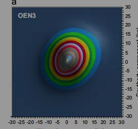
但这不是很奇怪吗?有更好的方法吗?我能画出像这样的东西吗? enter image description here

为什么您认为结果不正确?请参见下面修改后的图表: - CT Zhu
1个回答

2

我认为如果你稍微调整一下xlim和ylim,结果会更加合理:

# plot sample scatter
plt.scatter(sample[:, 0], sample[:, 1], marker='+', alpha=0.5)

# 1. Plot the probobility density distribution
# 2. Calculate the mean square error of the fitting model
x = np.linspace(-20.0, 30.0, 100)
y = np.linspace(-20.0, 40.0, 100)
X, Y = np.meshgrid(x, y)
XX = np.array([X.ravel(), Y.ravel()]).T
Z = -clf.score_samples(XX)[0]
Z = Z.reshape(X.shape)

CS = plt.contour(X, Y, Z, norm=LogNorm(vmin=1.0, vmax=10.0),
                 levels=np.logspace(0, 1, 10))
CB = plt.colorbar(CS, shrink=0.8, extend='both')
plt.xlim((10,30))
plt.ylim((-5, 15))

enter image description here


我是说我能否摆脱对 X 和 Y 的设置,让 matplotlib 处理它?用这种方式绘图真的很累人。 - ZK Zhao
有没有类似于 plt.density(Z) 的东西?我只想画一个简单的图。 - ZK Zhao
我猜 plt.imshow(Z, cmap=cm.gray) 可以实现这个功能? 但是你必须对齐坐标轴(x,y将超出范围)。 可能最好还是使用 contour - CT Zhu
这是一种期望最大化拟合方法,拟合优度通过AICBIC、对数似然等指标来衡量。可以使用clf.bic(sample)clf.aic(sample)来访问它们。 - CT Zhu
我可能没有表达清楚。我的意思不是拟合方法的问题。只是有太多代码来绘制概率密度函数。我想知道如何轻松地绘制密度函数。 - ZK Zhao
@ cqcn1991,使用matplotlib通常需要编写那么多代码(我认为10行并不算太多)。为什么不只是创建一个函数(def density(...): ...),将所有代码放在其中?这样做有什么问题吗? - Imanol Luengo

网页内容由stack overflow 提供, 点击上面的
可以查看英文原文,
原文链接