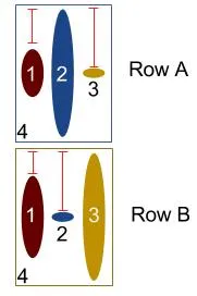
我有一个外部DIV(4)和三个内部DIV(1-3)。我不关心宽度,只关心高度和垂直居中。我希望外部DIV(4)的高度与最高的内部DIV(A行中的2)相同。更重要的是,我希望其他内部DIV(A行中的1和3)在垂直方向上居中(相对于具有与最高内部DIV相同高度的外部DIV的高度)。
DIV的内容是动态的(请比较A行和B行),因此我不知道哪个内部DIV会是最高的。到目前为止,我使用了一个jQuery解决方案来设置较小DIV的margin-top(红色标记),但现在我想用纯CSS来解决它。
我有一个外部DIV(4)和三个内部DIV(1-3)。我不关心宽度,只关心高度和垂直居中。我希望外部DIV(4)的高度与最高的内部DIV(A行中的2)相同。更重要的是,我希望其他内部DIV(A行中的1和3)在垂直方向上居中(相对于具有与最高内部DIV相同高度的外部DIV的高度)。
DIV的内容是动态的(请比较A行和B行),因此我不知道哪个内部DIV会是最高的。到目前为止,我使用了一个jQuery解决方案来设置较小DIV的margin-top(红色标记),但现在我想用纯CSS来解决它。
使用 flexbox 很容易实现 - 属性 align-items: center 可以产生期望的结果 - 请参见以下演示:
.wrapper {
  display: flex;
  justify-content: center;
  align-items: center;
  border: 1px solid red;
}
.wrapper > div {
  border: 1px solid;
}<div class="wrapper">
<div class="one">Some text here</div>
<div class="two">
There is a lot of text here
<br>There is a lot of text here
<br>There is a lot of text here
<br>
</div>
<div class="three">Some
<br>text</div>
</div>.outera {
border:solid 1px #333;
}
.outera div {
width:20px;
border-radius: 16px;
background-color:#212121;
margin:10px;
display:inline-block;
vertical-align: middle;
}
.outera .a1 {
height:20px;
}
.outera .a2 {
height:80px;
}
.outera .a3 {
height:50px;
}<div class='outera'>
<div class='a1'></div>
<div class='a2'></div>
<div class='a3'></div>
</div>你可以使用CSS Flexbox。
在下面的代码片段中,我使用了display: inline-flex;。请看下面的片段:
body {
  padding: 20px;
}

.outer {
  display: inline-flex;
  align-items: center;
  justify-content: center;
  border: 1px solid #000;
}

.inner {}

.a .element {
  width: 20px;
  height: 20px;
  border-radius: 50%;
  background: red;
}

.b .element {
  width: 20px;
  height: 50px;
  border-radius: 50%;
  background: green;
}

.c .element {
  width: 20px;
  height: 30px;
  border-radius: 50%;
  background: blue;
}<div class="outer">
<div class="inner a">
<div class="element"></div>
</div>
<div class="inner b">
<div class="element"></div>
</div>
<div class="inner c">
<div class="element"></div>
</div>
</div>希望这能帮到你!