我有一个页面区域,分为两部分。左侧是行容器中的内容,而另一半是超出容器范围的图像。该区域具有渐变背景,帮助产生笔记本电脑放在悬崖上的效果。以下是我要完成的屏幕截图:
 ( https://monosnap.com/file/fX2jGJ9HcEuw6xsSFK8TzbdO023RMd )
目标:
- 使图像占据50%的视窗并触及屏幕右侧。内容必须保留在内容容器(行)中。
- 渐变应与屏幕截图中所示位置保持一致。
- 当缩放时,该区域的高度可以相应调整。
HTML:
<section class="full-width snocruapp-offtheslopes tgs-section-titles half-and-half-section hide-for-small-only">
<div class="row">
<div class="large-6 medium-6 columns">
<div class="copy--with-image copy--align-left">
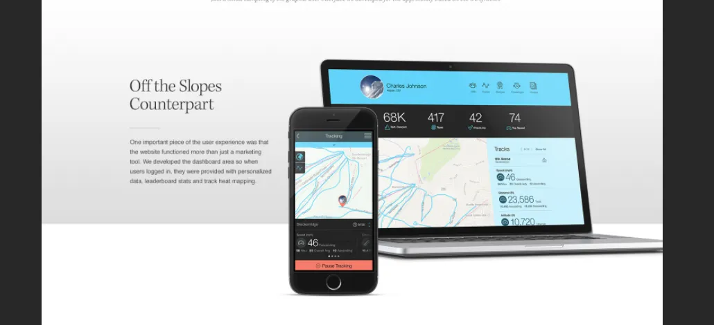
<div class="tgs-section-titles"><h3>Off the Slopes Counterpart</h3>
<hr>
<p>One important piece of the user experience was that the website functioned more than just a marketing tool. We developed the dashboard area so when users logged in, they were provided with personalized data, leaderboard stats and track heat mapping.</p>
</div>
</div>
</div><!--end large 6 right -->
<div class="large-6 medium-6 columns"></div>
<div class="image--align-to-window image--align-right">
<picture>
<source srcset="http://sandbox.techgrayscale.com/wp-content/uploads/2016/03/slopes-image2.png" media="(min-width: 1024px)">
<img srcset="http://sandbox.techgrayscale.com/wp-content/uploads/2016/03/sno_mbl_counterpart_nograd.png" alt="Half Image">
</picture>
</div>
</div><!--end row -->
</section>
我创建了一个使用Foundation网格的内容,并使内容保持相应位置不变。
接下来,我创建了一个图像div并绝对定位图像以覆盖网格的另一半。
CSS:
* {
  margin: 0;
  padding:0;
}

section {
    display: block;
    overflow: hidden;
}

.full-width {
    width: 100%;
    margin-left: auto;
    margin-right: auto;
    max-width: initial;
}

.half-and-half-section {
    position: relative;
    margin: 50px 0;
}

.half-and-half-section .image--align-to-window {
    position: absolute;
    top: 0;
}

.half-and-half-section .image--align-right {
    right: 0;
    width: 50%;
}

.snocruapp-offtheslopes {
    background: #ffffff;
    background: linear-gradient(to bottom, #ffffff 0%, #e2e2e2 75%, #ffffff 75%);
    filter: progid:DXImageTransform.Microsoft.gradient( startColorstr='#ffffff', endColorstr='#ffffff',GradientType=0 );
}
我将CSS渐变应用于该部分。图像是绝对定位的,因此不会成为该容器的一部分,并且可以延伸到视口的右侧。
我遇到了一些问题。
1.除非我向该部分添加填充,否则图像会被截断。
2.我不知道如何使渐变停留在同一位置(与图像成比例地调整大小),随着视口的重新调整大小。
我真的不知道如何在屏幕截图中获得功能和设计。