假设我有一些圆:
<circle class="first"> </circle>
<circle class="second"> </circle>
以下是相关的CSS代码:
circle {
  border-radius: 50%;
  width: 100px;
  height: 100px;
  background: #000;
}
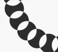
我该如何在重叠时获得以下效果?
最好使用CSS或canvas元素实现。
假设我有一些圆:
<circle class="first"> </circle>
<circle class="second"> </circle>
circle {
border-radius: 50%;
width: 100px;
height: 100px;
background: #000;
}
一种可能的方法是使用mix-blend-mode属性,目前大部分浏览器似乎不支持此属性。
以下是一个在Chrome和Firefox中可行的示例(感谢@vals)
body
{
  background-color: white;
}

.circle
{
  border-radius: 100px;
  background-color: white;
  width: 100px;
  height: 100px;
  float: left;
  mix-blend-mode: exclusion;
}

.circle:not(:first-child)
{
  margin-left: -20px;
}<div class="circle"></div>
<div class="circle"></div>
<div class="circle"></div>
<div class="circle"></div>
<div class="circle"></div>
<div class="circle"></div>正如@vals所指出的,您需要为body(或父元素)设置background-color才能在Firefox中正常工作。
这里有两个关于此主题的好参考资料:
使用单个路径在<svg>中可以轻松实现该效果。
如果形状重叠,则fill-rule将是您要查找的内容,那么您获得的效果就是每个形状颜色相互重叠。
<svg width="500px" height="200px" viewBox="0 0 100 500">
  <path fill-rule="evenodd" d="
        M 50, 100
        m -75, 0
        a 75,75 0 1,0 150,0
        a 75,75 0 1,0 -150,0
        Z
        M 150, 100
        m -75, 0
        a 75,75 0 1,0 150,0
        a 75,75 0 1,0 -150,0
        Z
        M 250, 100
        m -75, 0
        a 75,75 0 1,0 150,0
        a 75,75 0 1,0 -150,0
        Z
        M 350, 100
        m -75, 0
        a 75,75 0 1,0 150,0
        a 75,75 0 1,0 -150,0
        Z
        M 450, 100
        m -75, 0
        a 75,75 0 1,0 150,0
        a 75,75 0 1,0 -150,0
        Z" />
</svg>