更改日历项的前景色

9
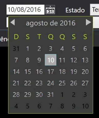
我正在自定义WPF中的日历控件,我可以调整背景颜色、标题前景颜色等。但是我找不到如何编辑1-31天日历项目的外观。如下截图所示,数字全部为深灰色,几乎无法阅读。我还想去掉鼠标悬停时出现的蓝色覆盖层。
代码:
<Window x:Class="WPFDatePickerSample.Window2"
    xmlns="http://schemas.microsoft.com/winfx/2006/xaml/presentation"
    xmlns:x="http://schemas.microsoft.com/winfx/2006/xaml"
    Title="Window2" Height="500" Width="500"
    Background="#2F2F2F">

<Window.Resources>
    <Style TargetType="{x:Type CalendarItem}">
        <Setter Property="Margin" Value="50"/>

        <Setter Property="Template">
            <Setter.Value>
                <ControlTemplate TargetType="{x:Type CalendarItem}">
                    <ControlTemplate.Resources>
                        <DataTemplate x:Key="{x:Static CalendarItem.DayTitleTemplateResourceKey}">
                            <TextBlock Foreground="#FFA9C822" FontWeight="Normal" FontSize="12" HorizontalAlignment="Center" Margin="0,5,0,5" Text="{Binding}" VerticalAlignment="Center"/>
                        </DataTemplate>
                    </ControlTemplate.Resources>

                    <Grid x:Name="PART_Root">
                        <Grid.Resources>
                            <SolidColorBrush x:Key="DisabledColor" Color="#A5FFFFFF"/>
                        </Grid.Resources>

                        <VisualStateManager.VisualStateGroups>
                            <VisualStateGroup x:Name="CommonStates">
                                <VisualState x:Name="Normal"/>
                                <VisualState x:Name="Disabled">
                                    <Storyboard>
                                        <DoubleAnimation Duration="0" To="1" Storyboard.TargetProperty="Opacity" Storyboard.TargetName="PART_DisabledVisual"/>
                                    </Storyboard>
                                </VisualState>
                            </VisualStateGroup>
                        </VisualStateManager.VisualStateGroups>

                        <Border BorderBrush="{TemplateBinding BorderBrush}" BorderThickness="{TemplateBinding BorderThickness}" Background="{TemplateBinding Background}" CornerRadius="1">
                            <Border BorderBrush="#FFFFFFFF" BorderThickness="0" CornerRadius="0">
                                <Grid>
                                    <Grid.Resources>
                                        <ControlTemplate x:Key="PreviousButtonTemplate" TargetType="{x:Type Button}">
                                            <Grid Cursor="Hand">
                                                <VisualStateManager.VisualStateGroups>
                                                    <VisualStateGroup x:Name="CommonStates">
                                                        <VisualState x:Name="Normal"/>
                                                        <VisualState x:Name="MouseOver">
                                                            <Storyboard>
                                                                <ColorAnimation Duration="0" To="#FFA9C822" Storyboard.TargetProperty="(Shape.Fill).(SolidColorBrush.Color)" Storyboard.TargetName="path"/>
                                                            </Storyboard>
                                                        </VisualState>
                                                        <VisualState x:Name="Disabled">
                                                            <Storyboard>
                                                                <DoubleAnimation Duration="0" To=".5" Storyboard.TargetProperty="(Shape.Fill).(Brush.Opacity)" Storyboard.TargetName="path"/>
                                                            </Storyboard>
                                                        </VisualState>
                                                    </VisualStateGroup>
                                                </VisualStateManager.VisualStateGroups>

                                                <Rectangle Fill="Transparent" Opacity="1" Stretch="Fill"/>

                                                <Grid>
                                                    <Path x:Name="path" Data="M288.75,232.25 L288.75,240.625 L283,236.625 z" Fill="Silver" HorizontalAlignment="Left" Height="10" Margin="5,-6,0,0" Stretch="Fill" VerticalAlignment="Center" Width="6"/>
                                                </Grid>
                                            </Grid>
                                        </ControlTemplate>

                                        <ControlTemplate x:Key="NextButtonTemplate" TargetType="{x:Type Button}">
                                            <Grid Cursor="Hand">
                                                <VisualStateManager.VisualStateGroups>
                                                    <VisualStateGroup x:Name="CommonStates">
                                                        <VisualState x:Name="Normal"/>
                                                        <VisualState x:Name="MouseOver">
                                                            <Storyboard>
                                                                <ColorAnimation Duration="0" To="#FFA9C822" Storyboard.TargetProperty="(Shape.Fill).(SolidColorBrush.Color)" Storyboard.TargetName="path"/>
                                                            </Storyboard>
                                                        </VisualState>

                                                        <VisualState x:Name="Disabled">
                                                            <Storyboard>
                                                                <DoubleAnimation Duration="0" To=".5" Storyboard.TargetProperty="(Shape.Fill).(Brush.Opacity)" Storyboard.TargetName="path"/>
                                                            </Storyboard>
                                                        </VisualState>
                                                    </VisualStateGroup>
                                                </VisualStateManager.VisualStateGroups>

                                                <Rectangle Fill="Transparent" Opacity="1" Stretch="Fill"/>

                                                <Grid>
                                                    <Path x:Name="path" Data="M282.875,231.875 L282.875,240.375 L288.625,236 z" Fill="Silver" HorizontalAlignment="Right" Height="10" Margin="0,-6,5,0" Stretch="Fill" VerticalAlignment="Center" Width="6"/>
                                                </Grid>
                                            </Grid>
                                        </ControlTemplate>

                                        <ControlTemplate x:Key="HeaderButtonTemplate" TargetType="{x:Type Button}">
                                            <Grid Cursor="Hand">
                                                <VisualStateManager.VisualStateGroups>
                                                    <VisualStateGroup x:Name="CommonStates">
                                                        <VisualState x:Name="Normal"/>
                                                        <VisualState x:Name="MouseOver">
                                                            <Storyboard>
                                                                <DoubleAnimation Duration="0" To=".7" Storyboard.TargetProperty="Opacity" Storyboard.TargetName="buttonContent"/>
                                                            </Storyboard>
                                                        </VisualState>

                                                        <VisualState x:Name="Disabled">
                                                            <Storyboard>
                                                                <DoubleAnimation Duration="0" To=".5" Storyboard.TargetProperty="Opacity" Storyboard.TargetName="buttonContent"/>
                                                            </Storyboard>
                                                        </VisualState>
                                                    </VisualStateGroup>
                                                </VisualStateManager.VisualStateGroups>

                                                <ContentPresenter x:Name="buttonContent" ContentTemplate="{TemplateBinding ContentTemplate}" Content="{TemplateBinding Content}" TextElement.Foreground="Silver" TextElement.FontFamily="Segoe UI" HorizontalAlignment="{TemplateBinding HorizontalContentAlignment}" Margin="1,3,1,9" VerticalAlignment="{TemplateBinding VerticalContentAlignment}"/>
                                            </Grid>
                                        </ControlTemplate>
                                    </Grid.Resources>

                                    <Grid.ColumnDefinitions>
                                        <ColumnDefinition Width="Auto"/>
                                        <ColumnDefinition Width="Auto"/>
                                        <ColumnDefinition Width="Auto"/>
                                    </Grid.ColumnDefinitions>

                                    <Grid.RowDefinitions>
                                        <RowDefinition Height="Auto"/>
                                        <RowDefinition Height="*"/>
                                    </Grid.RowDefinitions>

                                    <Grid Grid.Row="0" Grid.ColumnSpan="4" Background="#3C3C3C" HorizontalAlignment="Stretch">
                                        <Button x:Name="PART_PreviousButton" Grid.Column="0" Focusable="False" HorizontalAlignment="Left" Height="20" Grid.Row="0" Template="{StaticResource PreviousButtonTemplate}" Width="28"/>
                                        <Button x:Name="PART_HeaderButton" Grid.Column="1" FontWeight="Normal" Focusable="False" FontSize="13" HorizontalAlignment="Center" Grid.Row="0" Template="{StaticResource HeaderButtonTemplate}" VerticalAlignment="Center" />
                                        <Button x:Name="PART_NextButton" Grid.Column="2" Focusable="False" HorizontalAlignment="Right" Height="20" Grid.Row="0" Template="{StaticResource NextButtonTemplate}" Width="28"/>
                                    </Grid>
                                    <Grid x:Name="PART_MonthView" Grid.ColumnSpan="3" HorizontalAlignment="Center" Margin="6,-1,6,6" Grid.Row="1" Visibility="Visible">
                                        <Grid.ColumnDefinitions>
                                            <ColumnDefinition Width="Auto"/>
                                            <ColumnDefinition Width="Auto"/>
                                            <ColumnDefinition Width="Auto"/>
                                            <ColumnDefinition Width="Auto"/>
                                            <ColumnDefinition Width="Auto"/>
                                            <ColumnDefinition Width="Auto"/>
                                            <ColumnDefinition Width="Auto"/>
                                        </Grid.ColumnDefinitions>

                                        <Grid.RowDefinitions>
                                            <RowDefinition Height="Auto"/>
                                            <RowDefinition Height="Auto"/>
                                            <RowDefinition Height="Auto"/>
                                            <RowDefinition Height="Auto"/>
                                            <RowDefinition Height="Auto"/>
                                            <RowDefinition Height="Auto"/>
                                            <RowDefinition Height="Auto"/>
                                        </Grid.RowDefinitions>
                                    </Grid>

                                    <Grid x:Name="PART_YearView" Grid.ColumnSpan="3" HorizontalAlignment="Center" Margin="6,-3,7,6" Grid.Row="1" Visibility="Hidden">
                                        <Grid.ColumnDefinitions>
                                            <ColumnDefinition Width="Auto"/>
                                            <ColumnDefinition Width="Auto"/>
                                            <ColumnDefinition Width="Auto"/>
                                            <ColumnDefinition Width="Auto"/>
                                        </Grid.ColumnDefinitions>

                                        <Grid.RowDefinitions>
                                            <RowDefinition Height="Auto"/>
                                            <RowDefinition Height="Auto"/>
                                            <RowDefinition Height="Auto"/>
                                        </Grid.RowDefinitions>
                                    </Grid>
                                </Grid>
                            </Border>
                        </Border>

                        <Rectangle x:Name="PART_DisabledVisual" Fill="{StaticResource DisabledColor}" Opacity="0" RadiusY="2" RadiusX="2" Stretch="Fill" Stroke="{StaticResource DisabledColor}" StrokeThickness="1" Visibility="Collapsed"/>
                    </Grid>

                    <ControlTemplate.Triggers>
                        <Trigger Property="IsEnabled" Value="False">
                            <Setter Property="Visibility" TargetName="PART_DisabledVisual" Value="Visible" />
                        </Trigger>

                        <DataTrigger Binding="{Binding DisplayMode, RelativeSource={RelativeSource FindAncestor, AncestorType={x:Type Calendar}}}" Value="Year">
                            <Setter Property="Visibility" TargetName="PART_MonthView" Value="Hidden" />
                            <Setter Property="Visibility" TargetName="PART_YearView" Value="Visible" />
                        </DataTrigger>

                        <DataTrigger Binding="{Binding DisplayMode, RelativeSource={RelativeSource FindAncestor, AncestorType={x:Type Calendar}}}" Value="Decade">
                            <Setter Property="Visibility" TargetName="PART_MonthView" Value="Hidden" />
                            <Setter Property="Visibility" TargetName="PART_YearView" Value="Visible" />
                        </DataTrigger>
                    </ControlTemplate.Triggers>
                </ControlTemplate>
            </Setter.Value>
        </Setter>
    </Style>

    <Style TargetType="{x:Type Calendar}">
        <Setter Property="Background" Value="#3C3C3C"/>

        <Setter Property="SnapsToDevicePixels" Value="True" />
        <Setter Property="BorderBrush" Value="Transparent" />
        <Setter Property="BorderThickness" Value="1" />

        <Setter Property="Template">
            <Setter.Value>
                <ControlTemplate TargetType="{x:Type Calendar}">
                    <StackPanel x:Name="PART_Root" HorizontalAlignment="Center">
                        <CalendarItem x:Name="PART_CalendarItem" BorderBrush="{TemplateBinding BorderBrush}" BorderThickness="{TemplateBinding BorderThickness}" Background="{TemplateBinding Background}" />
                    </StackPanel>
                </ControlTemplate>
            </Setter.Value>
        </Setter>
    </Style>
</Window.Resources>

<Grid>
    <Calendar Width="400" Height="400"></Calendar>
</Grid>

5个回答

8
虽然这个问题已经存在几年了,但我现在只需要为一个触摸屏应用程序设计一个日历。因此,我查看了您的问题和Sheridan的答案,并在查阅MSDN CalendarDayButtonStyle后完成了我的工作。因此,对于任何感兴趣的人,这是基于您的触摸日历的结果。

enter image description here

这是样式:

<Style x:Key="CalendarDayButtonStyle" TargetType="{x:Type CalendarDayButton}">
    <!--<Setter Property="Background" Value="#FFBADDE9" />-->

    <Setter Property="FontSize" Value="20" />
    <Setter Property="HorizontalContentAlignment" Value="Center" />
    <Setter Property="VerticalContentAlignment" Value="Center" />
    <Setter Property="MinWidth" Value="35" />
    <Setter Property="MinHeight" Value="35" />
    <Setter Property="Template">
        <Setter.Value>
            <ControlTemplate TargetType="CalendarDayButton">
                <Grid>
                    <VisualStateManager.VisualStateGroups>
                        <VisualStateGroup x:Name="CommonStates">
                            <VisualStateGroup.Transitions>
                                <VisualTransition GeneratedDuration="0:0:0.1" />
                            </VisualStateGroup.Transitions>
                            <VisualState x:Name="Normal" />
                            <VisualState x:Name="MouseOver">
                                <Storyboard>
                                    <DoubleAnimation Storyboard.TargetName="Background" Storyboard.TargetProperty="Opacity" To=".5" Duration="0" />
                                </Storyboard>
                            </VisualState>
                            <VisualState x:Name="Pressed">
                                <Storyboard>
                                    <DoubleAnimation Storyboard.TargetName="Background" Storyboard.TargetProperty="Opacity" To=".5" Duration="0" />
                                </Storyboard>
                            </VisualState>
                            <VisualState x:Name="Disabled">
                                <Storyboard>
                                    <DoubleAnimation Storyboard.TargetName="Background" Storyboard.TargetProperty="Opacity" To="0" Duration="0" />
                                    <DoubleAnimation Storyboard.TargetName="Content" Storyboard.TargetProperty="Opacity" To=".35" Duration="0" />
                                </Storyboard>
                            </VisualState>
                        </VisualStateGroup>
                        <VisualStateGroup x:Name="SelectionStates">
                            <VisualStateGroup.Transitions>
                                <VisualTransition GeneratedDuration="0" />
                            </VisualStateGroup.Transitions>
                            <VisualState x:Name="Unselected" />
                            <VisualState x:Name="Selected">
                                <Storyboard>
                                    <DoubleAnimation Storyboard.TargetName="SelectedBackground" Storyboard.TargetProperty="Opacity" To=".75" Duration="0" />
                                </Storyboard>
                            </VisualState>
                        </VisualStateGroup>
                        <VisualStateGroup x:Name="CalendarButtonFocusStates">
                            <VisualStateGroup.Transitions>
                                <VisualTransition GeneratedDuration="0" />
                            </VisualStateGroup.Transitions>
                            <VisualState x:Name="CalendarButtonFocused">
                                <Storyboard>
                                    <ObjectAnimationUsingKeyFrames Storyboard.TargetName="FocusVisual" Storyboard.TargetProperty="Visibility" Duration="0">
                                        <DiscreteObjectKeyFrame KeyTime="0" Value="{x:Static Visibility.Visible}" />
                                    </ObjectAnimationUsingKeyFrames>
                                </Storyboard>
                            </VisualState>
                            <VisualState x:Name="CalendarButtonUnfocused">
                                <Storyboard>
                                    <ObjectAnimationUsingKeyFrames Storyboard.TargetName="FocusVisual" Storyboard.TargetProperty="Visibility" Duration="0">
                                        <DiscreteObjectKeyFrame KeyTime="0" Value="{x:Static Visibility.Collapsed}" />
                                    </ObjectAnimationUsingKeyFrames>
                                </Storyboard>
                            </VisualState>
                        </VisualStateGroup>
                        <VisualStateGroup x:Name="ActiveStates">
                            <VisualStateGroup.Transitions>
                                <VisualTransition GeneratedDuration="0" />
                            </VisualStateGroup.Transitions>
                            <VisualState x:Name="Active" />
                            <VisualState x:Name="Inactive">
                                <Storyboard>
                                    <ColorAnimation Storyboard.TargetName="Content" Storyboard.TargetProperty="(ContentControl.Foreground).(GradientBrush.GradientStops)[2].(GradientStop.Color)" To="{DynamicResource DisableDay1}" Duration="0" />
                                    <ColorAnimation Storyboard.TargetName="Content" Storyboard.TargetProperty="(ContentControl.Foreground).(GradientBrush.GradientStops)[3].(GradientStop.Color)" To="{DynamicResource DisableDay2}" Duration="0" />
                                </Storyboard>
                            </VisualState>
                        </VisualStateGroup>
                        <VisualStateGroup x:Name="DayStates">
                            <VisualStateGroup.Transitions>
                                <VisualTransition GeneratedDuration="0" />
                            </VisualStateGroup.Transitions>
                            <VisualState x:Name="RegularDay"  />
                            <VisualState x:Name="Today">
                                <Storyboard>
                                    <DoubleAnimation Storyboard.TargetName="TodayBackground" Storyboard.TargetProperty="Opacity" To="1" Duration="0" />
                                    <DoubleAnimation Storyboard.TargetName="Content" Storyboard.TargetProperty="(ContentControl.Foreground).(GradientBrush.GradientStops)[1].(GradientStop.Offset)" To="1" Duration="0" />
                                    <DoubleAnimation Storyboard.TargetName="Content" Storyboard.TargetProperty="(ContentControl.Foreground).(GradientBrush.GradientStops)[2].(GradientStop.Offset)" To="1" Duration="0" />
                                </Storyboard>
                            </VisualState>
                        </VisualStateGroup>
                        <VisualStateGroup x:Name="BlackoutDayStates">
                            <VisualStateGroup.Transitions>
                                <VisualTransition GeneratedDuration="0" />
                            </VisualStateGroup.Transitions>
                            <VisualState x:Name="NormalDay" />
                            <VisualState x:Name="BlackoutDay">
                                <Storyboard>
                                    <DoubleAnimation Storyboard.TargetName="BlackoutVisual" Storyboard.TargetProperty="Opacity" To=".2" Duration="0" />
                                </Storyboard>
                            </VisualState>
                        </VisualStateGroup>
                    </VisualStateManager.VisualStateGroups>

                    <Rectangle x:Name="TodayBackground" RadiusX="1" RadiusY="1" Opacity="0" Fill="#FFAAAAAA" />
                    <Rectangle x:Name="SelectedBackground" RadiusX="1" RadiusY="1" Opacity="0" Fill="{TemplateBinding Background}" />
                    <Rectangle x:Name="Background" RadiusX="1" RadiusY="1" Opacity="0" Fill="{TemplateBinding Background}" />

                    <ContentControl x:Name="Content" IsTabStop="False" Content="{TemplateBinding Content}" ContentTemplate="{TemplateBinding ContentTemplate}" HorizontalAlignment="{TemplateBinding HorizontalContentAlignment}" VerticalAlignment="{TemplateBinding VerticalContentAlignment}" FontSize="{TemplateBinding FontSize}" Margin="5,1,5,1">
                        <ContentControl.Foreground>
                            <LinearGradientBrush>
                                <GradientStop Offset="0" Color="{DynamicResource SelectedDay1}" />
                                <GradientStop Offset="0" Color="{DynamicResource SelectedDay2}" />
                                <GradientStop Offset="0" Color="{DynamicResource NormalDay1}" />
                                <GradientStop Offset="1" Color="{DynamicResource NormalDay2}" />
                            </LinearGradientBrush>
                        </ContentControl.Foreground>
                    </ContentControl>

                    <Path x:Name="BlackoutVisual" Opacity="0" Margin="3" HorizontalAlignment="Stretch" VerticalAlignment="Stretch" RenderTransformOrigin="0.5,0.5" Fill="#FF000000" Stretch="Fill" Data="M8.1772461,11.029181 L10.433105,11.029181 L11.700684,12.801641 L12.973633,11.029181 L15.191895,11.029181 L12.844727,13.999395 L15.21875,17.060919 L12.962891,17.060919 L11.673828,15.256231 L10.352539,17.060919 L8.1396484,17.060919 L10.519043,14.042364 z" />
                    <Rectangle x:Name="FocusVisual" Visibility="Collapsed" IsHitTestVisible="false" RadiusX="1" RadiusY="1" Stroke="#FF6DBDD1" />
                </Grid>
            </ControlTemplate>
        </Setter.Value>
    </Setter>
</Style>

所以你只需要将颜色设置为资源即可:
<Color x:Key="DisableDay1">Black</Color>
<Color x:Key="DisableDay2">Black</Color>

<Color x:Key="NormalDay1">LightGray</Color>
<Color x:Key="NormalDay2">Gray</Color>

<Color x:Key="SelectedDay1">White</Color>
<Color x:Key="SelectedDay2">White</Color>

...并将样式模板添加到您的日历中:

<Style x:Key="TouchCalendarStyle" TargetType="{x:Type Calendar}">    
    <Setter Property="CalendarDayButtonStyle" Value="{DynamicResource CalendarDayButtonStyle}"/>
    ...
</Style>

所以感谢你的帮助。 :)

2
做得很好!为了一些应该是简单属性集的东西,付出了很多工作。 - Wonko the Sane
1
是的,你说得对,WPF 很强大,但肯定不会让你的工作变得容易! - Nemesis
1
日历中还有另外两个网格。那么如何更改这些网格(月份名称)的前景色? - kalsara Magamage
1
这不在CalendarDayButtonStyle中,而是在CalendarItem模板中。在这里提到了(https://msdn.microsoft.com/en-us/library/cc278077(v=vs.95).aspx),你要找的CalendarItem部件是MonthView和YearView网格。 - Nemesis

3
您可以使用CalendarDayButtonStyle属性访问日期按钮:

Resources中:

<Style x:Key="CalendarDayButtonStyle" TargetType="{x:Type CalendarDayButton}">
    <Setter Property="TextElement.FontSize" Value="20" />
</Style>

在XAML中:
<Calendar CalendarDayButtonStyle="{StaticResource CalendarDayButtonStyle}" />

我还没有尝试为它们提供新的ControlTemplate,但我猜想这是可能的。


1
在您的日历样式中添加CalendarDayButtonStyle,如下所示。
<Style TargetType="{x:Type Calendar}">
        <Setter Property="TextElement.Foreground" Value="Black"/>
        <Setter Property="Background" Value="{StaticResource DatePickerPopupBackgroundBrush}"/>
        <Setter Property="BorderBrush" Value="{DynamicResource SolidBorderBrush}"/>
        <Setter Property="BorderThickness" Value="1"/>
        <Setter Property="CalendarDayButtonStyle" Value= "{StaticResource CalendarDayButtonStyle}"/>
        <Setter Property="CalendarButtonStyle" Value= "{DynamicResource CalendarButtonStyle}"/>
        <Setter Property="Template">
            <Setter.Value>
                <ControlTemplate TargetType="{x:Type Calendar}">
                    <StackPanel x:Name="PART_Root" HorizontalAlignment="Center">
                        <CalendarItem x:Name="PART_CalendarItem" BorderBrush="{TemplateBinding BorderBrush}" BorderThickness="{TemplateBinding BorderThickness}" Background="{TemplateBinding Background}" Style="{DynamicResource CalendarItemStyle}"/>
                    </StackPanel>
                </ControlTemplate>
            </Setter.Value>
        </Setter>
    </Style>

在CalendarDayButtonStyle中,ContentPresenter默认使用Textblock样式,您需要按以下方式覆盖它:
<Style TargetType="CalendarDayButton"
       x:Key="CalendarDayButtonStyle">
        <Setter Property="MinWidth" Value="5" />
        <Setter Property="MinHeight" Value="5" />
        <Setter Property="FontSize" Value="10" />
        <Setter Property="HorizontalContentAlignment" Value="Center" />
        <Setter Property="VerticalContentAlignment" Value="Center" />
        <Setter Property="Template">
            <Setter.Value>
                <ControlTemplate TargetType="CalendarDayButton">
                    <Grid>
                        <Rectangle x:Name="TodayBackground" RadiusX="1" RadiusY="1" Opacity="0">
                            <Rectangle.Fill>
                                <SolidColorBrush Color="{DynamicResource DatePickerPopupBackground}" />
                            </Rectangle.Fill>
                        </Rectangle>
                        <Rectangle x:Name="SelectedBackground" RadiusX="1" RadiusY="1" Opacity="0">
                            <Rectangle.Fill>
                                <SolidColorBrush Color="{DynamicResource SelectedBackgroundColor}" />
                            </Rectangle.Fill>
                        </Rectangle>
                        <Border Background="{TemplateBinding Background}" BorderThickness="{TemplateBinding BorderThickness}" BorderBrush="{TemplateBinding BorderBrush}" />
                        <Rectangle x:Name="HighlightBackground" RadiusX="1" RadiusY="1" Opacity="0">
                            <Rectangle.Fill>
                                <SolidColorBrush Color="{DynamicResource ControlMouseOverColor}" />
                            </Rectangle.Fill>
                        </Rectangle>
                        <ContentPresenter x:Name="NormalText"
                            HorizontalAlignment="{TemplateBinding HorizontalContentAlignment}"
                            VerticalAlignment="{TemplateBinding VerticalContentAlignment}"
                            Margin="5,1,5,1" >
                            <ContentPresenter.Resources>
                                <Style TargetType="{x:Type TextBlock}">
                                    <Setter Property="TextWrapping" Value="Wrap"/>
                                    <Setter Property="Foreground" Value="Black"/>
                                </Style>
                            </ContentPresenter.Resources>
                        </ContentPresenter>
                        <Path x:Name="Blackout" Opacity="0" Margin="3" HorizontalAlignment="Stretch" VerticalAlignment="Stretch" RenderTransformOrigin="0.5,0.5"  Fill="#FF000000" Stretch="Fill"
                Data="M8.1772461,11.029181 L10.433105,
                  11.029181 L11.700684,12.801641 L12.973633,
                  11.029181 L15.191895,11.029181 L12.844727,
                  13.999395 L15.21875,17.060919 L12.962891,
                  17.060919 L11.673828,15.256231 L10.352539,
                  17.060919 L8.1396484,17.060919 L10.519043,
                  14.042364 z" />
                        <Rectangle x:Name="DayButtonFocusVisual" Visibility="Collapsed" IsHitTestVisible="false" RadiusX="1" RadiusY="1">
                            <Rectangle.Stroke>
                                <SolidColorBrush Color="{DynamicResource SelectedBackgroundColor}" />
                            </Rectangle.Stroke>
                        </Rectangle>
                    </Grid>
                </ControlTemplate>
            </Setter.Value>
        </Setter>
        <Style.Triggers>
            <Trigger Property="IsMouseOver" Value="True">
                <Setter Property="Background" Value="{StaticResource ActiveButtonBrush}" />
                <Setter Property="TextBlock.Foreground" Value="{StaticResource TextBrush}" />
                <Setter Property="Opacity" Value="0.5"/>
            </Trigger>
            <Trigger Property="IsSelected" Value="True">
                <Setter Property="Background" Value="{StaticResource ActiveButtonBrush}" />
                <Setter Property="TextBlock.Foreground" Value="{StaticResource TextBrush}" />
            </Trigger>
        </Style.Triggers>
    </Style>

1

要为CalendarDayButton设置样式,您可以使用VisualStateManager,如@Nemesis的答案所示,但使用VisualStateManager会显得笨拙。对于最近应用程序中的简单日历样式,我使用了Trigger而不是VisualStateManager

<Style TargetType="CalendarDayButton" x:Key="CalendarDayButtonStyle">
    <Setter Property="Template">
        <Setter.Value>
            <ControlTemplate TargetType="CalendarDayButton">
                <Border x:Name="day" CornerRadius="5" Width="20" Height="20">
                    <ContentPresenter x:Name="presenter" 
                                    HorizontalAlignment="Center"
                                    VerticalAlignment="Center"
                                    TextElement.FontSize="12"/>
                </Border>
                <ControlTemplate.Triggers>
                    <Trigger Property="IsMouseOver" Value="True">
                        <Setter TargetName="day" Property="Background" Value="LightBlue"/>
                    </Trigger>
                    <Trigger Property="IsToday" Value="True">
                        <Setter TargetName="day" Property="Background" Value="Bisque"/>
                    </Trigger>
                    <Trigger Property="IsInactive" Value="True">
                        <Setter TargetName="presenter" Property="TextElement.Foreground" Value="LightGray"/>
                        <Setter TargetName="presenter" Property="TextElement.FontStyle" Value="Italic"/>
                    </Trigger>
                    <MultiTrigger>
                        <MultiTrigger.Conditions>
                            <Condition Property="IsMouseOver" Value="True"/>
                            <Condition Property="IsInactive" Value="True"/>
                        </MultiTrigger.Conditions>
                        <Setter TargetName="presenter" Property="TextElement.Foreground" Value="Black"/>
                    </MultiTrigger>
                </ControlTemplate.Triggers>
            </ControlTemplate>
        </Setter.Value>
    </Setter>
</Style>

0
尝试使用DependencyProperty本身进行设置:TextElement.Foreground。在日历的父级中尝试设置它,或者在日历本身中尝试设置它。尝试类似于这样的一些东西:
<namespace:Calendar TextElement.Foreground="White" .../>

这应该以层次结构的方式更改日历内所有文本元素的前景。希望这可以帮助...


不错的尝试,但是没有任何效果。 - Robby Smet
可能是因为该属性被日历控件的可视子元素设置了。也许你应该使用Snoop查看应用程序,使用Snoop修改颜色,然后尝试在代码中进行更改。 - Raúl Otaño

网页内容由stack overflow 提供, 点击上面的
可以查看英文原文,
原文链接