如何将CSS模糊滤镜应用于背景(非图像)

3
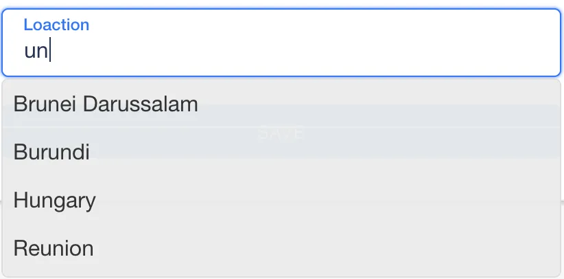
我得到了一个带有几乎纯色背景的自动完成下拉菜单。
.Suggestions {
  text-align: left;
  position: absolute;
  border: 1px solid #ddd;
  border-radius: 5px;
  background-color: rgba(235, 235, 235, 0.95);
  list-style: none;
  margin-top: -9px;
  max-height: 143px;
  overflow-y: auto;
  padding-left: 0;
  width: 406px;
}

当被激活时覆盖其他元素(按钮,输入框...)
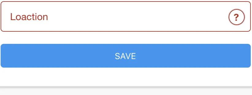
未激活 enter image description here

已激活 enter image description here

我想创造一个类似Safari下拉的效果,当点击url时,后面的一切都几乎是可见且模糊。

enter image description here

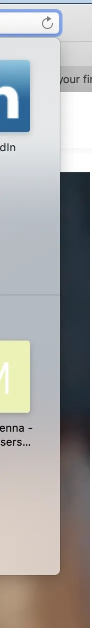
有没有办法在CSS中实现这个效果? 我知道可以创建一个图像,然后应用模糊滤镜,但是自动完成在许多具有不同背景的屏幕上使用,因此为每个屏幕创建图像将是一项巨大的任务。


请提供您尝试过的代码,并将其作为工作示例与HTML一起添加到此处,以便我们更好地帮助您。这可能有助于改善您的问题 https://stackoverflow.com/help/asking 。就目前而言,我们需要了解问题的具体情况,请注意在此处发布的示例是通用的还是特定的,并指出哪些部分会发生变化,以便我们能够给出一个很好的答案。 - Mark Schultheiss
嗨,马克。我刚刚编辑了我的问题,我真的不知道如何让我的问题更清晰...我认为这个问题非常直接了当。如果有答案的话可能会有点棘手。 - user6935527
2个回答

1

  function myFunction() {
    var Textfield  = document.getElementById("Textfield");
   
    if (Textfield.value == "")
      document.getElementById("back_div").classList.remove("blur");
    else
      document.getElementById("back_div").classList.add("blur");

  }
 .blur {
      /* Add the blur effect */
      filter: blur(2.5px);
      -webkit-filter: blur(2.5px);
    }
  <input id="Textfield" onkeyup="myFunction()" type="text">
  <div id="back_div">test text</div>


嗨,谢谢回复,但我需要模糊容器后面的所有内容,而不是实际的容器。我刚刚编辑了我的问题,现在可能更清楚了。 - user6935527
好的,我编辑了我的代码。当您在文本字段中输入文本时,会向一个 div 添加模糊类以进行模糊处理,您可以为您的背景做类似的操作!希望它对您有用,对我的糟糕英语感到抱歉!如果您有任何问题,请问我。 - Kirito
谢谢。其实我已经尝试过这种方法了,但是它有一些缺点。容器可能只覆盖元素的一半或整个元素,这取决于建议的数量,而且我必须把模糊效果添加到所有可能被覆盖的地方。我想我只能不用模糊效果了,因为我认为没有其他好的解决方案,所以你对这个问题的答案是正确的。无论如何,感谢你的回答。 - user6935527
你能分享一下你的HTML吗?我觉得我可以帮忙。 - Kirito
抱歉,我现在无法完成这项工作... 这项工作仍在进行中,但我非常感谢您的努力。 - user6935527

0

这个问题涉及到模糊你能模糊div后面的内容吗?。同时也有透明度,下面是一些丑陋的东西来演示。

这个问题有点难回答,因为它在某种程度上取决于你的标记 - 纯CSS与一些JavaScript在某些情况下非常不同。以下是一些方法。

.my-select {
  -webkit-appearance: none;
  -moz-appearance: none;
  appearance: none;
  padding: .4em;
  background: rgba(235, 235, 235, 0.8);
  border: none;
  border-radius: 0.5em;
  padding: 1em 2em 1em 1em;
  font-size: 1em;
}


/* the triagle arrow */

.select-container {
  position: relative;
  display: inline;
}


/* the triagle arrow */

.select-container:after {
  content: "";
  width: 0;
  height: 0;
  position: absolute;
  pointer-events: none;
}


/* the triagle arrow */

.select-container:after {
  border-left: 5px solid transparent;
  border-right: 5px solid transparent;
  top: .3em;
  right: .75em;
  border-top: 8px solid black;
  opacity: 0.5;
}

.my-select::-ms-expand {
  display: none;
}

.my-select:focus {
  outline: none;
  border-radius: 0.5em;
}

select.my-select * {
  background: rgba(235, 235, 235, 0.8);
  opacity: 0.8;
  color: lightorange;
}

select.my-select * {
  background-color: #bbeeee;
  color: #226666;
  opacity: 8;
}

select.my-select *:focus {
  background: rgba(235, 135, 100, 0.5);
  opacity: 0.8;
}

.list-container>.my-list:hover {
  opacity: 0.6;
}

.list-container .my-list li:hover {
  color: lime;
  );
}

.something {
  font-size: 2em;
  position: relative;
  top: -0.7em;
  z-index: -2
}

.my-list {
  padding-top: 0.4em;
  background: rgba(240, 240, 200, 0.9);
  border: none;
  border-radius: 0.5em;
  padding: 1em 1.5em 1em 1em;
  font-size: 1.4em;
  border: solid 0.25px green;
}

.my-list li {
  color: #227777;
  list-style-type: square;
}

.other {
  color: red;
  font-size: 2em;
  background-color: lightblue;
  position: relative;
  top: -2.5em;
  left: 1px;
  height: 3em;
  z-index: -1;
}

.test-backdrop-container {
  height: 10em;
  border: 1px dotted red;
  font-size: 2em;
  position: relative;
}

.test-backdrop {
  position: relative;
  size: 1.5em;
  top: 0.75em;
  left: 0.75em;
  border: solid blue 1px;
  background-color: #dddddd;
}

.test-backdrop {
  -webkit-backdrop-filter: blur(10px);
  opacity: 0.8;
}
<div class="select-container">
  <select class="my-select">
    <option>one wider text</option>
    <option>two</option>
    <option>eagle</option>
    <option>canary</option>
    <option>crow</option>
    <option>emu</option>
  </select>
</div>
<div class="something">something here</div>
<div class="list-container">
  <ul class="my-list">
    <li>one wider text</li>
    <li>two</li>
    <li>eagle</li>
    <li>canary</li>
    <li>crow</li>
    <li>emu</li>
  </ul>
</div>
<div class="other">Tester out
  <input class="other-input" type="text" value="something in textbox" /> More is not more but not less
</div>
<div class="test-backdrop-container">Test Container
  <div class="test-backdrop">Test Backdrop</div>
  more text in container more test text
</div>


嗨,马克。在rgba中的不透明度和alpha是我已经尝试过的,但效果并不好。如果CSS中有类似于“容器下模糊”的功能,可以产生模糊背景的效果,那将是很好的。我希望CSS中有一些可以完成这项工作的东西...我会查看您发布的类似问题的其他答案。谢谢。 - user6935527

网页内容由stack overflow 提供, 点击上面的
可以查看英文原文,
原文链接