如何在手机应用程序中删除额外的空格?

5

在此输入图片描述

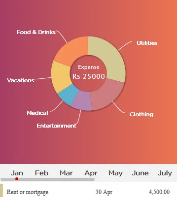
我正在使用Highchart框架开发移动应用程序,并已经使用Highchart、HTML和CSS制作了一个应用程序。上面是来自应用程序的屏幕截图。

我想要去除图表和表格之间的空白。

这是图表的代码:

$(function () {
  $('#statement-graph').highcharts({
    chart: {
      plotBackgroundColor: null,
      plotBorderWidth: 0,
      plotShadow: true,
      backgroundColor: 'transparent',
      borderWidth: 0
    },
    title: {
      text: 'Expense',
      align: 'center',
      verticalAlign: 'middle',
      font: 'gothamrnd-light',
      y: -10,
      x : 1,
      style : {
        color: '#fff',
        fontSize: '0.9em'
      },
    },
    header :{

    },
    credits: {
      enabled: false
    },
    subtitle: {
      text: 'Rs 25000',
      align: 'center',
      verticalAlign: 'middle',
      y: 10,
      x : 1,
      style : {
        color: '#fff',
        fontSize: '1.2em'
      },
    },
    exporting: { enabled: false },
    tooltip: {
      pointFormat: '<b>{point.percentage:.1f}%</b>'
    },
    plotOptions: {
      series: {
        dataLabels: {
          enabled: true,
          format: '<b>{point.name}</b>',
          style: {
            color: 'white',
            textShadow: '0px 0px 0px white',
            fontWeight: '200',
            font: '13px gothamrnd-light'
          },
          connectorColor: 'white',
        }
      },
      pie: {
        dataLabels: {
          enabled: false
        },
        shadow: true,
        center: ['50%', '50%'],
        borderWidth: 0 // < set this option
      }
    },

    series: [{
      type: 'pie',
      name: '',
      innerSize: '50%',
      showInLegend: false,
      data: [
        {
          name: 'Utilities',
          y: 45, 
          color : "#D2C993"
        },
        {
          name: 'Clothing',
          y: 30,
          color : "#CD7D80"
        },
        {
          name: 'Entertainment',
          y: 15,
          color : "#B486B1"
        },
        {
          name: 'Medical',
          y: 12,
          color : "#5CB1CE"
        },
        {
          name: 'Vacations',
          y: 23,
          color : "#F2C56A"
        },
        {
          name: 'Food & Drinks',
          y: 30,
          color : "#F78E58"
        }
      ]
    }]
  });
});

以下是Highchart的HTML代码:

<div id="statement-graph" style="
    height: 60vh;
    margin: 0px auto;
    width: 100%;
    float: left;
    text-align: center;
    display: table;"></div>

你的意思是减少图表和表格之间的空间,那个有颜色的部分吗? - Federico Martinez
这里需要注意的是,您不设置饼图的大小。因此,Highcharts会更改图表大小以适应绘图区域中的所有标签。如果您尝试缩短连接器长度并缩短标签,则会发现图表变大而空间减小。如果您始终知道最长标签的长度,则可以尝试查看哪种饼图大小最佳,然后根据这个来操作容器大小以减少表格和图表��间的空间。 - Rahul Sharma
@RahulSharma 好的,我会尝试一下。 - Swapnil Kadam
调整highchart的边距,使用底部和顶部的负值。类似于margin: -10px auto。请考虑Rahul所说的内容并进行相应的调整。 - Federico Martinez
1
我认为你应该能够通过使用chart.marginBottom参数以及plotOptions.pie.size(也许是pie.center)来缩小这个间隙。我已经制作了一个简单的示例,展示了如何在Highcharts网站的示例中使用它:http://jsfiddle.net/mnua1rue/。正如你所看到的,饼图和容器底部之间的间隙被缩小了。 - Grzegorz Blachliński
显示剩余3条评论
1个回答

1

我希望能够查看生成的页面源代码,这样我就可以确定元素的独立ID或类,但是这里有一个建议。在您的图表代码中,您有:

  pie: {
    dataLabels: {
      enabled: false
    },
    shadow: true,
    center: ['50%', '50%'],
    borderWidth: 0 // < set this option
  }

尝试更改
center: ['50%', '50%']

center: ['50%', '25%']

center: ['50%', '75%'],
...并在以下位置进行更改:
subtitle: {
  text: 'Rs 25000',
  align: 'center',
  verticalAlign: 'middle',
  y: 10,
  x : 1,
  style : {
    color: '#fff',
    fontSize: '1.2em'
  },
},

你可以尝试更改:

  verticalAlign: 'middle',

垂直对齐方式为: '底部',


网页内容由stack overflow 提供, 点击上面的
可以查看英文原文,
原文链接