我有一个使用chart.js的简单折线图。
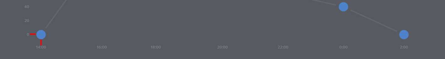
它应该看起来像这样:http://fs1.directupload.net/images/150819/ktkgs9pw.jpg(使用Photoshop,我用红线标出了填充)
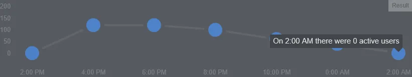
目前使用chart.js的样子:http://fs2.directupload.net/images/150819/ql5l3jez.png
正如您所见,图形点的轮廓与底部的X轴重叠,例如“下午2:00”,并与左侧的Y轴重叠,例如“0”。
我的折线图代码:
HTML:
<canvas id="server-usage"></canvas>
全局图表设置:
Chart.defaults.global = {
            // Boolean - Whether to animate the chart
            animation: false,

            // Number - Number of animation steps
            animationSteps: 60,

            // String - Animation easing effect
            // Possible effects are:
            // [easeInOutQuart, linear, easeOutBounce, easeInBack, easeInOutQuad,
            //  easeOutQuart, easeOutQuad, easeInOutBounce, easeOutSine, easeInOutCubic,
            //  easeInExpo, easeInOutBack, easeInCirc, easeInOutElastic, easeOutBack,
            //  easeInQuad, easeInOutExpo, easeInQuart, easeOutQuint, easeInOutCirc,
            //  easeInSine, easeOutExpo, easeOutCirc, easeOutCubic, easeInQuint,
            //  easeInElastic, easeInOutSine, easeInOutQuint, easeInBounce,
            //  easeOutElastic, easeInCubic]
            animationEasing: "easeInOutQuart",

            // Boolean - If we should show the scale at all
            showScale: true,

            // Boolean - If we want to override with a hard coded scale
            scaleOverride: true,

            // ** Required if scaleOverride is true **
            // Number - The number of steps in a hard coded scale
            scaleSteps: 7,
            // Number - The value jump in the hard coded scale
            scaleStepWidth: 18,
            // Number - The scale starting value
            scaleStartValue: 0,

            // String - Colour of the scale line
            scaleLineColor: "#565a60",

            // Number - Pixel width of the scale line
            scaleLineWidth: 0.1,

            // Boolean - Whether to show labels on the scale
            scaleShowLabels: true,

            // Interpolated JS string - can access value
            scaleLabel: "<%=value%>",

            // Boolean - Whether the scale should stick to integers, not floats even if drawing space is there
            scaleIntegersOnly: true,

            // Boolean - Whether the scale should start at zero, or an order of magnitude down from the lowest value
            scaleBeginAtZero: false,

            // String - Scale label font declaration for the scale label
            scaleFontFamily: "'Open Sans', sans-serif",

            // Number - Scale label font size in pixels
            scaleFontSize: 13,

            // String - Scale label font weight style
            scaleFontStyle: "500",

            // String - Scale label font colour
            scaleFontColor: "#7c8189",

            // Boolean - whether or not the chart should be responsive and resize when the browser does.
            responsive: true,

            // Boolean - whether to maintain the starting aspect ratio or not when responsive, if set to false, will take up entire container
            maintainAspectRatio: false,

            // Boolean - Determines whether to draw tooltips on the canvas or not
            showTooltips: true,

            // Function - Determines whether to execute the customTooltips function instead of drawing the built in tooltips (See [Advanced - External Tooltips](#advanced-usage-custom-tooltips))
            customTooltips: false,

            // Array - Array of string names to attach tooltip events
            tooltipEvents: ["mousemove", "touchstart", "touchmove"],

            // String - Tooltip background colour
            tooltipFillColor: "#42454a",

            // String - Tooltip label font declaration for the scale label
            tooltipFontFamily: "'Open Sans', sans-serif",

            // Number - Tooltip label font size in pixels
            tooltipFontSize: 15,

            // String - Tooltip font weight style
            tooltipFontStyle: "normal",

            // String - Tooltip label font colour
            tooltipFontColor: "#e7e7e7",

            // String - Tooltip title font declaration for the scale label
            tooltipTitleFontFamily: "'Open Sans', sans-serif",

            // Number - Tooltip title font size in pixels
            tooltipTitleFontSize: 14,

            // String - Tooltip title font weight style
            tooltipTitleFontStyle: "regular",

            // String - Tooltip title font colour
            tooltipTitleFontColor: "#fff",

            // Number - pixel width of padding around tooltip text
            tooltipYPadding: 6,

            // Number - pixel width of padding around tooltip text
            tooltipXPadding: 6,

            // Number - Size of the caret on the tooltip
            tooltipCaretSize: 8,

            // Number - Pixel radius of the tooltip border
            tooltipCornerRadius: 0,

            // Number - Pixel offset from point x to tooltip edge
            tooltipXOffset: 10,

            // String - Template string for single tooltips
            tooltipTemplate: "On <%if (label){%><%=label%> there were <%}%><%= value %> active users",

            // String - Template string for multiple tooltips
            multiTooltipTemplate: "<%= value %>",

            // Function - Will fire on animation progression.
            onAnimationProgress: function(){},

            // Function - Will fire on animation completion.
            onAnimationComplete: function(){}
}
一些图表数据:
var usageData = {
     labels : ["2:00 PM","4:00 PM","6:00 PM","8:00 PM","10:00 PM","0:00 AM","2:00 AM"],
     datasets : [
         {
               strokeColor : "#61666c",
               pointColor : "#4e82c9",
               pointStrokeColor : "#565a60",
               data : [0,120,120,100,60,40,0]
          }
     ]
}
图表选项:
var options = {

            ///Boolean - Whether grid lines are shown across the chart
            scaleShowGridLines : false,

            //String - Colour of the grid lines
            scaleGridLineColor : "rgba(0,0,0,.05)",

            //Number - Width of the grid lines
            scaleGridLineWidth : 1,

            //Boolean - Whether to show horizontal lines (except X axis)
            scaleShowHorizontalLines: true,

            //Boolean - Whether to show vertical lines (except Y axis)
            scaleShowVerticalLines: true,

            //Boolean - Whether the line is curved between points
            bezierCurve : false,

            //Number - Tension of the bezier curve between points
            bezierCurveTension : 0.4,

            //Boolean - Whether to show a dot for each point
            pointDot : true,

            //Number - Radius of each point dot in pixels
            pointDotRadius : 18,

            //Number - Pixel width of point dot stroke
            pointDotStrokeWidth : 8,

            //Number - amount extra to add to the radius to cater for hit detection outside the drawn point
            pointHitDetectionRadius : 20,

            //Boolean - Whether to show a stroke for datasets
            datasetStroke : true,

            //Number - Pixel width of dataset stroke
            datasetStrokeWidth : 4,

            //Boolean - Whether to fill the dataset with a colour
            datasetFill : false,

            //String - A legend template
            legendTemplate : "<ul class=\"<%=name.toLowerCase()%>-legend\"><% for (var i=0; i<datasets.length; i++){%><li><span style=\"background-color:<%=datasets[i].strokeColor%>\"></span><%if(datasets[i].label){%><%=datasets[i].label%><%}%></li><%}%></ul>"

};
创建图表:
var serverUsage = document.getElementById('server-usage').getContext('2d');
new Chart(serverUsage).Line(usageData, options);
我在搜索“Question-Tag chart.js”后找到了一个相似的问题,但它的效果并不太好,因为当鼠标悬停时解决方案存在缺陷,并且它不是一条线图。(Chart.JS spacing and padding)
Chart.defaults.global。您只需要覆盖您已经有的内容,例如Chart.defaults.global.scaleSteps = 7; Chart.defaults.global.animation = false;对于您的单个图表选项,您只需要在选项对象中包含要覆盖的选项-您可以省略其余部分。 - potatopeelings