Python matplotlib:连接两个子图表

4

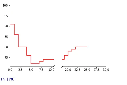
我尝试创建一个带有断开的x轴的图表。 我使用了可以在matplotlib页面上找到的示例。

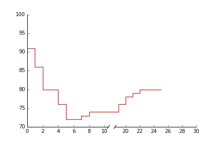
对我来说问题是:如何连接两个图表? 我需要一个闭合线条的图形(并且两个x轴应该更加接近)。

有没有办法实现这一点?

import matplotlib.pyplot as plt

#x-axis
x_axis = [0,1,2,3,4,5,6,7,8,19,20,21,22,23,24,25]

# Line 1
line = [99,91,86,80,80,76,72,72,73,74,76,78,79,80,80,80]


# create broken x-axis
f, (ax, ax2) = plt.subplots(1, 2, sharey=True)
ax.step(x_axis, line, color='red')
ax2.step(x_axis, line, color='red')

ax.set_xlim(0, 10.5)
ax2.set_xlim(18.5, 30)

ax.spines['right'].set_visible(False)
ax.spines['top'].set_visible(False)

ax2.spines['left'].set_visible(False)
ax2.spines['top'].set_visible(False)
ax2.spines['right'].set_visible(False)

ax2.tick_params(
                axis='y',
                which='both',
                left='off')

# seperators for x-axis

d = .015
kwargs = dict(transform=ax.transAxes, color='k', clip_on=False)
ax.plot((1 - d, 1 + d), (-d, +d), **kwargs) 

kwargs.update(transform=ax2.transAxes) 
ax2.plot ( (0-d ,0+d),(-d, +d ), **kwargs)

plt.show()

有没有办法只获得“一个”图表? 2个子图的当前图表(png)

我在这里定义的“connect_spines”函数可能是一个起点:https://gist.github.com/phobson/9de120cabde660ec734c - Paul H
1个回答

3
你可以在你的图形对象上使用lines。这样做的好处是,这些图形线条比轴上的线条更高级,因此无需为其绘制轴而担心。
(我从这个stackoverflow答案中得到了这个想法:ref
应用于你的代码,看起来像这样:
import matplotlib.pyplot as plt
import matplotlib as mpl

#x-axis
x_axis = [0,1,2,3,4,5,6,7,8,19,20,21,22,23,24,25]

# Line 1
line = [99,91,86,80,80,76,72,72,73,74,76,78,79,80,80,80]


# create broken x-axis
f, (ax, ax2) = plt.subplots(1, 2, sharey=True)
ax.step(x_axis, line, color='red')
ax2.step(x_axis, line, color='red')

ax.set_xlim(0, 10.5)
ax2.set_xlim(18.5, 30)

ax.spines['right'].set_visible(False)
ax.spines['top'].set_visible(False)

ax2.spines['left'].set_visible(False)
ax2.spines['top'].set_visible(False)
ax2.spines['right'].set_visible(False)

ax2.tick_params(
                axis='y',
                which='both',
                left='off')

# seperators for x-axis

d = .015
kwargs = dict(transform=ax.transAxes, color='k', clip_on=False)
ax.plot((1 - d, 1 + d), (-d, +d), **kwargs) 

kwargs.update(transform=ax2.transAxes) 
ax2.plot ( (0-d ,0+d),(-d, +d ), **kwargs)

# transFigure: used to transform the coordinates from your subplots
# to coordinates on the figure
# points are hardcoded as an example
transFigure = f.transFigure.inverted()
# last point on your left figure
coord1 = transFigure.transform(ax.transData.transform([8,74]))
# first point on your right figure
coord2 = transFigure.transform(ax2.transData.transform([19,74]))

# generate your line with the transformed coordinates
line = mpl.lines.Line2D((coord1[0],coord2[0]),(coord1[1],coord2[1]),
                       transform=f.transFigure, color='red')
# add your line to the figure
f.lines.append(line)

plt.show()

enter image description here


网页内容由stack overflow 提供, 点击上面的
可以查看英文原文,
原文链接