Chrome浏览器中背景附着(background-attachment)固定和位置固定(position fixed)元素的问题

35

我遇到了这个问题很长一段时间,看起来是Chrome的重绘bug没有被修复。因此,我正在寻找任何临时解决方案。

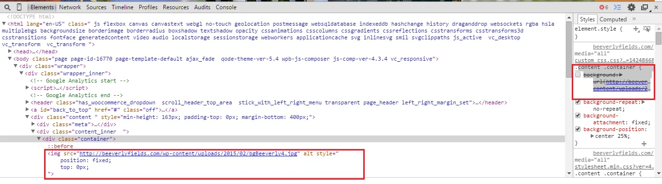
主要问题在于,当页面上的元素具有使用以下代码的背景图像时:

background-attachment: fixed;

如果另一个元素被固定,并且具有一个子视频元素,那么具有背景图像的元素将消失。

现在它在Safari中正常工作(以及Firefox和IE),因此这不完全是webkit问题。我已经尝试了几个建议的属性,但没有效果。

-webkit-backface-visibility: hidden;
-webkit-transform: translate3d(0, 0, 0);

初始演示

目前我的解决方案就是通过媒体查询来选择带有固定背景图片的元素,然后关闭固定背景属性。

@media screen and (-webkit-min-device-pixel-ratio:0) {
background-attachment: scroll;
}

有什么想法吗?

更新

感谢 Daniel 提供的可行演示。

更新2

更好的演示!

致谢 somesayiniceFourKitchens 博客文章


你的问题是由于Chrome浏览器中背景图片未加载导致的吗? - codefreaK
没有背景图片加载,是因为background-attachement: fixed引起的问题。如果你关闭它,它们就可以工作,但不是固定的。 - Alex
2
我遇到过这个问题很多次,而且似乎总是通过添加“transform: translateZ(0);”到固定的div来解决。这似乎强制渲染,但显然会以一些性能为代价。 - Steve de Niese
使用最新版本的Chrome浏览器,似乎无法与任何文本进行交互(无法高亮显示、无法点击等)-- 你有什么想法为什么会发生这种情况? - Nick Endle
@StevedeNiese,这会在FireFox中导致错误。 - Mathew
8个回答

34

由于在 Chrome 中,固定定位的背景似乎毫无理由地失效,您可以尝试调整 clipposition:fixed 属性。这个技巧并不是广为人知,但是当绝对定位的元素设置了 clip 属性时,实际上可以裁剪甚至是已固定定位的子元素。

然而,这种方法有一些缺点。最重要的是,在 iOS 上,这个技巧遗憾地不能很好地工作,因为当用户滚动时,浏览器会出现渲染整个图像的困难(你会看到一种弹入的效果)。这并不是什么太大的问题,但或许是应该考虑的事情。当然,您仍然可以通过使用一些聪明的 JavaScript 来解决这个问题,例如回退到固定背景。另外一个在 iOS 上的解决方法是仅使用 -webkit-mask-image: -webkit-linear-gradient(top, #ffffff 0%,#ffffff 100%),它基本上是 clip 的 WebKit 特定替代品clip: rect(auto,auto,auto,auto)(即在容器外裁剪所有内容)。

我制作了一个JSFiddle(codepen 不想和我玩)的实现示例,您可以查看 .moment.moment-image 和新的 .moment-clipper

希望这能对您有所帮助!

更新:Clip 现已被 clip-path 取代,但在撰写本文时仍然受到所有浏览器的支持。不过,同样的效果也可以通过以下方式实现:

-webkit-clip-path: polygon(0 0, 100% 0, 100% 100%, 0 100%);
clip-path: polygon(0 0, 100% 0, 100% 100%, 0 100%);
overflow: hidden;

position: absolute在容器上不再需要。目前仅Chrome和Safari支持clip-path,但支持相对较少。最保险的做法可能是同时包含clip和clip-path,因为它们似乎不会互相干扰。

我已更新上面的示例以包括clip-path。


这很棒,但是顺便提一下:在Firefox或IE中无法正常工作。 - Flobin
你是在说移动端的FF和IE吗?对我来说,它至少可以在IE9+和FF 16+中工作。 - Daniel Perván

8
我在 https://fourword.fourkitchens.com/article/fix-scrolling-performance-css-will-change-property 上找到了解决方案。
这似乎是使用:before伪元素的巧妙方法。 对于固定宽度的元素限制其宽度,但对于全宽页面效果很好。 基本上看起来像这样:

.background_fill {
  overflow: hidden;
  position: relative;
    color: red;
}
.background_fill:before {
  background-color: white;
  background: url('http://www.lausanneworldpulse.com/pdfs/brierley_map_0507.jpg') no-repeat center center;
  background-size: cover;
  z-index: -3;
  content: " ";
  position: fixed;
  will-change: transform;
  width: 100%;
  height: 100%;
}
<div class="background_fill">
  <div>this is on a background / this is on a background / this is on a background / this is on a background / this is on a background / this is on a background</div>
  <div>this is on a background / this is on a background / this is on a background / this is on a background / this is on a background / this is on a background</div>
  <div>this is on a background / this is on a background / this is on a background / this is on a background / this is on a background / this is on a background</div>
  <div>this is on a background / this is on a background / this is on a background / this is on a background / this is on a background / this is on a background</div>
  <div>this is on a background / this is on a background / this is on a background / this is on a background / this is on a background / this is on a background</div>
  <div>this is on a background / this is on a background / this is on a background / this is on a background / this is on a background / this is on a background</div>
  <div>this is on a background / this is on a background / this is on a background / this is on a background / this is on a background / this is on a background</div>
  <div>this is on a background / this is on a background / this is on a background / this is on a background / this is on a background / this is on a background</div>
  <div>this is on a background / this is on a background / this is on a background / this is on a background / this is on a background / this is on a background</div>
  <div>this is on a background / this is on a background / this is on a background / this is on a background / this is on a background / this is on a background</div>
  <div>this is on a background / this is on a background / this is on a background / this is on a background / this is on a background / this is on a background</div>
  <div>this is on a background / this is on a background / this is on a background / this is on a background / this is on a background / this is on a background</div>
  <div>this is on a background / this is on a background / this is on a background / this is on a background / this is on a background / this is on a background</div>
  <div>this is on a background / this is on a background / this is on a background / this is on a background / this is on a background / this is on a background</div>
  <div>this is on a background / this is on a background / this is on a background / this is on a background / this is on a background / this is on a background</div>
  <div>this is on a background / this is on a background / this is on a background / this is on a background / this is on a background / this is on a background</div>
</div>

这对我来说是一个很好的方法,可以避开这个非常烦人的 bug。


那似乎是一个很好的方法。我会研究一下。谢谢! - Alex
1
我把答案改成了你的。不仅在现代浏览器中它可以运行,而且我可以不用hacky的解决方案来得到我的固定背景。 太惊人了! - Alex
1
这很棒,但如果你有多个像这样的背景怎么办?我正在面临这个挑战。到目前为止,我最好的解决方案是在每个背景滚动到视图中时更改其z-index,但它的性能不佳。 - Benjamin
为什么不在一个div中使用多个div,所有的div都使用相同的滚动背景?我不确定你的用例。@Benjamin - somesayinice
1
只是一个小错误:将 background-size: cover; 放在 background: url(..); _下面_,因为后者会覆盖前者的属性声明。 - Prid

2

虽然回答晚了,但我想到了一个办法并且有点突破。

思路是创建一个内部元素,它将承载背景图像,并与 background-attachment:fixed 属性起到相同的作用。

由于这个属性会使背景图像的位置相对于窗口而言,因此我们需要在内部元素所在的容器中移动该元素,这样就可以获得这种效果。

var parallax_container = $(".parallax_container");
/*Create the background image holder*/
parallax_container.prepend("<div class='px_bg_holder'></div>");
$(".px_bg_holder").css({
    "background-image" : parallax_container.css("background-image"), /*Get the background image from parent*/
    "background-position" : "center center",
    "background-repeat" : "no-repeat",
    "background-size" : "cover",
    "position" : "absolute",
    "height" : $(window).height(), /*Make the element size same as window*/
    "width" : $(window).width()
});
/*We will remove the background at all*/
parallax_container.css("background","none");
parallax_container.css("overflow","hidden");/*Don't display the inner element out of it's parent*/
$(window).scroll(function(){
    var bg_pos = $(window).scrollTop() - $(".parallax_container").offset().top; /*Calculate the scrollTop of the inner element*/
    $(".px_bg_holder").css({
        "margin-top" : bg_pos+"px"
    });
});
$(window).resize(function(){
    $(".px_bg_holder").css({
        "height" : $(window).height(),
        "width" : $(window).width()
    });
});

2
感谢您发布解决方案。看到人们仍然发布解决方案总是很棒的,即使帖子已经过时了。 - mn.

2

正如Raphael Rychetsky这个很棒的示例中所示,translate3d可能会引起问题。

如果您使用transform: translate3d(0,0,0),请尝试将其替换为transform: translate(0,0),这应该可以解决问题。至少对我来说是有效的。


1

嗨,这很简单,不需要添加任何webkit和media标签,只需按照以下步骤操作:

  1. 我在下面的容器中删除了背景Url标签

.content .container { /* background: url(http://beeverlyfields.com/wp-content/uploads/2015/02/bgBeeverly4.jpg); */

  1. 我在class="container"中添加了img src标签,并将位置设置为fixed和top = 0

enter image description here 现在它可以在chrome-40和IE中工作了。


0

是的,那已经是这个问题的选定答案了。谢谢 :) - Alex

0

我的问题是我在文档中有一个带有动画3D变换的悬停div

.anim-y360:hover {
    -webkit-transform: rotateY(360deg);
    ...
}

每次我运行动画时,固定的图像都会消失。
解决方案很简单:
.anim-y360 {   
   z-index: XX;
   ...
}

其中XX比固定位置图像的z-index更高。


0

这个问题通常出现在HTML5视频中。只需将其包装在带有样式规则position: relative; 和overflow:hidden;的dom元素中,这将修复所有浏览器中的所有问题!


网页内容由stack overflow 提供, 点击上面的
可以查看英文原文,
原文链接