我已经附上一张图片,以展示确切的布局。照片中的线仅用于显示颜色应该改变的位置。
这是我尝试过但不满意的代码。
.block {
  background-color: black;
  left: -50;
  height: 150px;
  width: 100%;
  transform: rotate(-40deg);
}<body>
<div class="block">
</div>
</body>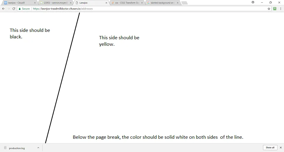
我已经附上一张图片,以展示确切的布局。照片中的线仅用于显示颜色应该改变的位置。
这是我尝试过但不满意的代码。
.block {
background-color: black;
left: -50;
height: 150px;
width: 100%;
transform: rotate(-40deg);
}<body>
<div class="block">
</div>
</body>
body {
  height: 100vh;
  margin: 0;
  background: yellow;
}

body:before {
  content: "";
  position: absolute;
  top: 0;
  bottom: 0;
  left: 0;
  width: 300px;
  background: #000;
  transform: skew(-30deg);
  transform-origin:top;
}为了在调整大小时保持相同的视觉效果,请为伪元素设置一个大的固定高度并将其居中:
html {
  background: yellow;
}

html:before {
  content: "";
  position: fixed;
  top: calc(50% - 1000px);
  left: 0;
  width: 500px;
  height:2000px;
  background: #000;
  transform: skew(-15deg);
  transform-origin:top;
}使用线性渐变,设置角度
body {
 margin:0;
 }

div {
  height: 100vh;
  background: linear-gradient(105deg, black 25%, yellow 25%)
}<div></div>.left-sidebar {
position: absolute;
width: 20%;
background: #000;
transform: skewY(5px);
}
.content {
background: #fff;
}
div的属性是CSS中的transform: skew(X,Y)。尝试一下,希望能有所帮助。div以获得所需的效果。