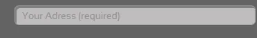
输入文本的样式CSS

7

我想创建如下图所示的输入文本框:
enter image description here
一开始我使用了 CSS3,并参考了像 这个 jsfiddle。但由于旧版浏览器兼容问题,我决定不再使用 CSS3。 现在我的代码是这样的:

input[type=text]
{
    color: #979797;
    height: 28px;
    padding-left: 10px;
    text-decoration: none;
        background-image: url('Pictures/Input-BG.png');
    background-repeat: repeat-x;

}
   <input id="txtScrictAddress" value="Your Adress (required)" type="text" />

Input-BG.png是这张图片:
输入框背景图
并且这里是结果。

  1. 我是否正确地切割了输入图像?
  2. 输入框左侧有一个边框颜色,我应该如何在CSS中设置输入框样式以匹配图像?

1
图片很好,添加 border: 0; 来禁用默认的边框样式。 - kapex
@Kapap 谢谢,那么输入框左侧的阴影怎么处理? - Shahin
3个回答

18

你只需要设置一个边框半径并将边框设置为无。然后编辑您的图像,使暗色部分位于左侧。

input[type=text]
{
    color: #979797;
    height: 28px;
    padding-left: 10px;
    text-decoration: none;
    background-image: url('http://i.stack.imgur.com/pbpVI.png');
    background-repeat: repeat-x;
    border-radius: 5px; /*up to date browsers support this, but you can add prefixes if you want*/

    border: 0;
}

http://jsfiddle.net/TGzng/8/


谢谢。看起来比我的代码好,但我认为你的示例与我放置的图像仍有一些不同。我的意思是输入框左侧的小阴影。 - Shahin
1
我使用了您提供的图像,但需要对图像进行编辑以包含阴影的左侧部分。 - Kyle

1

谢谢。所以您的意思是我应该使用两张图片,一张用于左边,另一张则用作背景? - Shahin

0

你需要添加一个border-radius属性来使边缘变圆。但是在IE8之前的版本中无法使用。

input[type=text]
{
    color: #979797;
    height: 28px;
    padding-left: 10px;
    text-decoration: none;
        background-image: url('http://i.stack.imgur.com/pbpVI.png');
    background-repeat: repeat-x;
    border:1px solid #777;
    border-radius:5px
}

关于图像切片,获取左侧阴影部分的简单方法是需要拥有非常宽的背景图像。或者可以尝试另一个人建议的滑动门技术。

网页内容由stack overflow 提供, 点击上面的
可以查看英文原文,
原文链接