更新的答案(2):只需使用fixfacets()
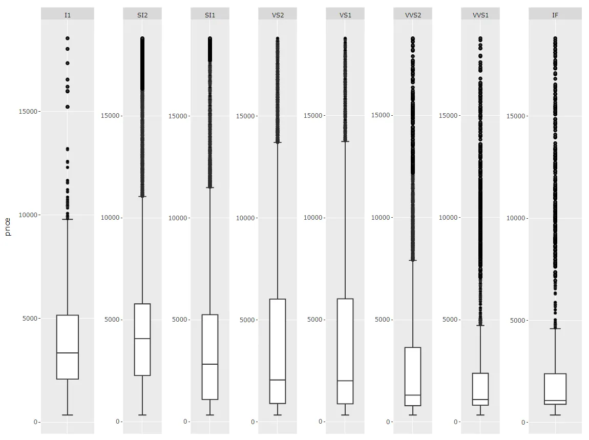
我编写了一个函数fixfacets(fig, facets, domain_offset)用于将这个图表:
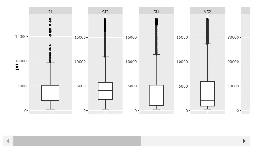
...通过以下方式处理:
f <- fixfacets(figure = fig, facets <- unique(df$clarity), domain_offset <- 0.06)
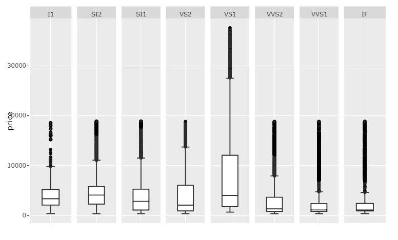
...变成这个:
现在,这个函数对于不同数量的分面应该都很灵活。
完整代码如下:
library(tidyverse)
library(plotly)
df <- data.frame(diamonds)
df['price'][df$clarity == 'VS1', ] <- filter(df['price'], df['clarity']=='VS1')*2
myplot <- df %>% ggplot(aes(clarity, price)) +
geom_boxplot() +
facet_wrap(~ clarity, scales = 'free', shrink = FALSE, ncol = 8, strip.position = "bottom", dir='h') +
theme(axis.ticks.x = element_blank(),
axis.text.x = element_blank(),
axis.title.x = element_blank())
fig <- ggplotly(myplot)
fixfacets <- function(figure, facets, domain_offset){
xHi <- seq(0, 1, len = n_facets+1)
xHi <- xHi[2:length(xHi)]
xOs <- domain_offset
shp <- fig$x$layout$shapes
j <- 1
for (i in seq_along(shp)){
if (shp[[i]]$fillcolor=="rgba(217,217,217,1)" & (!is.na(shp[[i]]$fillcolor))){
fig$x$layout$shapes[[i]]$x1 <- xHi[j]
fig$x$layout$shapes[[i]]$x0 <- (xHi[j] - xOs)
j<-j+1
}
}
ann <- fig$x$layout$annotations
annos <- facets
j <- 1
for (i in seq_along(ann)){
if (ann[[i]]$text %in% annos){
fig$x$layout$annotations[[i]]$x <- (((xHi[j]-xOs)+xHi[j])/2)
fig$x$layout$annotations[[i]]$xanchor <- 'center'
j<-j+1
}
}
xax <- names(fig$x$layout)
j <- 1
for (i in seq_along(xax)){
if (!is.na(pmatch('xaxis', lot[i]))){
fig[['x']][['layout']][[xax[i]]][['domain']][2] <- xHi[j]
fig[['x']][['layout']][[xax[i]]][['domain']][1] <- xHi[j] - xOs
j<-j+1
}
}
return(fig)
}
f <- fixfacets(figure = fig, facets <- unique(df$clarity), domain_offset <- 0.06)
f
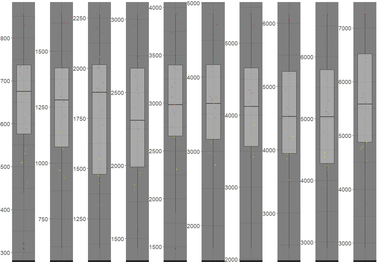
更新的答案(1):如何通过编程处理每个元素!
需要进行一些编辑以满足您对于维护每个分面的比例和修复奇怪布局方面需求的图形元素包括:
- 通过
fig$x$layout$annotations 处理 x 轴标签注释,
- 通过
fig$x$layout$shapes 处理 x 轴标签形状,以及
- 通过
fig$x$layout$xaxis$domain 处理每个分面在 x 轴上的起始和结束位置。
唯一的真正挑战是引用正确的形状和注释,例如在众多形状和注释中引用正确的形状和注释。下面的代码片段将完全做到这一点,以生成以下图形:
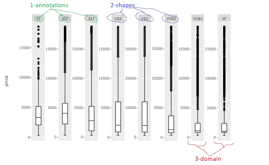
针对每种情况,代码片段可能需要进行一些仔细的调整,包括分面名称和名称数量,但代码本身非常基本,因此您不应该有任何问题。我会在找到时间时进一步完善它。
完整代码:
ibrary(tidyverse)
library(plotly)
df <- data.frame(diamonds)
df['price'][df$clarity == 'VS1', ] <- filter(df['price'], df['clarity']=='VS1')*2
myplot <- df %>% ggplot(aes(clarity, price)) +
geom_boxplot() +
facet_wrap(~ clarity, scales = 'free', shrink = FALSE, ncol = 8, strip.position = "bottom", dir='h') +
theme(axis.ticks.x = element_blank(),
axis.text.x = element_blank(),
axis.title.x = element_blank())
facets <- unique(df$clarity)
n_facets <- length(facets)
xHi <- seq(0, 1, len = n_facets+1)
xHi <- xHi[2:length(xHi)]
xOs <- 0.06
shp <- fig$x$layout$shapes
j <- 1
for (i in seq_along(shp)){
if (shp[[i]]$fillcolor=="rgba(217,217,217,1)" & (!is.na(shp[[i]]$fillcolor))){
fig$x$layout$shapes[[i]]$x1 <- xHi[j]
fig$x$layout$shapes[[i]]$x0 <- (xHi[j] - xOs)
j<-j+1
}
}
ann <- fig$x$layout$annotations
annos <- facets
j <- 1
for (i in seq_along(ann)){
if (ann[[i]]$text %in% annos){
fig$x$layout$annotations[[i]]$x <- (((xHi[j]-xOs)+xHi[j])/2)
fig$x$layout$annotations[[i]]$xanchor <- 'center'
j<-j+1
}
}
lot <- names(fig$x$layout)
j <- 1
for (i in seq_along(lot)){
if (!is.na(pmatch('xaxis', lot[i]))){
fig[['x']][['layout']][[lot[i]]][['domain']][2] <- xHi[j]
fig[['x']][['layout']][[lot[i]]][['domain']][1] <- xHi[j] - xOs
j<-j+1
}
}
fig
基于内置功能的初始答案
由于许多变量具有非常不同的值,无论如何,您似乎都将得到具有挑战性的格式,这意味着要么
- 单元格宽度会有所不同,或者
- 标签将覆盖单元格或太小以无法阅读,或者
- 图形将过宽而无法在没有滚动条的情况下显示。
因此,我建议您为每个唯一的清晰度和设置重新缩放您的price列,并设置scale='free_x'。我仍然希望有人能提出更好的答案。但以下是我的做法:
图1: 重新缩放的值和scale='free_x'
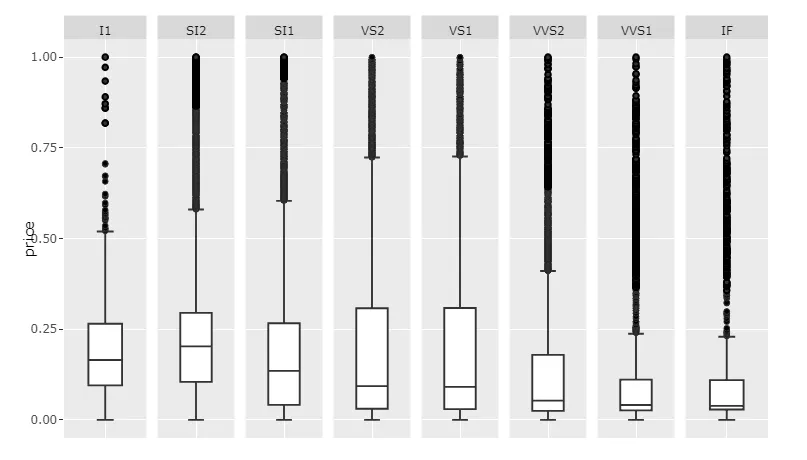
代码1:
library(tidyverse)
library(plotly)
library(scales)
library(data.table)
setDT(df)
df <- data.frame(diamonds)
df['price'][df$clarity == 'VS1', ] <- filter(df['price'], df['clarity']=='VS1')*2
setDT(df)
clarities <- unique(df$clarity)
for (c in clarities){
df[clarity == c, price := rescale(price)]
}
df$price <- rescale(df$price)
myplot <- df %>% ggplot(aes(clarity, price)) +
geom_boxplot() +
facet_wrap(~ clarity, scales = 'free_x', shrink = FALSE, ncol = 8, strip.position = "bottom") +
theme(axis.ticks.x = element_blank(),
axis.text.x = element_blank(),
axis.title.x = element_blank())
p <- ggplotly(myplot)
p
这当然只会提供每个类别内部分布的洞察力,因为数值已经重新缩放。如果您想显示原始价格数据并保持可读性,则建议通过设置足够大的width来为滚动条腾出空间。
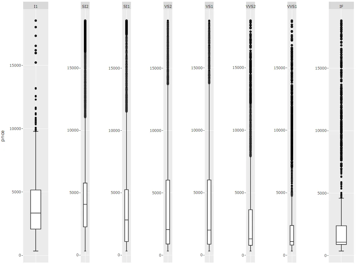
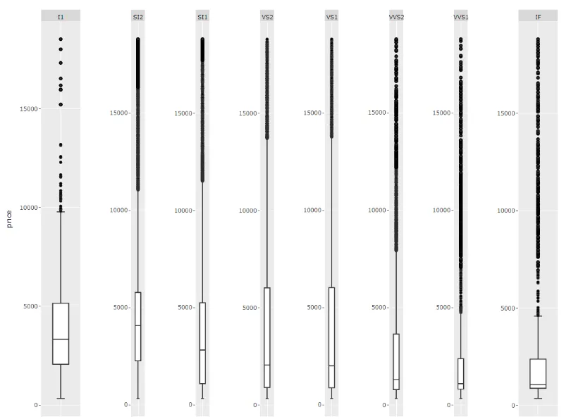
图表2:scales='free'和足够大的宽度:
代码2:
library(tidyverse)
library(plotly)

df <- data.frame(diamonds)

df['price'][df$clarity == 'VS1', ] <- filter(df['price'], df['clarity']=='VS1')*2

myplot <- df %>% ggplot(aes(clarity, price)) +
  geom_boxplot() +
  facet_wrap(~ clarity, scales = 'free', shrink = FALSE, ncol = 8, strip.position = "bottom") +
  theme(axis.ticks.x = element_blank(),
        axis.text.x = element_blank(),
        axis.title.x = element_blank())

p <- ggplotly(myplot, width = 1400)
p
当然,如果您的值在不同类别之间变化不太大,scales='free_x' 就可以正常工作。
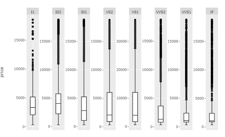
图 3:scales='free_x'
代码 3:
library(tidyverse)
library(plotly)

df <- data.frame(diamonds)

df['price'][df$clarity == 'VS1', ] <- filter(df['price'], df['clarity']=='VS1')*2

myplot <- df %>% ggplot(aes(clarity, price)) +
  geom_boxplot() +
  facet_wrap(~ clarity, scales = 'free_x', shrink = FALSE, ncol = 8, strip.position = "bottom") +
  theme(axis.ticks.x = element_blank(),
        axis.text.x = element_blank(),
        axis.title.x = element_blank())

p <- ggplotly(myplot)
p