使用纯SVG是否可能制作这样的东西?
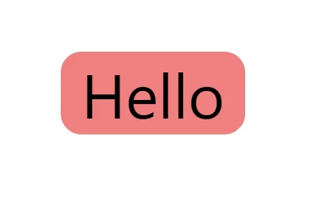
无需JavaScript、固定大小或HTML。
我尝试使用矩形元素,但这不是一个灵活的解决方案。
我尝试过使用滤镜,但这是一个没有圆角的解决方案。
使用纯SVG是否可能制作这样的东西?
无需JavaScript、固定大小或HTML。
我尝试使用矩形元素,但这不是一个灵活的解决方案。
我尝试过使用滤镜,但这是一个没有圆角的解决方案。
<svg width="800px" height="600px">
<defs>
  <filter id="rounded-corners" x="-5%" width="110%" y="0%" height="100%">
<feFlood flood-color="#FFAA55"/>
<feGaussianBlur stdDeviation="2"/>
<feComponentTransfer>
  <feFuncA type="table"tableValues="0 0 0 1"/>
</feComponentTransfer>

<feComponentTransfer>
  <feFuncA type="table"tableValues="0 1 1 1 1 1 1 1"/>
</feComponentTransfer>
   <feComposite operator="over" in="SourceGraphic"/>
  </filter>

   <filter id="rounded-corners-2" primitiveUnits="objectBoundingBox">
<feImage preserveAspectRatio="none" width="110%" height="110%" x="-5%" y="0%"  xlink:href="data:image/svg+xml,%3Csvg xmlns='http://www.w3.org/2000/svg' x='0px' y='0px' viewBox='0 0 400 40' height='40' width='400'%3E%3Crect fill='red' x='0' y='0' rx='10' ry='10' width='400' height='40'/%3E%3C/svg%3E"/>
   <feComposite operator="over" in="SourceGraphic"/>
  </filter>


  </defs>


  <text filter="url(#rounded-corners)" x="20" y="40" style="font-size:30">Blur & opacity filter</text>

  <text filter="url(#rounded-corners)" x="20" y="80" style="font-size:30"> But the x padding is relative and overflows with long text</text>

<text filter="url(#rounded-corners-2)" x="20" y="140" style="font-size:30">feImage and a rect filter</text>

<text filter="url(#rounded-corners-2)" x="20" y="180" style="font-size:30">But you still can't get away from relative padding</text>

</svg>filter id="rounded-corners-2" 过滤器在 Firefox 中无法使用。 - Alexandr_TT如果您不需要使用笔画进行其他操作,那么有一个更简单的选择:通过为文本元素设置大量的描边宽度,使用绘制顺序属性指定其在填充后面绘制,然后使用 CSS 剪切路径将圆角插入剪辑应用到文本元素上。调整插入剪辑的负值以适当地调整填充。(您可能需要向下滚动代码片段窗口才能看到它)
svg text {
  clip-path: inset(-5px -5px -5px -5px round 10px);
}<svg xmlns="http://www.w3.org/2000/svg"
xml:space="preserve"
width="100%"
height="100%"
style="fill-rule:evenodd; clip-rule:evenodd; stroke-linejoin:round; stroke-miterlimit:2"
viewBox="0 0 100 100">
<text style="paint-order:stroke fill"
stroke="salmon"
stroke-width="50"
x="50%" y="50%"
dominant-baseline="middle"
text-anchor="middle"
fill="black">
hello
</text>
</svg>
<rect x="10" y="120" height="100" width="100" rx="10" ry="10" />您也可以使用文本元素来绘制文本。 - enxaneta