我想知道是否有可能使用 CSS 或 jQuery 创建一个具有对角边框线的表格,就像下面这样:

只要你足够耐心地尝试,任何事情都是可能的。下面是一个例子,使用了一些创意边框和大量CSS:
.arrow_box:after, .arrow_box:before {
    top: 100%;
    border: solid transparent;
    content: " ";
    height: 0;
    width: 0;
    position: absolute;
    pointer-events: none;
}
另一个使用CSS3旋转的示例:
-webkit-transform: rotate(26.5deg);
   -moz-transform: rotate(26.5deg);
    -ms-transform: rotate(26.5deg);
     -o-transform: rotate(26.5deg);
        transform: rotate(26.5deg);
或者你可以将图片作为表格的背景。
官方上讲,表格不可以有对角线边框,但是通过一些 CSS 技巧,你可以让它看起来像有对角线边框。以下是代码:
.borderdraw {
position:fixed;
    border-style:solid;
    height:0;
    line-height:0;
    width:0;
    z-index:-1;

}

table td
    {
        width:60px;
            max-height:55px;
        border:1px solid #000;
    }

.tag1{ z-index:9999;position:absolute;top:40px; }

.tag2 { z-index:9999;position:absolute;left:40px; }

.diag { position: relative; width: 50px; height: 50px; }
.outerdivslant { position: absolute; top: 0px; left: 0px; border-color: transparent transparent transparent rgb(64, 0, 0); border-width: 50px 0px 0px 60px;}
.innerdivslant {position: absolute; top: 1px; left: 0px; border-color: transparent transparent transparent #fff; border-width: 49px 0px 0px 59px;}
</style>
  <table>
    <tr>
      <td>
    <div class = "tag1">Tag1</div>
    <div class="tag2">Tag2</div>

        <div style="z-index:-1;">
           <div class="diag">
             <div class="outerdivslant borderdraw">
             </div>

           <div class = "innerdivslant borderdraw">
           </div>
         </div>
        </div>

      </td>
    </tr>
</table>
以下是输出结果。

希望对您有所帮助。
here's an example in table with border and diagonal in css https://codepen.io/halimarm/pen/rNaPyGR?editors=1100
table {
  width: 100%;
}

table td {
  position: relative;
  overflow: hidden;
  border: 1px solid #000;
}

.line {
  position: absolute;
  height: 40px;
  top: 40px;
  bottom: 0;
  margin: auto;
  left: -5px;
  width: 100%;
  border-top: 1px solid #000;
  -webkit-transform: rotate(14deg);
  -ms-transform: rotate(14deg);
  transform: rotate(14deg);
}

.diagonal {
  width: 150px;
  height: 40px;
}
.diagonal span.lb {
  position: absolute;
  bottom: 2px;
  left: 2px;
}
.diagonal span.rt {
  position: absolute;
  top: 2px;
  right: 2px;
}<table>
<tr>
<td>abc</td>
<td>abc</td>
<td class="diagonal">
<span class="lb">Rata - Rata</span>
<span class="rt">Total</span>
<div class="line"></div>
</td>
</tr>
<tr>
<td>abc</td>
<td>abc</td>
<td>abc</td>
</tr>
<tr>
<td>abc</td>
<td>abc</td>
<td>abc</td>
</tr>
</table>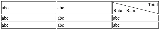
表格边框不能为斜线,您可以尝试使用一个带有一条边框的元素(div)并旋转它(如果css3可用)。
使用CSS linear-gradient 实现对角线,使用CSS transform 定位内部单元格的解决方案:
td {
    padding: 30px;
    border: 2px solid black;
    background-image: -webkit-gradient(linear, left bottom, right top, color-stop(49%, white), color-stop(50%, black), color-stop(51%, white));
    background-image: -webkit-linear-gradient(bottom left, white 49%, black 50%, white 51%);
    background-image: -o-linear-gradient(bottom left, white 49%, black 50%, white 51%);
    background-image: linear-gradient(to top right, white 49%, black 50%, white 51%);
}
td .c1 {
    -webkit-transform: translate(20px,-20px);
        -ms-transform: translate(20px,-20px);
            transform: translate(20px,-20px);
}
td .c2 {
    -webkit-transform: translate(-20px,20px);
        -ms-transform: translate(-20px,20px);
            transform: translate(-20px,20px);
}<table border=1>
<tr>
<td>
<div class="c1">Foo</div>
<div class="c2">Bar</div>
</td>
</tr>
</table>或者使用 CSS background: url(...) 和 CSS Grid 布局 来定位内部单元格的 SVG 图像,也可以采用 Peter Krautzberger 提供的解决方案。
.cell {
  display: grid;
  width: max-content;
  justify-content: space-between;
  grid-template-columns: repeat(2, 1fr);
  grid-auto-rows: 1fr;
  border: 1px solid #000;
  background: url("data:image/svg+xml;utf8,<svg xmlns='http://www.w3.org/2000/svg' version='1.1' preserveAspectRatio='none' viewBox='0 0 100 100'><line x1='0' y1='0' x2='100' y2='100' stroke='black' vector-effect='non-scaling-stroke'/></svg>");
  background-size: 100% 100%;
}

.cell--topRight {
  grid-column-start: 2;
  text-align: right;
}

.cell--bottomLeft {
  grid-column-start: 1;
}<table border=1>
<tr>
<td class=cell>
<div class="cell--topRight">Foo</div>
<div class="cell--bottomLeft">Bar</div>
</td>
</tr>
</table>
top: 190px; left: 33px;。 - gabbler