CSS中的位置定位

3

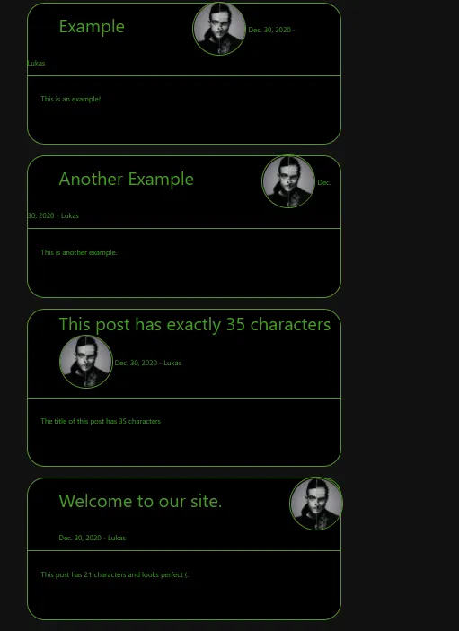
我正在使用Django制作一个博客发布网站。当用户发布文章时,如果标题有21个字符,那么文章看起来很棒。如果标题有35个字符,它将使作者、日期和缩略图向右移动,如果少于21个字符,则将它们向左移动。我不希望出现这种情况!

目前的显示效果如下:

{% for post in posts %}
        <div class="blogpost">
        <a class="post-title"> {{post.title}} </a>
       <img class="thumbnail" src="{{post.author.imageURL}}"> 
        <a class="date-author">{{post.date}} - {{post.author}}</a>
        <br>
        <hr>
        <br>
        <div class="blogpost-content">{{post.context|linebreaks}}</div>
        <br>
        <br>
        <br>
    </div>

    <br>
{% endfor %}

CSS 代码
.blogpost {
  /*Whole blogpost div*/
  border: 5px solid #149414;
  background-color: black;  
  color: #149414;
  width: 700px;
  margin:auto;
  border-radius: 40px;
  border-width: 1px;
}

hr{
  /*The middle line in the blogpost*/
  height: 1px;
  background-color: #149414;
  border: none;
}

.thumbnail{
  /*The author's image of the blogpost*/
  height: 120px;
  width: 120px;
  position: relative;
  right: -70px;
  bottom: 4px;
  border: 3px solid #149414;
  border-radius: 50%;
}

.blogpost-content{
  /*Content in the blogpost*/
  text-align: left;
  margin-left: 30px;
  margin-right: 30px;
}

.date-author{
  /*The date and author div in the blogpost*/
  font-size: 12;
  margin:10%;
}

.green_link{
  /*Green link to the random key*/
  color:#149414;
}

.post-title{
  font-size: 40px;
  margin: 10%;
}

我尝试跟随这个视频:https://www.youtube.com/watch?v=jx5jmI0UlXU,但好像不起作用。我认为这与...有关。

position: relative;

但我不确定。


我建议使用Flexbox来进行布局。有很多优秀的资源可以学习,但总体想法是无论标题有多长,头像都会停留在一侧。这是一个快速示例:https://jsfiddle.net/6jukp3ab/。我不确定您的布局应该是什么样子,但那应该可以让您开始工作。 - veddermatic
定位是一种非常糟糕的网页布局方法。它极度缺乏灵活性,并且有更好、更具响应性的选项。请查看LearnLayout.com。 - Paulie_D
2个回答

4
这是一种将帖子标题的宽度相对于父容器的解决方案。请注意,我还包括了 post-author-wrapper,其中包含了 img 和 date。当您使用 right 和 bottom 时,必须将元素的 position 设置为 absolute。您也可以使用 flexbox。这个链接很好地解释了 flexbox:https://css-tricks.com/snippets/css/a-guide-to-flexbox/。在这个解决方案中,因为我正在浮动元素,所以我在 before 和 after 中添加内容来清除浮动。您想要对 hr 做同样的事情。

https://jsfiddle.net/3qe1kcvx/

 <div class="blogpost">
   <a class="post-title">You can write whatever you want this will not affect the image because you gave a certain width to the post-title which is calculated according to the width of the parent container which is blogpost...</a>
   <div class="post-author-wrapper">
       <img class="thumbnail" src="{{post.author.imageURL}}"> 
       <a class="date-author">post.date - post.author</a>
   </div>
   <br>
   <hr>
   <br>
   <div class="blogpost-content">post.context|linebreaks</div>
   <br>
   <br>
   <br>
</div>

.blogpost {
  /*Whole blogpost div*/
  border: 5px solid #149414;
  background-color: black;  
  color: #149414;
  width: 700px;
  margin:auto;
  border-radius: 40px;
  border-width: 1px;
}
.blogpost::before, .blogpost::after {
  content: '';
  display: table;
  clear: both;
}

hr{
  /*The middle line in the blogpost*/
  height: 1px;
  background-color: #149414;
  border: none;
  clear: both;
}

.thumbnail{
  /*The author's image of the blogpost*/
  height: 120px;
  width: 120px;
  position: relative;
  border: 3px solid #149414;
  border-radius: 50%;
}

.blogpost-content{
  /*Content in the blogpost*/
  text-align: left;
  margin-left: 30px;
  margin-right: 30px;
}
.post-author-wrapper {
    width: 120px;
    padding: 15px;
    float: right;
    display: block;
}
.date-author{
  /*The date and author div in the blogpost*/
  font-size: 12;
  margin: 0 auto;
  display: block;
}

.green_link{
  /*Green link to the random key*/
  color:#149414;
}

.post-title{
    font-size: 40px;
    padding: 10px 30px 10px 30px;
    width: calc( 700px - 120px - 90px );
    display: block;
    float: left;
}

1
谢谢你的帮助,Chris!这对于图片来说很棒,但是日期和作者现在在右边而不是之前标题下面的左边了。 - root
2
@lukas,请检查更新后的HTML结构以及绝对定位的工作方式。还要检查一下,现在您必须在.blogpost类上添加position: relative,因为您将元素相对于父div进行了绝对定位。这有助于使img不会超出blogpost。https://jsfiddle.net/b8kym6cr/1/ - chris niko
2
@lukas 抱歉更新了一个:https://jsfiddle.net/b8kym6cr/1/ - chris niko

3

可能出现标题比calc( 700px - 120px - 90px )还长的情况。此时可以使用CSS省略号。为此,请将以下内容添加到标题的CSS中:

.post-title {
  white-space: nowrap; /* keep all on 1 line */
  overflow: hidden; /* no overflow */
  text-overflow: ellipsis; /* ellipsis the end of the title */
}

网页内容由stack overflow 提供, 点击上面的
可以查看英文原文,
原文链接