我正在尝试实现类似于以下效果:
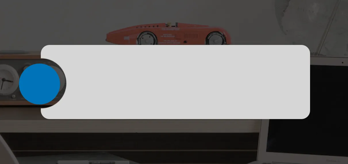
我知道如何设置背景图片等。但是蓝色圆圈应该是一个带有图层蒙版的图像,因此您可以看到背景图像。左侧的灰色div将只是在其后面重叠。我不确定如何实现遮罩效果,我已经进行了一些研究这里,但是我很难判断哪些内容对于我想要实现的效果有用。有人有任何想法吗?我该如何编写代码来实现这个效果?
我正在尝试实现类似于以下效果:
我知道如何设置背景图片等。但是蓝色圆圈应该是一个带有图层蒙版的图像,因此您可以看到背景图像。左侧的灰色div将只是在其后面重叠。我不确定如何实现遮罩效果,我已经进行了一些研究这里,但是我很难判断哪些内容对于我想要实现的效果有用。有人有任何想法吗?我该如何编写代码来实现这个效果?
我猜大概是这样的。
* { margin:0; padding: 0; }
body {
  background: url('http://www.bestmanspeechestoasts.com/wp-content/themes/thesis/rotator/sample-4.jpg');
}
p { padding: 0 10px; font-size: 12px; color:#fff; line-height: 1.3; overflow: hidden; }
.outer {
  margin: 50px auto;
  width: 300px;
  position: relative;
}
.box {
  position: relative;
  padding: 20px 0;
  overflow: hidden;
  border-radius: 10px;
}
.box:before {
  content: '';
  display: block;
  width: 50px;
  height: 50px;
  margin-left: -25px;
  float: left;
  border-radius: 50px;
  box-shadow: 0 0 0 350px rgba(0, 0, 0, 1);
}
.outer:before {
  content: '';
  position: absolute;
  width: 40px;
  height: 40px;
  background-color: blue;
  border-radius: 20px;
  position: absolute;
  top: 25px;
  left: -20px;
}<div class="outer">
<div class="box"><p>Lorem Ipsum is simply dummy text of the printing and typesetting industry. Lorem Ipsum has been the industry's standard dummy text ever since the 1500s</p></div>
</div>像这样的代码可以让你开始入门:
HTML
<div id="container">
<div id="gray-box" class="clip-circle"></div>
<div id="blue-circle"> </div>
</div>
CSS
.clip-circle {
  clip-path: circle(5px at 0px 15px);
}
#gray-box {
  border-radius: 15px;
  background-color: #AAA;
  width: 300px;
  height: 60px;
}
#blue-circle {
  position: absolute;
  left: 5px;
  top: 13px;
  border-radius: 50%;
  width: 50px;
  height: 50px;
  background-color: blue;
}