我正在使用 WPF 3.5 SP1,想要实现类似这样的效果(玻璃部分已经完成):
(来源:ggpht.com)
(源代码)
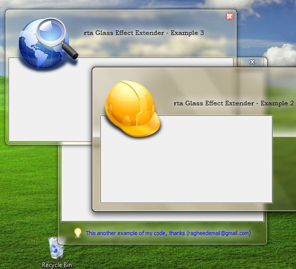
(源代码)
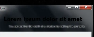
DrawThemeTextEx 是正确的方法,它使用推荐的系统选项来呈现模糊效果。然而,我该如何在WPF中实现相同的效果呢?我能够找到以下链接,其中包含有用的资源:
如何使Aero玻璃背景上的WPF文本可读?
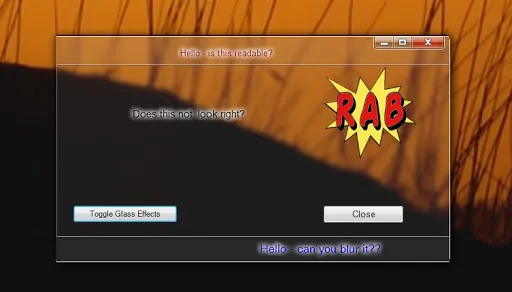
在玻璃表面上发光的标签控件 他们通过复制TextBlock并在其上设置模糊效果来实现此目的。然而,这不是一个真正的解决方案。以下是它的外观:
DrawThemeTextEx API)。谢谢。