我有一个包含单词及其出现频率的文件,希望生成一种“气泡”图表。这样做的想法是,气泡的大小对应相对频率,并在气泡上标记相应的单词。请问是否能使用标准的matplotlib或类似的工具来实现此功能?
2个回答
5
有很多库可以使用,这里提供了一些。
这是一个来自WordCloud的示例。
#!/usr/bin/env python
"""
Minimal Example
===============
Generating a square wordcloud from the US constitution using default arguments.
"""

import os

from os import path
from wordcloud import WordCloud

# using word frequency list:
#word_freq = open("/tmp/word_freq.txt").read()
# say it looks like this:
word_freq = {'apple': 4, 'banana': 1, 'melon': 2, 'strawberry': 3, 'grape': 8}
text = " ".join([(k + " ")*v for k,v in word_freq.items()])

# Generate a word cloud image
wordcloud = WordCloud().generate(text)


# Display the generated image:
# the matplotlib way:
import matplotlib.pyplot as plt
plt.imshow(wordcloud, interpolation='bilinear')
plt.axis("off")

# lower max_font_size
wordcloud = WordCloud(max_font_size=40).generate(text)
plt.figure()
plt.imshow(wordcloud, interpolation="bilinear")
plt.axis("off")
plt.show()

# The pil way (if you don't have matplotlib)
# image = wordcloud.to_image()
# image.show()
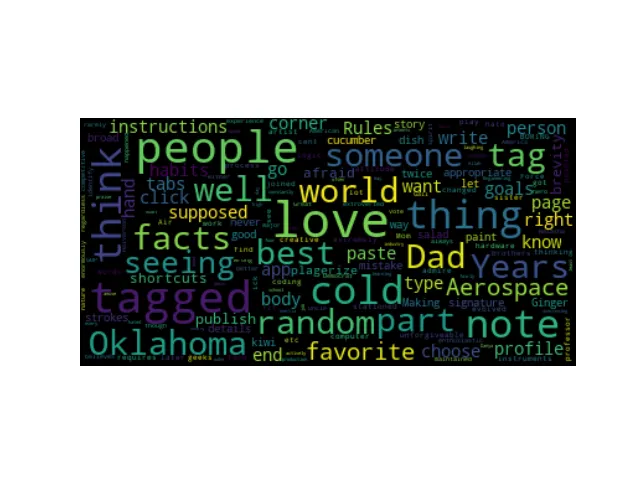
不同文本的词云图:
- keithpjolley
1
是的,这看起来不错,但它假设我拥有整个文本。我只有单词和频率,有没有其他方法可以处理这个问题,而不需要生成虚拟文件? - Ayumu Kasugano
0
假设您有字典
data中的频率数据
以下代码应该可以工作
import os
from os import path
from wordcloud import WordCloud
import matplotlib.pyplot as plt

data = {
    'Bla': 10,
    'Bl': 2,
    'cold' : 9,
    'random': 6
}
wordcloud = WordCloud(max_font_size=40).generate(" ".join([(k + ' ') * v for k,v in data.items()]))
plt.figure()
plt.imshow(wordcloud, interpolation="bilinear")
plt.axis("off")
plt.show()
- Krishna
网页内容由stack overflow 提供, 点击上面的可以查看英文原文,
原文链接
原文链接