我正在寻找一种方法,将表情符号作为HTML电子邮件的边框。实际上,我希望圣诞树表情符号 () 可以在一个div周围重复出现。您有什么想法如何实现吗?
3个回答
5
通常,一种方法是使用
border-image 属性,但需要使用图片而不是字符。
正如评论中指出的那样,很遗憾,在电子邮件中支持度不高。
.christmas {
  display: inline-block;
  padding: 15px;
  border: 33px solid transparent;
  -moz-border-image: url("https://istack.dev59.com/baEaT.webp") 33 repeat;
  -webkit-border-image: url("https://istack.dev59.com/baEaT.webp") 33 repeat;
  -o-border-image: url("https://istack.dev59.com/baEaT.webp") 33 repeat;
  border-image: url("https://istack.dev59.com/baEaT.webp") 33 repeat;
}<div class="christmas">
Merry Christmas!
</div>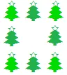
- Marvin
2
我对HTML电子邮件不太熟悉,因此过于乐观了。谢谢提示,我已根据您的评论更新了我的答案。 - Marvin
3
如果您将用于邮件发送,那么像这样使用表格将是解决方案:
<table style="width: 478px;height: 285px;">
  <tr>
    <td colspan="3" style="height:30px; background-image: url(https://istack.dev59.com/baEaT.webp); background-repeat: repeat-x"></td>
  </tr>
  <tr>
    <td style="width:26px; background-image: url(https://istack.dev59.com/baEaT.webp); background-repeat: repeat-y"></td>
    <td valign="top" style="padding: 20px;">

      Content

    </td>
    <td style="width:26px; background-image: url(https://istack.dev59.com/baEaT.webp); background-repeat: repeat-y;"></td>
  </tr>
  <tr>
    <td colspan="3" style="height:30px; background-image: url(https://istack.dev59.com/baEaT.webp); background-repeat: repeat-x"></td>
  </tr>
</table>
- Asons
0
这里有一个使用SVG文本和遮罩的想法。不使用PNG
.box {
  width: 300px;
  /* our SVG's width and height is 30px, so we need to keep the width and height multiple of 30 to avoid cutting */
  height: 240px;
  position: relative;
  /* to center the text */
  display: flex;
  justify-content: center;
  align-items: center;
}

.box:before {
  content: "";
  position: absolute;
  z-index: -1;
  top: 0;
  left: 0;
  right: 0;
  bottom: 0;
  background: url("data:image/svg+xml,%3Csvg xmlns='http://www.w3.org/2000/svg' height='30' width='30'%3E%3Ctext x='50%25' y='50%25' dominant-baseline='middle' text-anchor='middle'%3E%3C/text%3E%3C/svg%3E");

  --mask: linear-gradient(#000, #000) content-box,
          linear-gradient(#000, #000);
  -webkit-mask: var(--mask);
          mask: var(--mask);
  -webkit-mask-composite: destination-out;
          mask-composite: exclude;
  padding: 30px;
}<div class="box">
Hello
</div>我使用的SVG
<svg height="30" width="30">
  <text x="50%" y="50%" dominant-baseline="middle" text-anchor="middle"></text>
</svg>我使用svg-encoder进行编码。
您可以插入任何类型的表情符号:
.box {
  width: 300px;
  /* our SVG's width and height is 30px, so we need to keep the width and height multiple of 30 to avoid cutting */
  height: 240px;
  position: relative;
  /* to center the text */
  display: flex;
  justify-content: center;
  align-items: center;
}

.box:before {
  content: "";
  position: absolute;
  z-index: -1;
  top: 0;
  left: 0;
  right: 0;
  bottom: 0;
  background: url("data:image/svg+xml,%3Csvg xmlns='http://www.w3.org/2000/svg' height='30' width='30'%3E%3Ctext x='50%25' y='50%25' dominant-baseline='middle' text-anchor='middle'%3E%3C/text%3E%3C/svg%3E");

  --mask: linear-gradient(#000, #000) content-box,
          linear-gradient(#000, #000);
  -webkit-mask: var(--mask);
          mask: var(--mask);
  -webkit-mask-composite: destination-out;
          mask-composite: exclude;
  padding: 30px;
}<div class="box">
Hello
</div>- doğukan
网页内容由stack overflow 提供, 点击上面的可以查看英文原文,
原文链接
原文链接
<table>的布局。 - Dai