如何在GitHub中将README统计信息并排对齐

4

我不知道这是否是正确的地方来问这个问题,但我真的卡在了这一部分。基本上,我正在尝试在自述文件中将我的Github统计数据并排对齐。

我在自述文件中添加了以下代码:


![User GitHub Stats](https://github-readme-stats.vercel.app/api?username=user&show_icons=true&theme=radical)
![Top Languages Card](https://github-readme-stats.vercel.app/api/top-langs/?username=user&theme=radical&layout=compact)

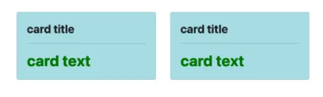
我该如何让这两张卡片并排对齐呢?就像这样:

enter image description here

有什么建议吗?

更新:

我尝试添加了这个,但它仍然无法运行:

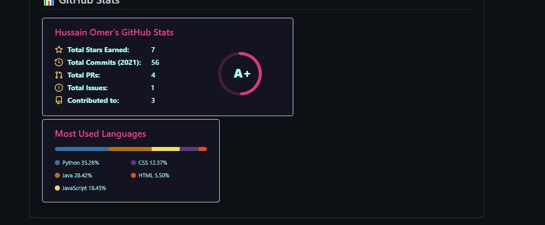
<img align="center" src="https://github-readme-stats.vercel.app/api?username=hussaino03&show_icons=true&theme=radical" />
 <img align="center" src="https://github-readme-stats.vercel.app/api/top-langs/?username=hussaino03&theme=radical&layout=compact" />

enter image description here


<div style="display: flex; flex-direction: row;">
 <img class="img" src="https://github-readme-stats.vercel.app/api?username=hussaino03&show_icons=true&theme=radical" />
 <img class="img" src="https://github-readme-stats.vercel.app/api/top-langs/?username=hussaino03&theme=radical&layout=compact" />
</div>

要么使用 display: flex;,要么使用 float 布局元素。如果您需要相关解决方案,请同时提供 HTML 和 CSS 代码。 - Kameron
这里有一个类似的问题:https://dev59.com/HWAf5IYBdhLWcg3wwk0V 也许你可以在那里找到答案。 - CleverUser123
是的,但它不同于自述文件(readme)统计数据吗? - user17458330
我编辑了我的问题,并附上了我尝试过的内容。 - user17458330
我几乎可以确定所有类型的样式都被过滤掉了,出于清洁卫生的原因,所以恐怕没有办法做你想要的事情。 - bk2204
4个回答

1

这是对我有效的解决方案。两张图片大小差不多并且在同一行。

<div class='container'>
<img style="height: auto; width: 55%;" class="img" src="https://github-readme-stats.vercel.app/api?username=user&show_icons=true&theme=blue-green" />
&nbsp;
&nbsp;
<img style="height: auto; width: 40%;" class="img" src="https://github-readme-stats.vercel.app/api/top-langs/?username=user&theme=blue-green&langs_count=8&layout=compact" /></div>
</div>

img


1
请看我添加的CSS和对你的HTML所做的更改。仅仅使用<img align="center"是不够的。

<div style="display: flex; flex-direction: row;">
 <img class="img" src="https://github-readme-stats.vercel.app/api?username=hussaino03&show_icons=true&theme=radical" />
 <img class="img" src="https://github-readme-stats.vercel.app/api/top-langs/?username=hussaino03&theme=radical&layout=compact" />
</div>

我检查了前端,并更改了div样式,按照建议进行更改后,它的工作效果符合预期。 img


你也可以使用内联样式。请参见所调整的样式。 - Kameron
嗯,不太起作用。 - user17458330
1
它在预览中能够工作,但在实际页面中却不能。 - user17458330
@user2345,请确认已经调整完毕。 - Kameron
不行,还是不起作用。 - user17458330
显示剩余17条评论

0
尝试以下操作: 使用dir="auto"(用于文本对齐)以及max-width 100%,您应该能够居中任何想要的内容。
<div align="center" dir="auto" <img style="max-width: 100%;" src="https://github-readme-stats.vercel.app/api?username=hussaino03&show_icons=true&theme=radical" />
 <img style="max-width: 100%;" src="https://github-readme-stats.vercel.app/api/top-langs/?username=hussaino03&theme=radical&layout=compact" />
</div>

0

The difference in both box sizes annoyed also me. I tried the other proposal here but for some reason it didn't work for me(both in the same size on the same row). So, I did the following that has made them look much better, although they are not on the same line

### GitHub Stats
<div><img style="height: auto; width: 40%;" class="img" src="https://github-readme-stats.vercel.app/api?username=Tsvetoslav88&theme=radical&show_icons=true&include_all_commits=true&hide_border=true" /></div>

### GitHub Languages
<div><img style="height: auto; width: 40%;" class="img" src="https://github-readme-stats.vercel.app/api/top-langs/?username=Tsvetoslav88&theme=radical&langs_count=8&layout=compact&hide_border=true" /></div>


网页内容由stack overflow 提供, 点击上面的
可以查看英文原文,
原文链接