在CSS中是否可以制作以下渐变效果:
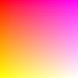
针对你的情况
方法1:
div{
overflow: hidden;
background: #f06;
background: linear-gradient(45deg, #fff722, #ff26f9);
min-height: 100%;
width: 256px;
height: 256px;
position: relative;
z-index: 1;
box-shadow: inset -20px 0 38px -18px #ff26f9,inset -3px -13px 65px -18px yellow;
}

div:before,div:after{
    content:'';
    position:absolute;
    width:100%;
    height:100%;
}
div:before{
    background: red;
    box-shadow: 0 0 140px 64px red;
    z-index:2;
    top: -96%;
left: -72%;
    opacity: 0.8;
}
div:after {
background: white;
z-index: 3;
bottom: -96%;
right: -72%;
box-shadow: 0 0 140px 64px white;
opacity: 1;
border-radius: 100%;
}
方法2:
div{
overflow: hidden;
background: #f06;
background: linear-gradient(45deg, #fff722, #ff26f9);
min-height: 100%;
width:256px;
height:256px;
position:relative;
    z-index:1;
}

div:before,div:after{
    content:'';
    position:absolute;
    width:100%;
    height:100%;
}
div:before{
    background: red;
    box-shadow: 0 0 140px 64px red;
    z-index:2;
    top: -96%;
left: -72%;
    opacity: 0.8;
}
div:after {
background: white;
z-index: 3;
bottom: -96%;
right: -72%;
box-shadow: 0 0 140px 64px white;
opacity: 1;
border-radius: 100%;
}
方法3:多重背景:
div{
background: #f06;
background: linear-gradient(45deg, #fff722, #ff26f9),linear-gradient(142deg, transparent, white),linear-gradient(108deg, red, transparent);
min-height: 100%;
width:256px;
height:256px;
position:relative;
    z-index:1;
}
方法4:伪元素。
div{
background: #f06;
background: linear-gradient(45deg, #fff722, #ff26f9);
min-height: 100%;
width:256px;
height:256px;
position:relative;
    z-index:1;
}

div:before,div:after{
    content:'';
    position:absolute;
    width:100%;
    height:100%;
    opacity: 0.8;
}
div:before{
    background: linear-gradient(108deg, red, transparent);
    z-index:2;
    top:0;
    left:0;
}
div:after{
    background: linear-gradient(142deg, transparent, white);
    z-index:3;
    bottom:0;
    right:0;
}
标记:
<div></div>
方法5:
div{
overflow: hidden;
background: #f06;
background: linear-gradient(45deg, #fff722, #ff26f9);
min-height: 100%;
width:256px;
height:256px;
position:relative;
    z-index:1;
}

div:before,div:after{
    content:'';
    position:absolute;
    width:100%;
    height:100%;
}
div:before{
    background: linear-gradient(108deg, red, transparent);
    z-index:2;
    top:0;
    left:0;
    opacity: 0.8;
}
div:after {
background: white;
z-index: 3;
bottom: -96%;
right: -72%;
box-shadow: 0 0 110px 54px white;
opacity: 1;
border-radius: 100%;
}
更新:感谢Ana-Maria Tudor <3
body{
position:fixed;
top:0;
right:0;
bottom:0;
left:0;
}

body:before {
  content: '';
  position:absolute;
  top:0;
  right:0;
  bottom:0;
  left:0;
  display: block;
  width: 100%;
  height: 600px;
  border-radius: 0%;
  background:
    radial-gradient(circle at 50% 0,
         rgba(255,0,0,.5), rgba(255,0,0,0) 70.71%),
    radial-gradient(circle at 6.7% 75%,
         rgba(0,0,255,.5), rgba(0,0,255,0) 70.71%),
    radial-gradient(circle at 93.3% 75%,
         rgba(0,255,0,.5), rgba(0,255,0,0) 70.71%);
}
只需为您的 div 元素使用此 background 样式:
.myDiv {
  width: 256px;
  height: 256px;
  background: linear-gradient(to top left, white, rgba(255, 153, 150, 0), red), linear-gradient(to top right, yellow, rgba(255, 153, 150, 0), magenta) rgba(255, 153, 150, 1);
}<div class="myDiv"></div>其中rgba(255, 153, 150, _ )是
rgba(255, 153, 150, 0)改为transparent 50%)。我们需要添加和样式化
.myDiv {
  width: 256px;
  height: 256px;
  background: linear-gradient(to bottom, red, yellow);
}

.myDiv::after {
  content: "";
  position: absolute;
  width: inherit;
  height: inherit;
  background: linear-gradient(to bottom, magenta, white);
  -webkit-mask-image: linear-gradient(to left, white, transparent);
}<div class="myDiv"></div>在这里有一个易于编辑的工作示例链接。灵感来自TheDarkln答案(我制作了纯CSS版本)。
.myDivC{
    overflow: hidden;
    background: linear-gradient(45deg, yellow, magenta);
    width:256px; height:256px;
    position:relative;
    z-index:1;
}

.myDivC:before,.myDivC:after{
    content:'';
    position:absolute;
    width:100%;
    height:100%;
}
.myDivC:before{
    background: red;
    box-shadow: 0 0 140px 64px red;
    z-index:2;
    top: -96%;
    left: -72%;
    opacity: 0.8;
}
.myDivC:after {
    background: white;
    z-index: 3;
    bottom: -96%;
    right: -72%;
    box-shadow: 0 0 100px 64px white;
    opacity: 1;
    border-radius: 100%;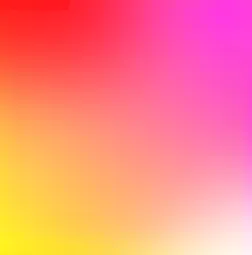
}<div class="myDivC"></div>通过使用盒子阴影和伪元素,可以轻松编辑代码,此处提供了演示。灵感来自Gildas.Tambo的回答(我选择了第二种解决方案——第一种方案在左下角有黑色阴影痕迹,其他解决方案无法在Edge上使用)。
已经测试了以下版本:
简单版 - 在Safari(效果较低但可以接受)、Chrome、Firefox和Edge上运行
中等版 - 在Safari、Chrome、Firefox上运行(在Edge上无法运行)
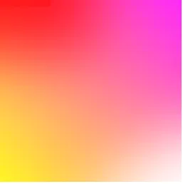
复杂版 - 在Chrome、Edge上运行,在Safari和Firefox上有左上角的“红框”痕迹 - 通过更改.myDivC:before{ ... top: -96% ...}为top: -100%可以减少这种痕迹,但我们会稍微失去一些红色的强度(此处)
下面是三个版本在Chrome上的比较:
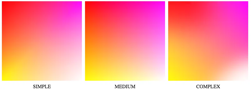
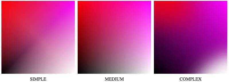
简单解决方案显示出更多的“线性”,中等解决方案具有最好的质量。复杂质量较低:不对称和左上角的红色矩形痕迹——当我们将所有解决方案中的黄色改为黑色时,这一点可以更加清晰地看到- 此处:
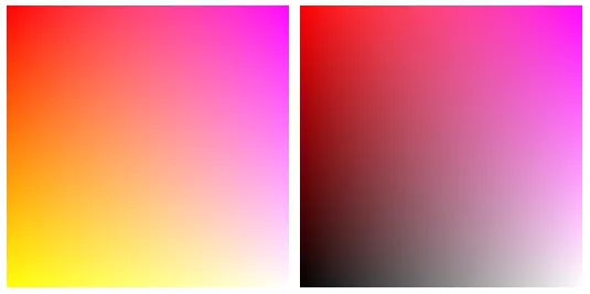
最近我开发了一种既具有高质量,又便携的解决方案 - 这里。
在那个答案中,我比较了三种解决方案 - 但我找到了第四种解决方案,它可以产生高质量的图像,并且可以在Chrome、Safari、Firefox和Edge上运行 - 在这里:
.myDiv {
    width: 256px; height: 256px;
    background-size: 100% 100%;
    background-image: url("data:image/svg+xml;utf8,%3Csvg preserveAspectRatio='none' viewBox='0 0 1 1' version='1.1' xmlns='http://www.w3.org/2000/svg'%3E%3Cdefs%3E%3ClinearGradient id='g'%3E%3Cstop offset='0' stop-color='%23fff' stop-opacity='0'%3E%3C/stop%3E%3Cstop offset='1' stop-color='%23fff' stop-opacity='1'%3E%3C/stop%3E%3C/linearGradient%3E%3Cmask id='m'%3E%3Crect x='0' y='0' width='1' height='1' fill='url(%23g)'%3E%3C/rect%3E%3C/mask%3E%3ClinearGradient id='a' gradientTransform='rotate(90)'%3E%3Cstop offset='0' stop-color='magenta'%3E%3C/stop%3E%3Cstop offset='1' stop-color='white'%3E%3C/stop%3E%3C/linearGradient%3E%3ClinearGradient id='b' gradientTransform='rotate(90)'%3E%3Cstop offset='0' stop-color='yellow'%3E%3C/stop%3E%3Cstop offset='1' stop-color='red'%3E%3C/stop%3E%3C/linearGradient%3E%3C/defs%3E%3Crect x='0' y='0' width='1' height='1' fill='url(%23a)' mask='url(%23m)'%3E%3C/rect%3E%3Crect x='0' y='0' width='1' height='1' fill='url(%23b)' mask='url(%23m)' transform='translate(1,1) rotate(180)'%3E%3C/rect%3E%3C/svg%3E");
}<div class="myDiv"></div>myDiv中的width和height(为了实现这一点,我们在svg中使用preserveAspectRatio='none',另外还使用background-size: 100% 100%;以支持firefox support)。SVG内部使用的颜色是magenta, white, yellow, red,可以更改为任何CSS格式的颜色。为了与MS Edge兼容,我们在解决方案中将以下字符进行转换:"转换为',<转换为%3C ,>转换为%3E ,#转换为%23(详情请参阅here)。
可编辑的示例 这里。下面是 SVG 背景生成器(或者这里)。
function generateCSS() {
  let str = svgData.innerHTML;

  let r = str
    .replace('width="256" height="256" ', "")
    .replace('colorTopLeft', colorTopLeft.value)
    .replace('colorTopRight', colorTopRight.value)
    .replace('colorBottomLeft', colorBottomLeft.value)
    .replace('colorBottomRight', colorBottomRight.value)
    .replace(/> +/g, ">")
    .replace(/ +</g, "<")
    .replace(/>/g, "%3E")
    .replace(/</g, "%3C")
    .replace(/>/g, "%3E")
    .replace(/#/g, "%23")
    .replace(/"/g, "'")
    .replace(/ +/g, " ")
    .replace(/^ +/g, "")
    .split("\n")
    .join("");


  svgToText.value = `background-image: url("data:image/svg+xml;utf8,${r}");`
  lengthCss.innerText = `length: ${r.length}`

  preview.style = svgToText.value + '; display: block;'
}
.topForm {
display: flex;
margin-bottom: 20px;
}
.previewBox {
display: none;
margin-left: 20px;
width: 256px;
height: 256px;
}<div class="topForm">
<div>
<div><input id="colorTopLeft" value="red"> top left</div>
<div><input id="colorTopRight" value="magenta"> top right</div>
<div><input id="colorBottomLeft" value="yellow"> bottom left</div>
<div><input id="colorBottomRight" value="white"> bottom right</div>
<div><button onclick="generateCSS()" style="margin: 20px">Generate CSS</button></div>
</div>
<div id="preview" class="previewBox"></div>
</div>
<textarea cols=70 rows=18 id="svgToText" style="top:20px;" placeholder="output CSS background-image"></textarea>
<div id="lengthCss"></div>
<template id="svgData">
<svg width="256" height="256" preserveAspectRatio='none' viewBox='0 0 1 1' version='1.1' xmlns='http://www.w3.org/2000/svg'>
<defs>
<linearGradient id='g' >
<stop offset='0' stop-color='#fff' stop-opacity='0'/>
<stop offset='1' stop-color='#fff' stop-opacity='1'/>
</linearGradient>
<mask id='m'>
<rect x='0' y='0' width='1' height='1' fill='url(#g)'/>
</mask>
<linearGradient id='a' gradientTransform='rotate(90)'>
<stop offset='0' stop-color='colorTopRight'/>
<stop offset='1' stop-color='colorBottomRight'/>
</linearGradient>
<linearGradient id='b' gradientTransform='rotate(90)'>
<stop offset='0' stop-color='colorBottomLeft'/>
<stop offset='1' stop-color='colorTopLeft'/>
</linearGradient>
</defs>
<rect x='0' y='0' width='1' height='1' fill='url(#a)' mask='url(#m)'/>
<rect x='0' y='0' width='1' height='1' fill='url(#b)' mask='url(#m)' transform='translate(1,1) rotate(180)'/>
</svg>
</template>通过使用 mask-image 和线性渐变,我们可以实现一个无缝的四个角都有渐变的效果,而只需要一个 ::after 伪元素。
HTML
<div id="quad">
</div>
SASS
@mixin QuadVertexColors($v0, $v1, $v2, $v3) {

  background: linear-gradient(to bottom, $v0, $v2);

  &::after {

    content: "";
    position: absolute;
    width: inherit;
    height: inherit;
    background: linear-gradient(to bottom, $v1, $v3);
    -webkit-mask-image: linear-gradient(to left, white, transparent);
  }
}

body {

  background-color: #111111;
  padding: 0;
  margin: 0;

  #quad {

    $size: 100vh;

    width: $size;
    height: $size;

    @include QuadVertexColors(red, magenta, yellow, white);
  }
}