如何将两种不同尺寸的图片排列成一个正方形网格?

5

我正在尝试使用非表格的CSS方法来实现以下内容:

design

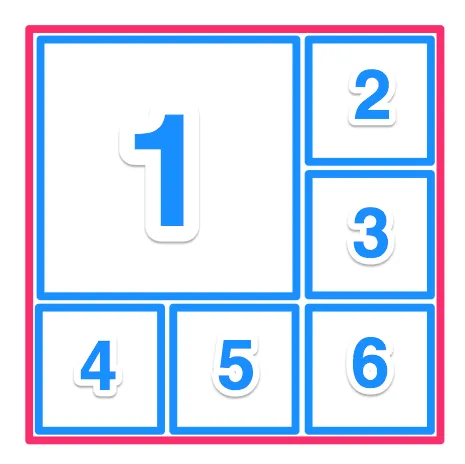
我需要解决的一个问题是,图片的大小可能不同,最大可以达到512x512,但整个元素应该保持1:1的纵横比。

我尝试将所有图片向左浮动,并设置

.image {
  width: 33%;
  height: 33%;
}

除了第一个,我将其设置为width:66%; height:66%
我还尝试将它们包装在div中,以使定位更容易:
<div class="all-the-images">
  <div class="image-row1">
    <div class="image-big">
      <div class="image"><img src="http://placehold.it/498x512" /></div>
    </div>
    <div class="image-right">
      <div class="image"><img src="http://placehold.it/313x313" /></div>
      <div class="image"><img src="http://placehold.it/498x512" /></div>
    </div>
  </div>
  <div class="image-bottom">
    <div class="image"><img src="http://placehold.it/512x234" /></div>
    <div class="image"><img src="http://placehold.it/234x234" /></div>
    <div class="image"><img src="http://placehold.it/234x512" /></div>
  </div>
</div>

http://codepen.io/luckydonald/pen/dOwNGX(使用 less)
https://jsfiddle.net/luckydonald/96hqds80/(生成的 css)

但是不同的图片尺寸会破坏行布局。


使用百分比缩放图像以恢复其原始大小。您需要在 img 标签上设置宽度和高度属性,以将图像缩放到1:1的比例。 - Alic
基本上,通过设置这两个属性,您正在表示图像的大小只能与其原始大小相同。百分比仅相对于其原始大小。 - Alic
1
叹气。百分比是相对于图像的大小。因此,如果您有一个200400的图像,通过设置width: 50%; height: 50%,您将得到一个100200的图像,要获得1:1的图像,您需要设置width: 100%; height: 50%。因此,您最好通过JavaScript来完成这个操作。在加载图像时获取其大小,并调整其大小为1:1。 - Alic
一个不是1:1的图像,你想让它发生什么?你想要它被拉伸吗?还是你想让它有width: 100%并且垂直地坐在它的单元格中间? - Trevor Nestman
@TrevorNestman 如果它更小,它应该居中。不过我目前是在服务器端处理这个问题。 - luckydonald
显示剩余3条评论
4个回答

2
这里有一个flexbox的解决方案。仅支持IE11及以上版本,除非您使用shim

.flex-container {
  display: flex;
  background: #eee;
  margin: 0 auto;
  flex: 1;
  width: 100%;
}
.flex-container.vert {
  flex-direction: column;
}
.flex-container.outer {
  width: 30vw;
  height: 30vw;
}
.flex-item {
  background: tomato;
  flex: 1;
}
.flex-item:nth-child(2n) {
  background: pink;
}
.flex-item img {
  width: 100%;
  height: 100%;
}
.double {
  flex: 2;
  background: lightgreen;
}
<div class="flex-container outer vert">
  <div class="flex-container double">
    <div class="flex-item double">
      <img src="http://lorempixel.com/800/800/nature/1" />
    </div>

    <div class="flex-container vert">
      <div class="flex-item">
        <img src="http://lorempixel.com/800/800/nature/2" />
      </div>
      <div class="flex-item">
        <img src="http://lorempixel.com/800/800/nature/3" />
      </div>
    </div>
  </div>

  <div class="flex-container">
    <div class="flex-item">
      <img src="http://lorempixel.com/800/800/nature/4" />
    </div>
    <div class="flex-item">
      <img src="http://lorempixel.com/800/800/nature/5" />
    </div>
    <div class="flex-item">
      <img src="http://lorempixel.com/800/800/nature/6" />
    </div>
  </div>
</div>


1
我没有彻底测试或优化,但使用CSS的tabletable-rowtable-cell属性如何?

span {
 border: 1px solid blue;
}
<div style="width:200px; height: 200px; display: table;">
<div display="table-row">
 <span style="width: 66%; height: 66%; display: table-cell">
  <img style="width: 100%" src="http://placehold.it/498x512" />
 </span>
 <span style="width: 33%; display: table-cell; vertical-align: top;">
  <img style="width: 100%;" src="http://placehold.it/512x512" />
  <img style="width: 100%;" src="http://placehold.it/512x512" />
 </span>
</div>
<div display="table-row">
 <span style="width: 33%; display: table-cell; vertical-align: top;">
  <img style="width: 100%;" src="http://placehold.it/512x512" />
 </span>
 <span style="width: 33%; display: table-cell; vertical-align: top;">
  <img style="width: 100%;" src="http://placehold.it/512x512" />
 </span>
 <span style="width: 33%; display: table-cell; vertical-align: top;">
  <img style="width: 100%;" src="http://placehold.it/512x512" />
 </span>
</div>
</div>


https://jsfiddle.net/luckydonald/yp8cb6hk/1/ 当使用不同大小的图像时,第六个元素仍然表现出奇怪的问题。 - luckydonald

1

好的...不确定您是否会很快回到这个问题。这是我使用浮动(就像您所谈论的那样)所做的。我有一些不成比例的图像设置为width: 100%height: auto。同样,我不确定您希望发生什么对于不完美的正方形图像(1:1比例)。

.allimages {
  width: 90vw;
  height: 90vw;
  margin: 0;
  padding: 0;
  box-sizing: border-box;
  background: #f3f3f3;
}
.image-container {
  display: inline-block;
  float: left;
  height: 33.333%;
  width: 33.333%;
  margin: 0;
  padding: 0;
  overflow: hidden;
  background: #222;
  box-sizing: border-box;
}

.image-container.big {
  height: 66.655%;
  width: 66.655%;
}
.image-container img {
  width: 100%;
  height: auto;
}
<div class="allimages">
  <div class="image-container big">
    <image src="http://lorempixel.com/700/700/cats"/>
  </div>
  <div class="image-container">
    <image src="http://lorempixel.com/400/400/sports"/>
  </div>
  <div class="image-container">
    <image src="http://lorempixel.com/500/500/food"/>
  </div>
  <div class="image-container">
    <image src="http://lorempixel.com/500/500/sports"/>
  </div>
  <div class="image-container">
    <image src="http://lorempixel.com/400/400/food"/>
  </div>
  <div class="image-container">
    <image src="http://lorempixel.com/500/700/sports"/>
  </div>
</div>


我目前正在确保它们是服务器端的正方形图像。 - luckydonald

-1

如果您不喜欢表格CSS,也可以这样做:

<div class="all-the-images">
  <div class="image-row1">
    <div class="image-big">
      <img src="http://placehold.it/498x512" />
    </div>
    <div class="image-right">
      <img src="http://placehold.it/313x313" />
      <img src="http://placehold.it/498x512" />
    </div>
  </div>
  <div class="image-row2">
    <img src="http://placehold.it/512x234" />
    <img src="http://placehold.it/234x234" />
    <img src="http://placehold.it/234x512" />
  </div>
</div>

.all-the-images {
  height: 300px;
  width: 300px;
  background-color: green;
}
img {
  max-width: 100%;
  max-height: 100%;
  float: left;
}
.all-the-images .image-row1 {
  height: 66.66666667%;
}
.all-the-images .image-row1 .image-big {
  width: 66.66666667%;
  height: 100%;
  float: left;
}
.all-the-images .image-row1 .image-right {
  width: 33%;
  height: 100%;
  float: left;
}
.all-the-images .image-row2 {
  height: 33.33333333%;
}
.all-the-images .image-row2 img {
  max-width: 33.33333333%;
}

https://jsfiddle.net/arleonard54/yu3Ls4zL/


网页内容由stack overflow 提供, 点击上面的
可以查看英文原文,
原文链接