button {
  background: none;
  border: 0;
  box-sizing: border-box;
  margin: 1em;
  padding: 1em 2em;
  box-shadow: inset 0 0 0 2px #f45e61;
  color: #f45e61;
  font-size: inherit;
  font-weight: 700;
  position: relative;
  vertical-align: middle;
}
button::before, button::after {
  box-sizing: inherit;
  content: " ";
  position: absolute;
  width: 100%;
  height: 100%;
}
.draw {
  transition: color 0.25s;
}
.draw::before, .draw::after {
  border: 2px solid transparent;
  width: 0;
  height: 0;
  transition: width 1.25s ease-out 1.25s, height 1.25s ease-out 1.25s;

}
.draw::before {
  top: 0;
  left: 0;
}
.draw::after {
  bottom: 0;
  right: 0;
}
.draw:hover {
  color: #60daaa;
}
.draw:hover::before, .draw:hover::after {
  width: 100%;
  height: 100%;
}
.draw:hover::before {
  border-top-color: #60daaa;
  border-right-color: #60daaa;
  transition: width 0.25s ease-out, height 0.25s ease-out 0.25s;
}
.draw:hover::after {
  border-bottom-color: #60daaa;
  border-left-color: #60daaa;
  transition: border-color 0s ease-out 0.5s, width 0.25s ease-out 0.5s, height 0.25s ease-out 0.75s;
}<section class="buttons">
<button class="draw">Draw</button>
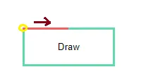
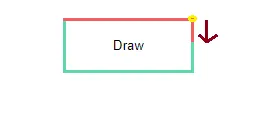
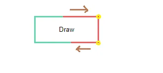
</section>我想能够在几秒钟后“反转”边框颜色更改。基本上,当相反的边框颜色更改时,我希望更改边框颜色:
- 上边框更改颜色 - 右侧边框更改颜色 - 底部边框更改颜色和上部边框返回其原始颜色 - 左边框更改颜色和右边框返回其原始颜色 - 上边框更改颜色和底部边框返回其原始颜色 - 右边框更改颜色和左边框返回其原始颜色,等等
现在我只能更改颜色,但不知道如何“反转”它。我还希望这个过渡无限循环,但我不知道从哪里开始。有什么建议吗?