我需要在横屏时将页面的视口宽度设置为950px,在竖屏时设置为630px。这些像素宽度非常死板。
我正在使用CSS媒体查询来根据方向调整DOM内容的宽度。
我正在监听JS中的方向更改事件,在方向更改时调整视口大小。
初始页面加载后(无论是竖屏还是横屏),一切看起来都很好。
然而,在方向更改后,移动Safari保留先前的比例设置,而不是适应屏幕的视口。双击或连续两次点击可解决此问题。但我需要此过程自动进行。
我已经附上了源代码,上传到演示网址。
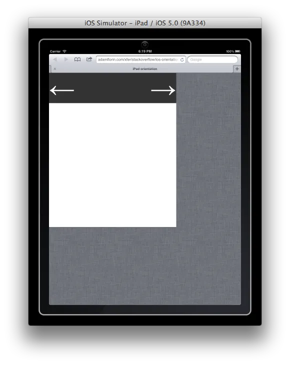
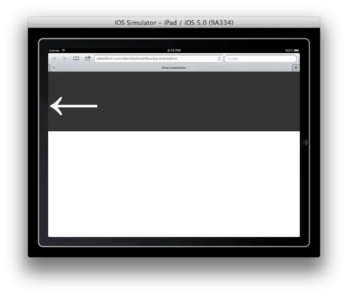
以下是方向更改后拍摄的屏幕截图:从横屏到竖屏,从竖屏到横屏。
如何强制Safari自动将视口宽度设置为屏幕宽度?或者我的做法是否有误?
更改视口中的各种比例设置没有帮助。将maximum-scale=1.0或initial-scale=1.0设置为覆盖我的width,将width设置为device-width(即在我的iPad 2上为1024或768),留下死边距。设置minimum-scale=1.0似乎没有任何作用。
<!DOCTYPE html>
<html>
<head>
<title>iPad orientation</title>
<meta name="viewport" content="user-scalable=yes">
<script src="jquery-1.4.2.min.js" type="text/javascript"></script>
<script type="text/javascript" charset="utf-8">;
/**
* update viewport width on orientation change
*/
function adapt_to_orientation() {
// determine new screen_width
var screen_width;
if (window.orientation == 0 || window.orientation == 180) {
// portrait
screen_width = 630;
} else if (window.orientation == 90 || window.orientation == -90) {
// landscape
screen_width = 950;
}
// resize meta viewport
$('meta[name=viewport]').attr('content', 'width='+screen_width);
}
$(document).ready(function() {
// bind to handler
$('body').bind('orientationchange', adapt_to_orientation);
// call now
adapt_to_orientation();
});
</script>
<style type="text/css" media="screen">
body {
margin: 0;
}
#block {
background-color: #333;
color: #fff;
font-size: 128px;
/* landscape */
width: 950px;
}
#block .right {
float: right
}
@media only screen and (orientation:portrait) {
#block {
width: 630px;
}
}
</style>
</head>
<body>
<div id="block">
<div class="right">→</div>
<div class="left">←</div>
</div>
</body>
</html>