A    B
A    B
A    X
A    B
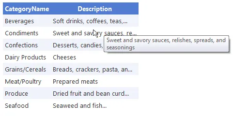
我有一个包含表格的容器块,其宽度为400px。当浏览器宽度小于421px时,包含块的宽度会切换到95%。类型为“A”和“B”的单元格包含简单文本。有一个单元格包含应用了white-space:nowrap的链接。
我需要表格自行确定其尺寸(因此不使用table-layout:fixed-width),但在确定第二列的宽度时不考虑单元格“X”。如果单元格“X”的内容不适合,则可以隐藏其内容。
我已经尝试在各种不同的元素上应用width:100%和overflow:hidden,但都没有成功。
html
<table>
    <tr>
        <th style="vertical-align:bottom;">
            <figure>
                <div class="minical-mo">month</div>
                <div class="minical-da">date</div>
            </figure>
        </th>
        <td style="vertical-align:bottom;"><h2>summary</h2></td>
    </tr>
    <tr>
        <th class="space">Calendar</th>
        <td class="space"></td>
    </tr>
    <tr>
        <th class="space">Date</th>
        <td class="space">date</td>
    </tr>
    <tr>
        <th>Start Time</th>
        <td>time</td>
    </tr>
    <tr>
        <th>End Time</th>
        <td>time</td>
    </tr>
    <tr>
        <th>Location</th>
        <td>location</td>
    </tr>
    <tr>
        <th class="space">Attachment</th>
        <td class="space link"><a href="link">link</a></td>
    </tr>
    <tr>
        <th class="space">Description</th>
        <td class="space">long desc</td>
    </tr>
</table>
scss
table{
    width:100%;
    margin:1em 0;
    th{
        color:$c_modal;
        text-align:right;
        font-size:.85em;
        padding: 3px;
        vertical-align:top;
        &.space{
            padding-top:1em;
        }
        figure{
            float:right;
            margin:0;
            .minical-mo{
                width:60px;
                height:15px;
                font-size:11px;
                line-height:15px;
                text-align:center;
                color:white;
                background-color:$c_main;
            }
            .minical-da{
                width:60px;
                height:45px;
                font-size:35px;
                line-height:45px;
                text-align:center;
                color:black;
                background-color:white;
                border-radius:0 0 5px 5px;
                -webkit-box-shadow: 0 5px 12px -5px $c_dk;
                -moz-box-shadow: 0 5px 12px -5px $c_dk;
                box-shadow: 0 5px 12px -5px $c_dk;
            }
        }
    }
    td{
        color:black;
        font-size:.85em;
        padding:3px;
        vertical-align:top;
        &.space{
            padding-top:1em;
        }
        p{
            margin-bottom:1em;
            line-height:1.2;
        }
        &.link{
            overflow:hidden;
            a{
                                    width:100%;
                overflow:hidden;
            }
        }
    }
}
max-width属性吗? - VoidKingmax-width,但它也无法正常工作。 - Steven L Smith