export const CircleProgress = withStyles(() => ({
  root: {
    width: '262px !important',
    height: '262px !important',
    transform: 'rotate(220deg) !important',
    color: 'blue',
  },
}))(CircularProgress);
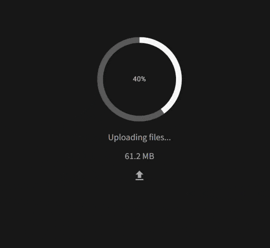
我该如何更改路径的颜色?
export const CircleProgress = withStyles(() => ({
root: {
width: '262px !important',
height: '262px !important',
transform: 'rotate(220deg) !important',
color: 'blue',
},
}))(CircularProgress);
const size = 120,
      thickness = 9,
      value = 22,
      secColor = '#d1d1d1';

const progressSx = {
   borderRadius: '50%',
   boxShadow: `inset 0 0 0 ${thickness/44*size}px ${secColor}`,
};

<CircularProgress variant='determinate' size={size} thickness={thickness} value={value} sx={progressSx} />
function App() {
    const { CircularProgress } = MaterialUI;

    const size = 120,
      thickness = 9,
      value = 22,
      secColor = '#d1d1d1';

    const progressSx = {
        borderRadius: '50%',
        boxShadow: `inset 0 0 0 ${thickness/44*size}px ${secColor}`,
    };

    return (
        <div className="App">
            <CircularProgress variant='determinate' size={size} thickness={thickness} value={value} sx={progressSx} />
        </div>
    );
  }

const container = document.getElementById('root');
const root = ReactDOM.createRoot(container);
root.render(<App />);
<!DOCTYPE html>
<html>
<head>
<script src="https://unpkg.com/react@18/umd/react.production.min.js" crossorigin></script>
<script src="https://unpkg.com/react-dom@18/umd/react-dom.production.min.js" crossorigin></script>
<script src="https://unpkg.com/@babel/standalone/babel.min.js"></script>
<script src="https://unpkg.com/@mui/material@latest/umd/material-ui.production.min.js"></script>
</head>
<body>
<div id="root"></div>
<script type="text/babel" src="./script.js"></script>
</body>
</html>border-radius: 50%;
box-shadow: inset 0 0 1px 5px $color;
background-color: transparent;
只需更改扩散半径即可。
<Box className="box-wrapper" sx={{ position: "relative", display: "inline-flex" }}>
    <CircularProgress
        variant="determinate"
        thickness={3}
        {...props}
        className={"foreground"}
    />
    <CircularProgress
        variant="determinate"
        value={100}
        className={"background"}
        thickness={3}
    />
    <Box
        sx={{
            top: 0,
            left: 0,
            bottom: 0,
            right: 0,
            position: "absolute",
            display: "flex",
            alignItems: "center",
            justifyContent: "center",
        }}>
        <Typography
            variant="caption"
            component="div"
            color="text.secondary">{`${Math.round(props.value)}%`}</Typography>
    </Box>
</Box>
.background {
    position: absolute;
    z-index: 1;
    right: 0;
    svg {
        color: var(--color_300);
        circle {
            stroke-dashoffset: 0px !important;
        }
    }
}
.foreground {
    position: relative;
    z-index: 2;
    svg {
        color: var(--color_050);
        circle {
        }
    }
}