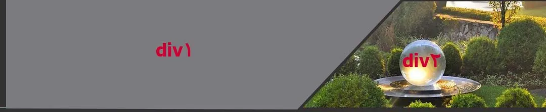
如何使用HTML、CSS和Bootstrap框架实现下图的效果?
我需要两个相邻的梯形形状的div(或者用对角线分隔)。两个div都需要有边框。
我需要两个相邻的梯形形状的div(或者用对角线分隔)。两个div都需要有边框。

:after来实现此效果:
/* Apply styles to both DIVs */
.container > div {
  width: 50%;
  float:left;
  font-weight: bold;
  padding-left: 10px;
  /* include padding in the height/width */
  box-sizing: border-box;
  margin: 0;
}

.container {
/* One way to make the DIV height extend to full heihgt of `float:left` DIVs inside it. Not the only way */
  clear: both;
}

.container div:first-child {
  background: #66ff66;
  /* The triangle will be position:absolute, so it requires a `position:relative` parent */
  position: relative;
  /* We are drawing a full rectangle later, so we hide the rest of it */
  overflow: hidden;
}

.container div:last-child {
  background: #ff6666;
}

.container div:first-child:after {
  position: absolute;
  display: block;
  content: ' ';
  padding: inherit;
  box-sizing: border-box;

  /* Change below units (you can use px not just em)
    to make the line  become at different angles */
  border-top: 1.3em solid transparent;
  border-bottom: 1.3em solid transparent;
  border-right: 1.3em solid #ff6666;

  right: 0;
  top: 0;
}<div class="container">
<div>div١</div>
<div>div٢</div>
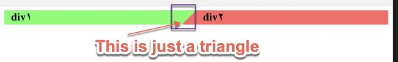
</div>但是根据您在评论中的要求,您想要一个使用div2创建三角形的不同答案,那么这里是:
/* Apply styles to both DIVs */
.container > div {
  width: 50%;
  float:left;
  font-weight: bold;


  /* include padding in the height/width */
  box-sizing: border-box;
  margin: 0;
}

.container {
/* One way to make the DIV height extend to full heihgt of `float:left` DIVs inside it. Not the only way */
  clear: both;
}

.container div:first-child {
  background: #66ff66;
  padding-left: 10px;

}

.container div:last-child {
  background: #ff6666;
  position: relative;
  padding-left: 1.3em;
}

.container div:last-child:before {
  position: absolute;
  content: '';.
  width: 0;
  height: 0;

  box-sizing: border-box;

  /* Change below units (you can use px not just em)
    to make the line  become at different angles */
  border-top: 1.3em solid #66ff66;
  border-bottom: 1.3em solid transparent;
  border-right: 1.3em solid transparent;

  top: 0;
  left: 0;
}<div class="container">
<div>div١</div>
<div>div٢</div>
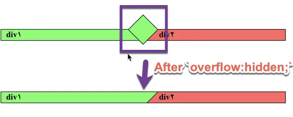
</div>你在评论中展示的图片包括真实的边框,这需要改变方法。新方法仍然使用:before,但加入了边框,并将其旋转45度。
这个想法基于一个例子:https://kilianvalkhof.com/2017/design/sloped-edges-with-consistent-angle-in-css/
想象一下:
这里是代码:
/* Apply styles to both DIVs */
.container > div {
  width: 50%;
  float:left;
  font-weight: bold;


  /* include padding in the height/width */
  box-sizing: border-box;
  margin: 0;
}

.container {
/* One way to make the DIV height extend to full heihgt of `float:left` DIVs inside it. Not the only way */
  clear: both;
}

.container div:first-child {
  background: #66ff66;
  padding-left: 10px;
  border: 1px solid;
  border-right: none;
}

/*
  The following assumes diemnsions 1.3em * 1.3em
  Your real case can change the number
*/

.container div:last-child {
  background: #ff6666;
  position: relative;
  border: 1px solid;
  border-left: none;
  padding-left: calc(1.5 * 1.3em);
  overflow: hidden;
}

.container div:last-child:before {
  position: absolute;
  content: '';
  width: calc(2 * 1.3em);
  height: calc(2 * 1.3em);

  box-sizing: border-box;
  background: #66ff66;

  border: 1px solid ;
  transform:rotate(45deg);

  margin-top: -1.3em;
  margin-left: -1.3em;
  left: 0;
  top: 0;
}<div class="container">
<div>div١</div>
<div>div٢</div>
</div>只需像以下代码片段一样使用 border-right,然后查看结果:
.parent{
  width: 100%;
  display: flex;
  background-color: #01579b;
}

.div1 {
  width: 30%;
  border-bottom: 100px solid #000;
  border-right: 50px solid transparent;
}

.div2 {
  width: 70%;
  height: 100px;
}<div class="parent">
<div class="div1"></div>
<div class="div2"></div>
</div>