我正在使用ggplot2制作一个条形图,并且有一组数据的计数为零,我希望能够显示它。我记得以前在HERE上看到过相关内容,所以想到使用
例如,在下面的代码中,type8~group4没有例子。我仍想让图表显示空的区域来表示零计数,而不是消除这个条形。我该怎么做?
scale_x_discrete(drop=F)。然而,在dodged bars中貌似不起作用。那么,如何使零计数的条形也能显示呢?例如,在下面的代码中,type8~group4没有例子。我仍想让图表显示空的区域来表示零计数,而不是消除这个条形。我该怎么做?
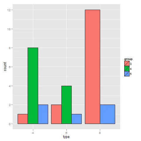
mtcars2 <- data.frame(type=factor(mtcars$cyl),
    group=factor(mtcars$gear))

m2 <- ggplot(mtcars2, aes(x=type , fill=group))
p2 <- m2 + geom_bar(colour="black", position="dodge") +
        scale_x_discrete(drop=F)
p2
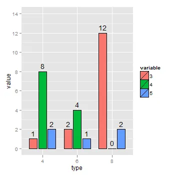
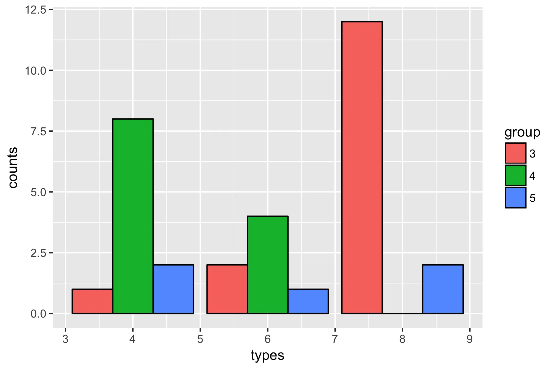
preserve = "single"保住了我的命 ;) - SeGa