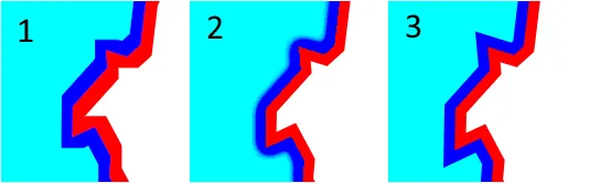
使用SVG滤镜创建内部描边

8
我希望在SVG路径上模拟“内描边”。 
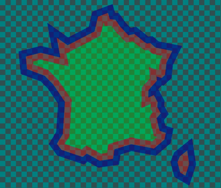
我有一个SVG地图,其中包含多个复杂路径(国家),每个路径都有不同的填充颜色和描边。 
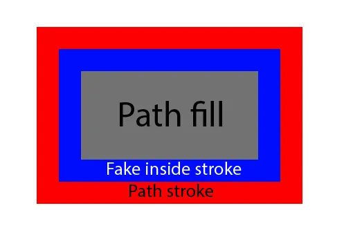
我想在第一个路径中添加一个“虚假的内描边”。 我使用内阴影技巧(高斯模糊滤镜)完成了一些工作,但无法使其“非模糊”。 理想的解决方案是作为SVG过滤器,因此我可以通过JS动态应用它,而无需更改路径或操作DOM。

非常感谢! 编辑 1: 到目前为止,我尝试了这个技巧,但是假阴影有时会覆盖在描边上,而且总是模糊的,所以我不确定这是最好的方法...

  <svg xmlns="http://www.w3.org/2000/svg" xmlns:xlink="http://www.w3.org/1999/xlink" width="150" height="150" style="transform:scale(2);transform-origin:0 0 ">
     <defs>
  <filter id='inset' x='-50%' y='-50%' width='200%' height='200%'>
  
    <feFlood fill-color="black"/>
    <feComposite in2="SourceAlpha" operator="out"/>
    
    <feGaussianBlur stdDeviation='10' edgeMode="none" />
    <feOffset dx='0' dy='0' result='offsetblur'/>
    <feFlood flood-color='#00ff00' result='color'/>
    <feComposite in2='offsetblur' operator='in'/>
    <feComposite in2='SourceAlpha' operator='in' />
    <feMerge>
      <feMergeNode in='SourceGraphic'/>
        <feMergeNode/>
    </feMerge>
  </filter> 
       
 </defs>
  
<path class="st0" d="M144.7,126.2l-2.8,8.8l-3.9-2.3l-2-7.7l1.7-4.3l5.5-4.4L144.7,126.2z M93.5,24.2l6,6.3l4.4-1l7.5,6l1.9,1.1
 l2.5-0.3l4,3.4l12.3,2.4l-4.3,8.9l-1.1,9.1l-2.4,2.2l-3.9-1.2l0.3,3.2l-6.3,7l-0.1,5.6l4.1-1.9l2.9,5.4L121,84l2.5,4.6l-3,3.7
 l2.2,9.3l4.6,1.5l-1,5.1l-7.8,6.6l-16.9-3.2l-12.5,3.8l-1,7l-9.9,1.5l-9.6-5.3l-3.1,2.5l-15.8-5.3l-3.4-4.6l4.4-7.1l1.6-24.1
 l-8.8-13l-6.3-6.4l-13.1-4.9l-0.9-9.4l11.1-2.8L48.9,47l-2.7-14.8l8.1,5.7l20-10.3l2.6-11l7.5-2.8l1.3,4.8l4,0.2L93.5,24.2z" stroke-width="1" fill="#00ffff"  stroke="#FF0000" filter="url(#inset)"/>
</svg>

4个回答

7
这个代码可以实现你想要的效果。请注意,它需要描边是一个颜色,且这个颜色不同于任何填充颜色(在这种情况下是100%红色-你可以将描边颜色更改为任何你想要的,但滤镜会变得更加复杂)。
你可以通过修改最后一个feColorMatrix的最后一列中的值来调整“假”内描边的颜色。目前,它是100%蓝色。(您也可以使用feMorphology来创建此效果-如def的答案所示-但这种方法不会保留原始的斜切接合。)

  <svg xmlns="http://www.w3.org/2000/svg" xmlns:xlink="http://www.w3.org/1999/xlink" width="150" height="150" style="transform:scale(2);transform-origin:0 0 ">
     <defs>
  <filter id='fake-stroke' x='-50%' y='-50%' width='200%' height='200%' color-interpolation-filters="sRGB">
  
   <!-- select just the red outline and zero out the opacity of everything that's not 100% red. -->
   <feColorMatrix type="matrix" values="1 0 0 0 0 
                                        0 0 0 0 0 
                                        0 0 0 0 0 
                                        255 -255 -255 -254 0" result="outline-only"/>
    <feGaussianBlur stdDeviation="1"/>

   <!-- select just the blur - not the original stroke. -->
    <feComposite operator="out" in2="outline-only"/>

   <!-- select just the blur that overlaps the original content -->
    <feComposite operator="in" in2="SourceGraphic" />

   <!-- increase its opacity to 100% except the most blurred - to fake anti-aliasing -->
    <feComponentTransfer>
      <feFuncA type="table" tableValues="0 1 1 1 1 1 1 1 1 1 1 1 1 1 1 1 1 1 1 1 1 1 1 1"/>
    </feComponentTransfer>

   <!-- change the color of the fake stroke to the desired value -->
    <feColorMatrix type="matrix" values ="0 0 0 0 0
                                          0 0 0 0 0
                                          0 0 0 0 1 
                                          0 0 0 1 0"/>
   <!-- put it on top of the original -->
    <feComposite operator="over" in2="SourceGraphic"/>

  </filter> 
       
 </defs>
  
<path class="st0" d="M144.7,126.2l-2.8,8.8l-3.9-2.3l-2-7.7l1.7-4.3l5.5-4.4L144.7,126.2z M93.5,24.2l6,6.3l4.4-1l7.5,6l1.9,1.1
 l2.5-0.3l4,3.4l12.3,2.4l-4.3,8.9l-1.1,9.1l-2.4,2.2l-3.9-1.2l0.3,3.2l-6.3,7l-0.1,5.6l4.1-1.9l2.9,5.4L121,84l2.5,4.6l-3,3.7
 l2.2,9.3l4.6,1.5l-1,5.1l-7.8,6.6l-16.9-3.2l-12.5,3.8l-1,7l-9.9,1.5l-9.6-5.3l-3.1,2.5l-15.8-5.3l-3.4-4.6l4.4-7.1l1.6-24.1
 l-8.8-13l-6.3-6.4l-13.1-4.9l-0.9-9.4l11.1-2.8L48.9,47l-2.7-14.8l8.1,5.7l20-10.3l2.6-11l7.5-2.8l1.3,4.8l4,0.2L93.5,24.2z" stroke-width="2" fill="#00ffff"  stroke="#FF0000" filter="url(#fake-stroke)"/>
</svg>


非常感谢,我尝试使用它,但在JS中动态更新矩阵值时失败了,另一种解决方案对我的用例更为简单明了。 - Flunch

7
如果您想要清晰的形状,应该使用SVG变换而不是将CSS变换应用于SVG元素。
当您绘制“内部描边”时,feMorphorogy元素非常有用。这可以减少(或增加)目标形状的绘制区域,从而您可以绘制“假内/外部”描边。

<svg xmlns="http://www.w3.org/2000/svg" 
  xmlns:xlink="http://www.w3.org/1999/xlink" width="300" height="300">
  <defs>
    <filter id='inset' x='-50%' y='-50%' width='200%' height='200%'>
      <!--outside-stroke-->
      <feFlood flood-color="red" result="outside-color"/>
      <feMorphology in="SourceAlpha" operator="dilate" radius="2"/>
      <feComposite in="outside-color" operator="in" result="outside-stroke"/>
      <!--inside-stroke-->
      <feFlood flood-color="blue" result="inside-color"/>
      <feComposite in2="SourceAlpha" operator="in" result="inside-stroke"/>
      <!--fill-area-->
      <feMorphology in="SourceAlpha" operator="erode" radius="2"/>
      <feComposite in="SourceGraphic" operator="in" result="fill-area"/>
      <!--merge graphics-->
      <feMerge>
        <feMergeNode in="outside-stroke"/>
        <feMergeNode in="inside-stroke"/>
        <feMergeNode in="fill-area"/>
      </feMerge>
    </filter>
  </defs>
  <g transform="scale(2)">
    <path class="st0" d="M144.7,126.2l-2.8,8.8l-3.9-2.3l-2-7.7l1.7-4.3l5.5-4.4L144.7,126.2z M93.5,24.2l6,6.3l4.4-1l7.5,6l1.9,1.1
  l2.5-0.3l4,3.4l12.3,2.4l-4.3,8.9l-1.1,9.1l-2.4,2.2l-3.9-1.2l0.3,3.2l-6.3,7l-0.1,5.6l4.1-1.9l2.9,5.4L121,84l2.5,4.6l-3,3.7
  l2.2,9.3l4.6,1.5l-1,5.1l-7.8,6.6l-16.9-3.2l-12.5,3.8l-1,7l-9.9,1.5l-9.6-5.3l-3.1,2.5l-15.8-5.3l-3.4-4.6l4.4-7.1l1.6-24.1
  l-8.8-13l-6.3-6.4l-13.1-4.9l-0.9-9.4l11.1-2.8L48.9,47l-2.7-14.8l8.1,5.7l20-10.3l2.6-11l7.5-2.8l1.3,4.8l4,0.2L93.5,24.2z"
fill="#00ffff" filter="url(#inset)"/>
  </g>
</svg>


4

我尝试了现有的两个答案,发现它们以混乱的方式改变了内部轮廓的形状。我的解决方案如下,除了最理想的情况下使用SVG滤镜外,它覆盖了要求。我使用了clip-path功能,因为它允许我保留正确的斜角,并且不会导致模糊的插入。

Comparison of existing solutions to my solution

  1. defghi1977的解决方案导致了奇怪的轮廓轮廓,与原始形状不匹配。
  2. Michael Mullany的解决方案导致外部轮廓良好,但内部轮廓严重模糊。
  3. 我的解决方案导致了清晰的轮廓和正确的斜接。

SVG标记

<svg version="1.1" xmlns="http://www.w3.org/2000/svg"
                   xmlns:xlink="http://www.w3.org/1999/xlink"
                   width="600" height="300" viewbox="0 0 300 150">
  <defs>
    <clipPath id="inset1">
      <path id="area1" d="M144.7,126.2l-2.8,8.8l-3.9-2.3l-2-7.7l1.7-4.3l5.5-4.4L144.7,
                          126.2z M93.5,24.2l6,6.3l4.4-1l7.5,6l1.9,1.1l2.5-0.3l4,3.4l
                          12.3,2.4l-4.3,8.9l-1.1,9.1l-2.4,2.2l-3.9-1.2l0.3,3.2l-6.3,7l
                          -0.1,5.6l4.1-1.9l2.9,5.4L121,84l2.5,4.6l-3,3.7l2.2,9.3l4.6,
                          1.5l-1,5.1l-7.8,6.6l-16.9-3.2l-12.5,3.8l-1,7l-9.9,1.5l-9.6
                          -5.3l-3.1,2.5l-15.8-5.3l-3.4-4.6l4.4-7.1l1.6-24.1l-8.8-13l
                          -6.3-6.4l-13.1-4.9l-0.9-9.4l11.1-2.8L48.9,47l-2.7-14.8l8.1,
                          5.7l20-10.3l2.6-11l7.5-2.8l1.3,4.8l4,0.2L93.5,24.2z"/>
    </clipPath>
  </defs>

  <use href="#area1" stroke-width="6" fill="cyan" stroke="blue" clip-path="url(#inset1)"/>
  <use href="#area1" stroke-width="2" fill="none" stroke="red"/>

</svg>


1

唐先生的想法开始迭代,您可能需要进一步分离每行甚至添加无重叠的填充-也许是因为您需要一些透明度或纹理。

如果将形状移动到defs中在给定用例中是可能的,并且交互性并不是必需的,那么可以进一步从中派生出不相交的掩膜,每个掩盖不同的区域:“外边框” (海滩),“内边框” (悬崖),甚至“填充” (内陆):

:root {
  background: dimgray;
  color: snow;
}
svg {
  --a: darkslategray;
  --b: teal;
  background-image: repeating-conic-gradient(var(--a) 0 25%, var(--b) 0 50%);
  background-size: 1em 1em;
}
<svg version="1.1" xmlns="http://www.w3.org/2000/svg" width="600" height="300" viewbox="0 0 300 150">

  <use mask="url(#beach)" fill="darkblue" opacity=".6" href="#canvas" />
  <use mask="url(#cliffs)" fill="red" opacity=".4" href="#canvas" />
  <use mask="url(#inland)" fill="lime" opacity=".3" href="#canvas" />

  <defs>
    <!-- Both "stroke halves" in single stroke-width: -->
    <g id="coast">
      <use href="#shoreline" stroke-width="10" />
    </g>
    <!-- Area with the outer half of the stroke: -->
    <mask id="beach">
      <use href="#coast" stroke="white" />
      <use href="#shoreline" fill="black" />
    </mask>
    <!-- For cutting the outer half of the stroke: -->
    <clipPath id="sea">
      <use href="#shoreline" />
    </clipPath>
    <!-- Area with the inner half of the stroke: -->
    <mask id="cliffs">
      <use href="#coast" stroke="white" clip-path="url(#sea)" />
    </mask>
    <!-- Area inside inner stroke: -->
    <mask id="inland">
      <use href="#coast" stroke="black" fill="white" />
    </mask>
    <!-- Viewport cover: -->
    <rect id="canvas" width="100%" height="100%" />
    <!-- The shape: -->
    <path id="shoreline" d="M144.7,126.2l-2.8,8.8l-3.9-2.3l-2-7.7l1.7-4.3l5.5-4.4L144.7,
                        126.2z M93.5,24.2l6,6.3l4.4-1l7.5,6l1.9,1.1l2.5-0.3l4,3.4l
                        12.3,2.4l-4.3,8.9l-1.1,9.1l-2.4,2.2l-3.9-1.2l0.3,3.2l-6.3,7l
                        -0.1,5.6l4.1-1.9l2.9,5.4L121,84l2.5,4.6l-3,3.7l2.2,9.3l4.6,
                        1.5l-1,5.1l-7.8,6.6l-16.9-3.2l-12.5,3.8l-1,7l-9.9,1.5l-9.6
                        -5.3l-3.1,2.5l-15.8-5.3l-3.4-4.6l4.4-7.1l1.6-24.1l-8.8-13l
                        -6.3-6.4l-13.1-4.9l-0.9-9.4l11.1-2.8L48.9,47l-2.7-14.8l8.1,
                        5.7l20-10.3l2.6-11l7.5-2.8l1.3,4.8l4,0.2L93.5,24.2z"
    />
  </defs>
</svg>

半透明地图图片,覆盖棋盘格图案,描有深蓝和红色线条的大大小小的岛屿轮廓。较大的岛屿内陆填充为绿色。

(致谢:) 请参阅Alex Chan的《在SVG中绘制内/外边框(剪辑和蒙版)》文章,演示了这种技术。


网页内容由stack overflow 提供, 点击上面的
可以查看英文原文,
原文链接