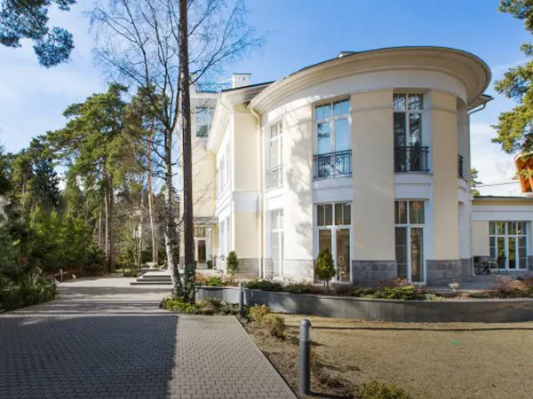
我该如何使用CSS裁剪(600x450)图片并在其周围创建边框?
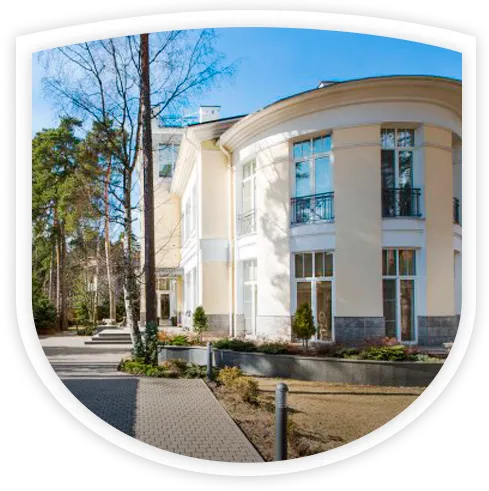
我认为这是使用CSS所能做到的最好效果:
CSS:
img {
    width:400px;
    height:400px;
    border-top-left-radius:50% 50px;
    border-top-right-radius:50% 50px;
    border-bottom-left-radius:50%;
    border-bottom-right-radius:50%;
}
http://jsfiddle.net/andyfurniss/rmc4nuu7/
然后只需添加一个白色边框和一个box-shadow。border-radius 总会有一些曲线,但我知道这并不完全符合您的需求。不过我不确定您是否能够通过纯 CSS 实现更好的效果。 - Andy Furniss<style>
#img{
border-bottom-left-radius: 50%;
border-bottom-right-radius: 50%;
border-top-right-radius: 10%;
border-top-right-radius: 10%;
width: 600px;
height: 450px;
}
</style>
我已更新@Phylogenesis的example以添加边框,阴影并使其响应。
除了不设置固定宽度和高度外,相关代码部分如下:
#mask img {
    margin-left: 50%;
    transform:translate(-50%, 0);
    border-bottom-left-radius:100%;
    border-bottom-right-radius:100%;
}