Flutter中PopupMenuButton的自定义形状

8

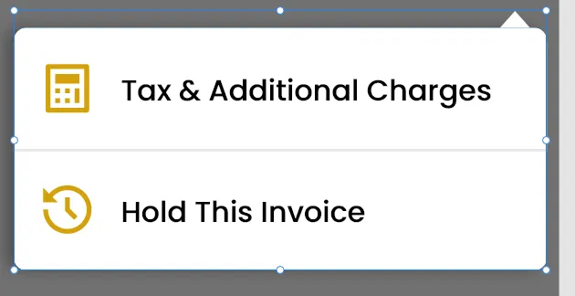
我想要在Flutter中更改PopupMenuButton的形状,并添加一个三角形,如下图所示。我已经在Google上花费了很多时间,但没有任何成果,请帮帮我。我是Flutter的新手,不知道如何更改默认容器,现在它只有一个白色圆角容器,在其顶部未添加白色箭头/三角形。请帮忙解决问题,先感谢您。

 popUpMenu= PopupMenuButton<String>(
     key: _menuKey,
     offset: Offset(50,100),
     padding: EdgeInsets.all(0.0),
     onSelected: (value) {
       if (value == "Tax & Additional Charges") {
         endDrawerController.drawerKey.value =
             EndDrawerKeys.TaxAndAdditionalChargesEndDrawer;
         endDrawerController.scaffoldKey.currentState.openEndDrawer();
         print("Entering in tax");
       } else if (value == "Hold this Invoice") {
         endDrawerController.drawerKey.value =
             EndDrawerKeys.HoldInvoiceEndDrawer;
         endDrawerController.scaffoldKey.currentState.openEndDrawer();
       }
     },
     shape: RoundedRectangleBorder(
         borderRadius: BorderRadius.all(Radius.circular(10.h))),
     itemBuilder: (context) => [
       PopupMenuItem(
         value: "Tax & Additional Charges",
         child: popUpMenuSingleItem(
             icon: AppAssets.DeliveryIcon,
             text: "Tax & Additional Charges",
             topMargin: 15.h),
       ),
       PopupMenuItem(
         value: "Hold this Invoice",
         child: popUpMenuSingleItem(
             icon: AppAssets.DeliveryIcon,
             text: "Hold this Invoice",
             topMargin: 25.h),
       ),
     ],
    );

这是我希望我的PopupMenuButton呈现的方式。 enter image description here

你查看过CustomPaint吗? - ambiguous58
是的,我已经通过CustomPaint创建了三角形,但不知道如何将其包装在PopupMenuButton容器中。我曾经将其包装在PopupMenuButton周围,但三角形被添加到PopupMenu选项按钮上,而该按钮位于应用栏中,这不是我想要的。我希望像上面的图片一样,在PopupMenuButton容器周围添加三角形。 - Majid Ali
2个回答

15
您可以为自定义的PopupMenuButton创建一个形状。
示例...
import 'package:flutter/material.dart';

void main() {
  runApp(MyApp());
}

class MyApp extends StatelessWidget {
  @override
  Widget build(BuildContext context) {
    return MaterialApp(
      debugShowCheckedModeBanner: false,
      home: HomePage(),
    );
  }
}

class HomePage extends StatelessWidget {
  @override
  Widget build(BuildContext context) {
    return Scaffold(
      appBar: AppBar(
        actions: <Widget>[
          PopupMenuButton(
            offset: Offset(0, 50),
            shape: const TooltipShape(),
            itemBuilder: (_) => <PopupMenuEntry>[
              PopupMenuItem(
                  child: ListTile(
                leading: const Icon(Icons.calculate_outlined),
                title: const Text('Tax & Additional Charges'),
              )),
              PopupMenuItem(
                  child: ListTile(
                leading: const Icon(Icons.av_timer_outlined),
                title: const Text('Hold This Invoice'),
              )),
            ],
          ),
        ],
      ),
    );
  }
}

/// I'm using [RoundedRectangleBorder] as my reference...
class TooltipShape extends ShapeBorder {
  const TooltipShape();

  final BorderSide _side = BorderSide.none;
  final BorderRadiusGeometry _borderRadius = BorderRadius.zero;

  @override
  EdgeInsetsGeometry get dimensions => EdgeInsets.all(_side.width);

  @override
  Path getInnerPath(
    Rect rect, {
    TextDirection? textDirection,
  }) {
    final Path path = Path();

    path.addRRect(
      _borderRadius.resolve(textDirection).toRRect(rect).deflate(_side.width),
    );

    return path;
  }

  @override
  Path getOuterPath(Rect rect, {TextDirection? textDirection}) {
    final Path path = Path();
    final RRect rrect = _borderRadius.resolve(textDirection).toRRect(rect);

    path.moveTo(0, 10);
    path.quadraticBezierTo(0, 0, 10, 0);
    path.lineTo(rrect.width - 30, 0);
    path.lineTo(rrect.width - 20, -10);
    path.lineTo(rrect.width - 10, 0);
    path.quadraticBezierTo(rrect.width, 0, rrect.width, 10);
    path.lineTo(rrect.width, rrect.height - 10);
    path.quadraticBezierTo(
        rrect.width, rrect.height, rrect.width - 10, rrect.height);
    path.lineTo(10, rrect.height);
    path.quadraticBezierTo(0, rrect.height, 0, rrect.height - 10);

    return path;
  }

  @override
  void paint(Canvas canvas, Rect rect, {TextDirection? textDirection}) {}

  @override
  ShapeBorder scale(double t) => RoundedRectangleBorder(
        side: _side.scale(t),
        borderRadius: _borderRadius * t,
      );
}

3
非常感谢,你真是太好了。 - Majid Ali
@rrickimaru非常感谢!我有一个疑问,当我们想要将剪辑放在左侧而不是右侧时,我们需要做什么? - Sangeetha Sakthivel
@SangeethaSakthivel 只需在 TooltipShape::getOuterPath(...) 中玩弄 path 的值即可。 - rickimaru

0

试试这个:

class PopMenu extends StatefulWidget {
  @override
  _PopMenuState createState() => _PopMenuState();
}

class _PopMenuState extends State<PopMenu> {
  List<Icon> icons = [
    Icon(Icons.person),
    Icon(Icons.settings),
    Icon(Icons.credit_card),
  ];
  GlobalKey _key = LabeledGlobalKey("button_icon");
  OverlayEntry _overlayEntry;
  Offset _buttonPosition;
  bool _isMenuOpen = false;

  void _findButton() {
    RenderBox renderBox = _key.currentContext.findRenderObject();
    _buttonPosition = renderBox.localToGlobal(Offset.zero);
  }

  void _openMenu() {
    _findButton();
    _overlayEntry = _overlayEntryBuilder();
    Overlay.of(context).insert(_overlayEntry);
    _isMenuOpen = !_isMenuOpen;
  }

  void _closeMenu() {
    _overlayEntry.remove();
    _isMenuOpen = !_isMenuOpen;
  }

  OverlayEntry _overlayEntryBuilder() {
    return OverlayEntry(
      builder: (context) {
        return Positioned(
          top: _buttonPosition.dy + 50,
          left: _buttonPosition.dx - 250,
          width: 300,
          child: _popMenu(),
        );
      },
    );
  }

  Widget _popMenu() {
    return Column(
      children: [
        Align(
          alignment: Alignment.centerRight,
          child: Padding(
            padding: EdgeInsets.only(right: 20),
            child: ClipPath(
              clipper: ArrowClipper(),
              child: Container(
                width: 17,
                height: 17,
                color: Color(0xFFF67C0B9),
              ),
            ),
          ),
        ),
        Container(
          width: 300,
          height: 300,
          decoration: BoxDecoration(
            color: Color(0xFFF67C0B9),
            borderRadius: BorderRadius.circular(4),
          ),
          child: Theme(
            data: ThemeData(
              iconTheme: IconThemeData(
                color: Colors.white,
              ),
            ),
            child: Column(
              mainAxisSize: MainAxisSize.min,
              children: List.generate(
                icons.length,
                (index) {
                  return GestureDetector(
                    onTap: () {},
                    child: Container(
                      width: 300,
                      height: 100,
                      child: icons[index],
                    ),
                  );
                },
              ),
            ),
          ),
        ),
      ],
    );
  }

  @override
  Widget build(BuildContext context) {
    return Scaffold(
      body: Center(
        child: Container(
          key: _key,
          decoration: BoxDecoration(
            color: Color(0xFFF5C6373),
            borderRadius: BorderRadius.circular(4),
          ),
          child: IconButton(
            icon: Icon(Icons.menu),
            color: Colors.white,
            onPressed: () {
              _isMenuOpen ? _closeMenu() : _openMenu();
            },
          ),
        ),
      ),
    );
  }
}

class ArrowClipper extends CustomClipper<Path> {
  @override
  Path getClip(Size size) {
    Path path = Path();
    path.moveTo(0, size.height);
    path.lineTo(size.width / 2, size.height / 2);
    path.lineTo(size.width, size.height);
    return path;
  }

  @override
  bool shouldReclip(CustomClipper<Path> oldClipper) {
    return true;
  }
}

网页内容由stack overflow 提供, 点击上面的
可以查看英文原文,
原文链接