在搜索了很多小时react native的RTL图表后,我发现没有与RTL相关的图表。是否有可用于React Native的RTL图表?
React Native中的RTL图表
3
- Hamza Haider
3
我在互联网上搜索了一下,但是我找不到RTL是什么意思。实时什么?准备学习?根据您接受的答案,我猜它是从右到左,但这似乎不是一个广泛使用的缩写或词组。 - Ben Butterworth
阅读了这个Quora问题之后,我只能假设你有一个阿拉伯语的背景。 - Ben Butterworth
2是的,这用于阿拉伯语和希伯来语内容。 - Hamza Haider
1个回答
4
实际上这很简单。 您可以选择任何图表库,例如此库(用于下面的示例) https://github.com/JesperLekland/react-native-svg-charts
在RTL中,您只需要反转传递给图表的数组的顺序即可: 例如,如果您有:
const data = [50, 10, 30, 20, -10, -20, 0, 25, -5, 10]
然后在RTL中,您希望将此数据传递给您的图表:
const dataRTL = [...data].reverse()
/** [10, -5, 25, 0, -20, -10, 20, 30, 10, 50]  **/
如果您有X轴,还需要反转该轴的数据。
如果要将Y轴放置在右侧,则可以切换组件顺序(请参见下面的示例)。 没有RTL的示例
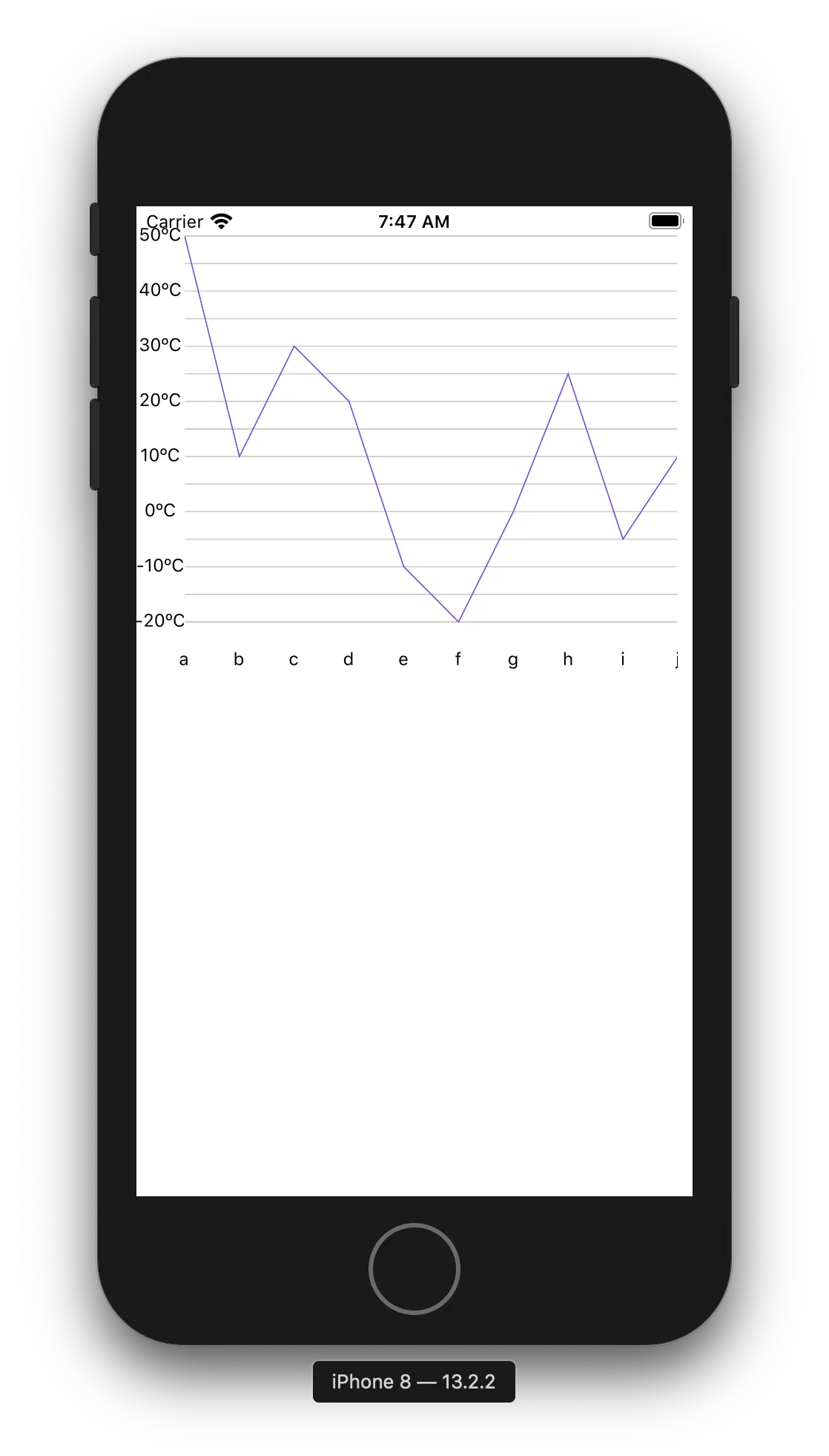
 render() {
    const data = [50, 10, 30, 20, -10, -20, 0, 25, -5, 10]
    const xLabel = ['a', 'b', 'c', 'd', 'e', 'f', 'g', 'h', 'i', 'j']

    return (
      <View>
        <View style={{ height: 300, flexDirection: 'row' }}>
          <YAxis
            data={data}
            contentInset={{ top: 20, bottom: 20 }}
            svg={{ fill: 'black', fontSize: 12 }}
            numberOfTicks={8}
            formatLabel={(value) => `${value}ºC`}
          />
          <LineChart
            style={{ flex: 1, marginRight: 10 }}
            data={data}
            svg={{ stroke: 'rgb(134, 65, 244)' }}
            contentInset={{ top: 20, bottom: 20 }}
          >
            <Grid />
          </LineChart>

        </View>
        <View>
          <XAxis
            style={{ marginHorizontal: 10 }}
            data={data}
            formatLabel={(value, index) => xLabel[index]}
            contentInset={{ left: 22, right: 0 }}
            svg={{ fontSize: 12, fill: 'black' }}
          />
        </View>
      </View>
    )
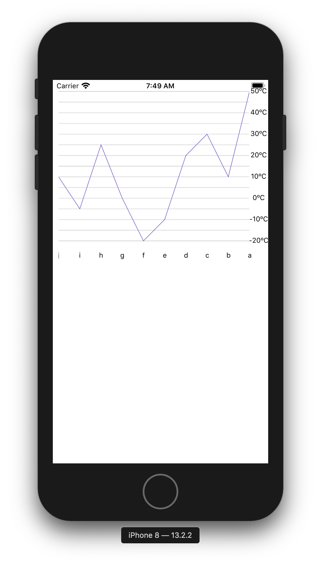
  render() {
    const data = [50, 10, 30, 20, -10, -20, 0, 25, -5, 10]
    const dataRTL = [...data].reverse()
    const xLabel = ['a', 'b', 'c', 'd', 'e', 'f', 'g', 'h', 'i', 'j']
    const xLabelRTL = [...xLabel].reverse()

    return (
      <View>
        <View style={{ height: 300, flexDirection: 'row' }}>
          <LineChart
            style={{ flex: 1, marginLeft: 10 }}
            data={dataRTL}
            svg={{ stroke: 'rgb(134, 65, 244)' }}
            contentInset={{ top: 20, bottom: 20 }}
          >
            <Grid />
          </LineChart>
          <YAxis
            data={dataRTL}
            contentInset={{ top: 20, bottom: 20 }}
            svg={{ fill: 'black', fontSize: 12 }}
            numberOfTicks={8}
            formatLabel={(value) => `${value}ºC`}
          />
        </View>
        <View>
          <XAxis
            style={{ marginHorizontal: 10 }}
            data={dataRTL}
            formatLabel={(value, index) => xLabelRTL[index]}
            contentInset={{ left: 0, right: 22 }}
            svg={{ fontSize: 12, fill: 'black' }}
          />
        </View>
      </View>
    )
(请注意,我还将YAxis组件放在LineChart组件下方,以便将Y轴放在右侧。)
- CR7
网页内容由stack overflow 提供, 点击上面的可以查看英文原文,
原文链接
原文链接