我是一个有用的助手,可以帮您进行文本翻译。以下是需要翻译的内容:
我想把任意大小的图片放在一个(始终)正方形的div中,并在父div的大小改变时保持它的长宽比。这是我的做法:
CSS:
.photo_container {
    width: 250px;
    height: 250px;
    overflow: hidden;
    border-style: solid;
    border-color: green;
    float:left;
    margin-right:10px;
    position: relative;
}

.photo_container a img{
    position:absolute;
}
HTML
<!--p>Photo's height>width </p-->
<div class="photo_container">
<a href="#">
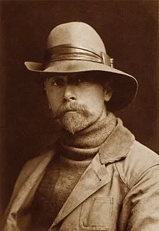
<img class="photo" src="https://upload.wikimedia.org/wikipedia/commons/thumb/5/57/ECurtis.jpg/224px-ECurtis.jpg"
style="width:100%; height:auto;">
</img>
</a>
</div>
<!--p>Photo's width>height </p-->
<div class="photo_container">
<a href="#">
<img class="photo" src="https://upload.wikimedia.org/wikipedia/commons/thumb/c/c8/Altja_j%C3%B5gi_Lahemaal.jpg/220px-Altja_j%C3%B5gi_Lahemaal.jpg"
style="width:auto; height:100%;left=-100px">
</img>
</a>
</div>
Javascript:
// fix image size on load
$(".photo").one("load", function() {
  fixImage($(this));
}).each(function() {
  if(this.complete) $(this).load();
});

// Just to test if everything's working fine
$(".photo").on("click",function(){
   var rand = Math.floor(Math.random() * 200) + 80;
    $(this).parent().parent().width(rand);
    $(this).parent().parent().height(rand);
   fixImage($(this));
});

// Brings the photo dead center
function fixImage(obj){
        //alert("something changed");
        var pw = obj.parent().parent().width();
        var ph = obj.parent().parent().height();
        var w = obj.width();
        var h = obj.height();
        console.log(w+"   "+pw);
        if(h>w){
            var top = (h-ph)/2;
            obj.css("top",top*-1);
        }else{
            var left = (w-pw)/2;
            obj.css("left",left*-1);
        }

}
工作示例:http://jsfiddle.net/vL95x81o/4
如何在不使用jquery的情况下只使用CSS实现此操作? 如果div的大小从不更改,则此解决方案就可以了。 但是,我正在研究响应式设计,似乎photo_container div的大小可能需要根据屏幕大小(通过CSS)进行更改。
这是裁剪之前的照片: