我正在尝试制作一个有三列的表格,其中第二列包含文本。为了防止该列过宽超出屏幕,我定义了如下样式:
max-width: 90%;
overflow: hidden;
text-overflow: ellipsis;
white-space: nowrap;
这个表格在屏幕宽度较小时试图跟随文本宽度而导致出现问题。在浏览器测试中,当我移除 white-space: nowrap; 样式后,表格可以调整大小以适应屏幕,但文字不再有省略号并且全部显示在屏幕上。
以下是发生的情况的一些图片:
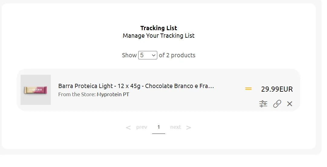
当屏幕宽度正确时应该是这样的:
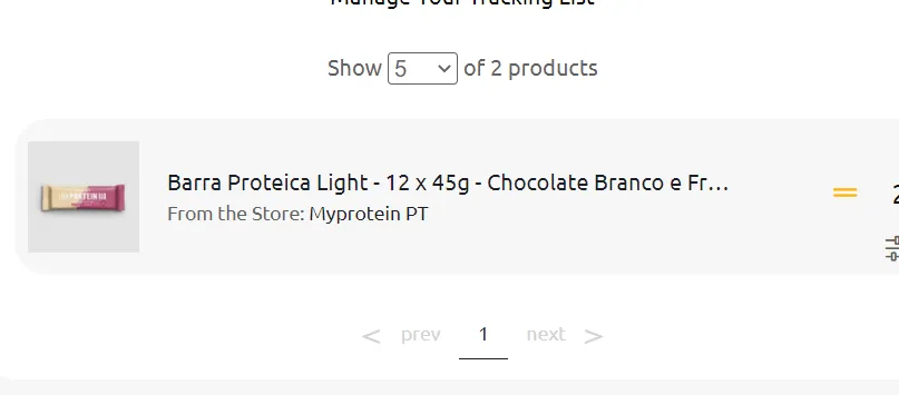
当我减小屏幕宽度时出现了问题:
代码:
table.table {
  width: 100%;
  border-collapse: separate;
  border-spacing: 0 10px;
}

table.table tr {
  height: 7em;
}

table.table tr td {
  background-color: #F7F7F7;
  padding: 10px;
}

table.table td:first-child {
  border-top-left-radius: 1.5rem;
  border-bottom-left-radius: 1.5rem;
  text-align: center;
  width: 128px;
}

table.table td:last-child {
  border-top-right-radius: 1.5em;
  border-bottom-right-radius: 1.5em;
}

table.table td img {
  max-width: 80px;
  margin-top: 5px;
}

table.table td p {
  margin: 0;
  color: #636262;
}

table.table td p:first-child {
  color: #1D1D25;
  font-weight: 400;
  margin-bottom: 5px;
}

table.table td p:last-child {
  font-size: 14px;
}

table.table td p span {
  color: #1D1D25;
}

table.table td:last-child a {
  color: #636262;
  display: inline-block;
  margin: 0 10px;
  text-decoration: none;
  font-size: 1.3em;
  cursor: pointer;
}

table.table td:last-child .col1 i,
table.table td:last-child .col1 span {
  display: inline-block;
  padding: 0 10px;
}

@media (max-width: 1040px) {
  .center-mobile {
    display: block;
    text-align: center;
  }
  .center-mobile .flex-self-center {
    padding-top: 7px;
  }
  .d-sm-none {
    display: none;
  }
  table.table td:first-child {
    width: 60px;
  }
  table.table td:last-child {
    width: 110px;
  }
  table.table td:last-child a {
    margin: 0 8px;
    font-size: 0.9em;
  }
  .pageCount {
    margin-top: 50px;
    text-align: center;
  }
  .sign.desktop {
    display: none !important;
  }
  .header .container-content .search-bar input {
    padding-left: 0;
    flex: 1;
  }
  .header .container-content .search-bar form {
    display: flex;
  }
  table.table {
    table-layout: fixed !important;
  }
  table.table td p:first-child {
    max-width: 90%;
    overflow: hidden;
    text-overflow: ellipsis;
    white-space: nowrap;
  }
  .desk tr td:nth-child(2) {
    max-width: 10px;
  }
  .mob {
    display: none;
  }
  .mob td:nth-child(2) {
    width: 100%;
  }
  .mob td:last-child div:first-child {
    display: flex;
  }
  .mob td:last-child span {
    padding-right: 0 !important;
  }
  .mob td:last-child .states {
    right: 5px !important;
  }
  @media screen and (max-width: 1040px) {
    .desk {
      display: none;
    }
    .mob {
      display: block;
    }
  }
  table.table td:last-child .col1 i,
  table.table td:last-child .col1 span {
    display: inline-block;
    padding: 0 10px;
  }
  table.table td:last-child .col1 i,
  table.table td:last-child .col1 span {
    font-size: 1.2em;
  }
  .table .actions {
    text-align: right;
    width: 100%;
    position: relative;
    bottom: -24px;
    right: 4px;
  }
  .table .actions a {
    font-size: 1.3em !important;
    padding-top: 5px;
  }
  .table .col1 {
    width: 100%;
    text-align: right;
    position: relative;
    top: 12px;
    padding-right: 10px;
  }
  .states {
    position: relative;
    right: 16px;
  }
}<link rel="stylesheet" href="https://pro.fontawesome.com/releases/v5.10.0/css/all.css" integrity="sha384-AYmEC3Yw5cVb3ZcuHtOA93w35dYTsvhLPVnYs9eStHfGJvOvKxVfELGroGkvsg+p" crossorigin="anonymous"/>
<table class="table mob">
<tbody>
<tr>
<td>
<img :src="https://s4.thcdn.com/productimg/960/960/11534151-1964670429319264.jpg" alt="">
</td>
<td>
<p class="text-bold">Barra Proteica Light - 12 x 45g - Chocolate Branco e Framboesa</p>
<p>From the Store: <span>Fnac</span></p>
</td>
<td>
<div class="col1 d-inline-block">
<i v-if="x.price !== x.last_price" class="states fa fa-chevron-down text-success"></i>
<span>10EUR</span>
</div>
<div class="actions d-inline-block">
<a class="fas fa-sliders-h"></a>
<a target="_blank" rel="nofollow noopener nofollow" class="fa fa-link"></a>
<a class="fa fa-times"></a>
</div>
</td>
</tr>
</tbody>
</table>
table.table td p:first-child { max-width: 90%; overflow: hidden; text-overflow: ellipsis; white-space: nowrap; }下。 - DeadSec