XAML TabControl 边框问题

5
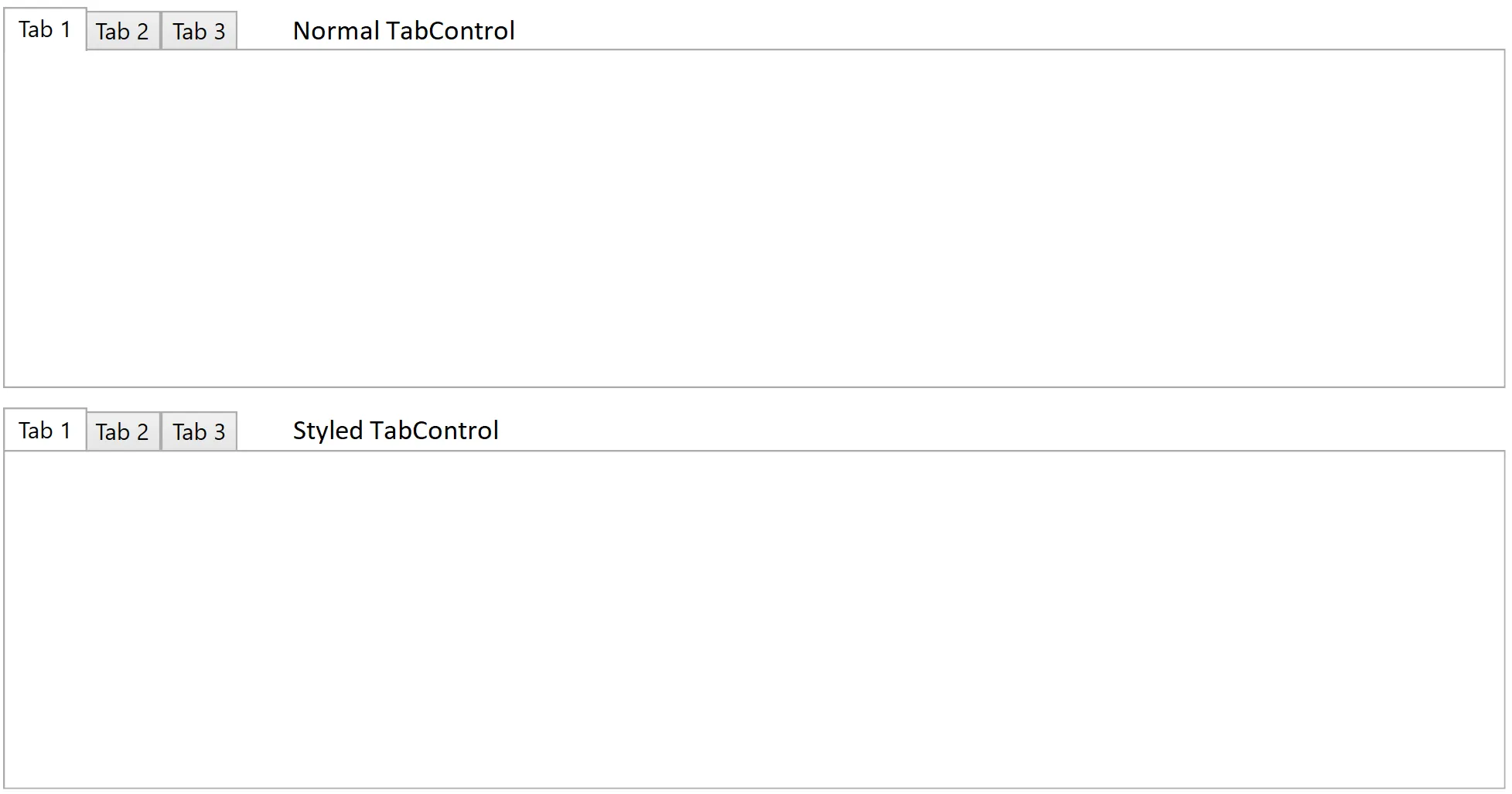
我正在尝试制作一个自定义的TabControl,它支持滚动但保留了TabControl的原始外观和感觉,显然除了滚动之外。为此,我选择编辑使用的原始模板TabControl的副本。然后,我将ScrollViewer放在TabPanel周围。然而,这导致了一个小问题,即当选中标签时,标签现在具有底部边框。可以通过比较下面的图像中的常规TabControl和样式化TabControl来看到这一点。起初,我认为这是滚动查看器的z索引,但在尝试不同的值并确保滚动查看器和TabPanel的z索引都明确高于Border的z索引后,没有任何区别。如何实现相同的效果,在包含在ScrollViewer中的情况下,所选选项卡底部没有边框?

enter image description here


MainWindow.xaml

<Window x:Class="ScrollableTabControl.MainWindow"
        xmlns="http://schemas.microsoft.com/winfx/2006/xaml/presentation"
        xmlns:x="http://schemas.microsoft.com/winfx/2006/xaml"
        xmlns:d="http://schemas.microsoft.com/expression/blend/2008"
        xmlns:mc="http://schemas.openxmlformats.org/markup-compatibility/2006"
        mc:Ignorable="d"
        Title="MainWindow" Height="450" Width="800">
    <Window.Resources>
        <SolidColorBrush x:Key="TabItem.Selected.Background" Color="#FFFFFF"/>
        <SolidColorBrush x:Key="TabItem.Selected.Border" Color="#ACACAC"/>
        <Style x:Key="TabControlStyle1" TargetType="{x:Type TabControl}">
            <Setter Property="Padding" Value="2"/>
            <Setter Property="HorizontalContentAlignment" Value="Center"/>
            <Setter Property="VerticalContentAlignment" Value="Center"/>
            <Setter Property="Background" Value="{StaticResource TabItem.Selected.Background}"/>
            <Setter Property="BorderBrush" Value="{StaticResource TabItem.Selected.Border}"/>
            <Setter Property="BorderThickness" Value="1"/>
            <Setter Property="Foreground" Value="{DynamicResource {x:Static SystemColors.ControlTextBrushKey}}"/>
            <Setter Property="Template">
                <Setter.Value>
                    <ControlTemplate TargetType="{x:Type TabControl}">
                        <Grid x:Name="templateRoot" ClipToBounds="true" SnapsToDevicePixels="true" KeyboardNavigation.TabNavigation="Local">
                            <Grid.ColumnDefinitions>
                                <ColumnDefinition x:Name="ColumnDefinition0"/>
                                <ColumnDefinition x:Name="ColumnDefinition1" Width="0"/>
                            </Grid.ColumnDefinitions>
                            <Grid.RowDefinitions>
                                <RowDefinition x:Name="RowDefinition0" Height="Auto"/>
                                <RowDefinition x:Name="RowDefinition1" Height="*"/>
                            </Grid.RowDefinitions>
                            <ScrollViewer VerticalScrollBarVisibility="Disabled"
                                          HorizontalScrollBarVisibility="Disabled"
                                          Grid.Column="0"
                                          Grid.Row="0"
                                          Panel.ZIndex="1"
                                          Background="Transparent">
                                <TabPanel IsItemsHost="true"
                                          Margin="2,2,2,0"
                                          Panel.ZIndex="2"
                                          Background="Transparent"
                                          KeyboardNavigation.TabIndex="1"
                                          x:Name="headerPanel"/>
                            </ScrollViewer>
                            <Border x:Name="contentPanel"
                                    BorderBrush="{TemplateBinding BorderBrush}"
                                    BorderThickness="{TemplateBinding BorderThickness}"
                                    Background="{TemplateBinding Background}"
                                    Grid.Column="0"
                                    Panel.ZIndex="0"
                                    KeyboardNavigation.DirectionalNavigation="Contained"
                                    Grid.Row="1"
                                    KeyboardNavigation.TabIndex="2"
                                    KeyboardNavigation.TabNavigation="Local">
                                <ContentPresenter x:Name="PART_SelectedContentHost"
                                                  ContentSource="SelectedContent"
                                                  Margin="{TemplateBinding Padding}"
                                                  SnapsToDevicePixels="{TemplateBinding SnapsToDevicePixels}"/>
                            </Border>
                        </Grid>
                    </ControlTemplate>
                </Setter.Value>
            </Setter>
        </Style>
    </Window.Resources>
    <Grid>
        <Grid.RowDefinitions>
            <RowDefinition Height="*"/>
            <RowDefinition Height="*"/>
        </Grid.RowDefinitions>
        <TabControl Margin="5"
                    Grid.Row="0">
            <TabItem Header="Tab 1"/>
            <TabItem Header="Tab 2"/>
            <TabItem Header="Tab 3"/>
        </TabControl>
        <TabControl Margin="5"
                    Grid.Row="1"
                    Style="{DynamicResource TabControlStyle1}">
            <TabItem Header="Tab 1"/>
            <TabItem Header="Tab 2"/>
            <TabItem Header="Tab 3"/>
        </TabControl>
    </Grid>
</Window>

请参考此链接:link。我认为上述链接可以解决您的问题。 - Yogeshwaran
@Gokul 谢谢你提供的链接。我会去看一下。不过,快速浏览了一下,它似乎使用了固定行高和其他可能会破坏 TabStripPlacement 属性行为的东西。当然,它可能可以被修改以使其与此兼容。 - Dan
2个回答

1

如果我们查看一个ScrollViewer样式模板,会注意到其中有一个Border并设置了颜色,这就是你看到的痕迹。

我们可以进入并编辑ScrollViewer的样式模板并删除它...或者在这个实例中,我们可以让它保持其边框并覆盖样式继承,因此在您的模板中,您可以做一些像这样的事情;

 <ScrollViewer ...>
    <ScrollViewer.Resources>
      <Color x:Key="BorderMediumColor">#FFFFFFFF</Color>
    </ScrollViewer.Resources>
 ....
 </ScrollViewer>

在这种情况下,它应该继承那个新的边框颜色,我只是把它变成了白色,或者您也可以将 alpha 通道改为“00”,使其完全透明。或者您可以执行先前提到的操作,并定义一个新的样式模板,不含硬编码的边框值。

希望这有所帮助,干杯!

补充说明:如果您找不到导致视觉边框线的罪犯,您可以通过 DOM 中元素的布局来利用边距来覆盖该线并实现相同的期望视觉效果。该线仍然可能存在,但是产生的错觉足以满足要求。 :)


工作代码示例
<Window x:Class="ScrollableTabControl.MainWindow"
        xmlns="http://schemas.microsoft.com/winfx/2006/xaml/presentation"
        xmlns:x="http://schemas.microsoft.com/winfx/2006/xaml"
        xmlns:d="http://schemas.microsoft.com/expression/blend/2008"
        xmlns:mc="http://schemas.openxmlformats.org/markup-compatibility/2006"
        mc:Ignorable="d"
        Title="MainWindow" Height="450" Width="800">
    <Window.Resources>
        <SolidColorBrush x:Key="TabItem.Selected.Background" Color="#FFFFFF"/>
        <SolidColorBrush x:Key="TabItem.Selected.Border" Color="#ACACAC"/>
        <Style x:Key="TabControlStyle1" TargetType="{x:Type TabControl}">
            <Setter Property="Padding" Value="2"/>
            <Setter Property="HorizontalContentAlignment" Value="Center"/>
            <Setter Property="VerticalContentAlignment" Value="Center"/>
            <Setter Property="Background" Value="{StaticResource TabItem.Selected.Background}"/>
            <Setter Property="BorderBrush" Value="{StaticResource TabItem.Selected.Border}"/>
            <Setter Property="BorderThickness" Value="1"/>
            <Setter Property="Foreground" Value="{DynamicResource {x:Static SystemColors.ControlTextBrushKey}}"/>
            <Setter Property="Template">
                <Setter.Value>
                    <ControlTemplate TargetType="{x:Type TabControl}">
                        <Grid x:Name="templateRoot"
                              ClipToBounds="true"
                              SnapsToDevicePixels="true"
                              KeyboardNavigation.TabNavigation="Local"
                              UseLayoutRounding="True"> <!-- Gets rid of pixel rounding errors which cause small bugs when window is a certain size -->
                            <Grid.ColumnDefinitions>
                                <ColumnDefinition x:Name="ColumnDefinition0"/>
                                <ColumnDefinition x:Name="ColumnDefinition1" Width="0"/>
                            </Grid.ColumnDefinitions>
                            <Grid.RowDefinitions>
                                <RowDefinition x:Name="RowDefinition0" Height="Auto"/>
                                <RowDefinition x:Name="RowDefinition1" Height="*"/>
                            </Grid.RowDefinitions>
                            <ScrollViewer VerticalScrollBarVisibility="Auto"
                                          HorizontalScrollBarVisibility="Auto"
                                          Grid.Column="0"
                                          Grid.Row="0"
                                          Panel.ZIndex="1"
                                          Margin="0, 0, 0, -1.25"
                                          Background="Transparent"> <!-- +- 1.25 seems to be required when mixed with the ZIndex to hide the border underneath the selected tab -->
                                <TabPanel IsItemsHost="true"
                                          Margin="2,2,2,1.25"
                                          Background="Transparent"
                                          KeyboardNavigation.TabIndex="1"
                                          x:Name="headerPanel"/>
                            </ScrollViewer>
                            <Border x:Name="contentPanel"
                                    BorderBrush="{TemplateBinding BorderBrush}"
                                    BorderThickness="{TemplateBinding BorderThickness}"
                                    Background="{TemplateBinding Background}"
                                    Grid.Column="0"
                                    KeyboardNavigation.DirectionalNavigation="Contained"
                                    Grid.Row="1"
                                    KeyboardNavigation.TabIndex="2"
                                    KeyboardNavigation.TabNavigation="Local">
                                <ContentPresenter x:Name="PART_SelectedContentHost"
                                                  ContentSource="SelectedContent"
                                                  Margin="{TemplateBinding Padding}"
                                                  SnapsToDevicePixels="{TemplateBinding SnapsToDevicePixels}"/>
                            </Border>
                        </Grid>
                    </ControlTemplate>
                </Setter.Value>
            </Setter>
        </Style>
    </Window.Resources>
    <Grid>
        <Grid.RowDefinitions>
            <RowDefinition Height="*"/>
            <RowDefinition Height="*"/>
        </Grid.RowDefinitions>
        <TabControl Margin="5"
                    Grid.Row="0">
            <TabItem Header="Tab 1"/>
            <TabItem Header="Tab 2"/>
            <TabItem Header="Tab 3"/>
        </TabControl>
        <TabControl Margin="5"
                    Grid.Row="1"
                    Style="{DynamicResource TabControlStyle1}">
            <TabItem Header="Tab 1"/>
            <TabItem Header="Tab 2"/>
            <TabItem Header="Tab 3"/>
        </TabControl>
    </Grid>
</Window>

嗨,Chris。谢谢你的答案。然而,我确信默认的ScrollViewer模板不包含边框。 - Dan
我很好奇那个边框是从哪里来的。我会打开一个默认模板,但不幸的是我不再在一个 .net/xaml 店工作了,可能回家后会看一眼。 - Chris W.
谢谢。在我的初始问题中,我谈到了zindex,并且仍然认为这是根本原因。我相信边框来自默认TabControl样式中名为contentPanel的边框,然后当选中选项卡时,由于它具有更高的zindex,它会遮盖边框。如果删除更改的zindex,则可以看到它与我的外观相同。我只是不明白为什么将其包装在scrollviewer中会影响它。 - Dan
1
啊,好的,有两件事。我对您设置的 TabItem.Selected.Border 颜色很感兴趣,另外,如果您可以将 TabPanel 的边距更改为 Margin="2,2,2,-1",那么它就可以向下移动到那条线上面... - Chris W.
1
@Dan 好的,没问题,周末愉快! - Chris W.
显示剩余2条评论

-1

你可以尝试使用这个方法来获得带有蓝色背景的自定义圆角标签 至于滚动,可以使用scrollviewer完成

<TabControl.Resources>
            <Style TargetType="TabItem">
                <Setter Property="Template">
                    <Setter.Value>
                        <ControlTemplate TargetType="TabItem">
                            <Border Name="Border" BorderThickness="1,1,1,1" CornerRadius="4,4,0,0" Margin="2,0" Background="#252e37">
                                <ContentPresenter x:Name="ContentSite"
                                    VerticalAlignment="Center"
                                    HorizontalAlignment="Center"
                                    ContentSource="Header"
                                    Margin="10,2"/>
                            </Border>
                            <ControlTemplate.Triggers>
                                <Trigger Property="IsSelected" Value="True">
                                    <Setter TargetName="Border" Property="Background" Value="LightSkyBlue" />
                                </Trigger>
                                <Trigger Property="IsSelected" Value="False">
                                    <Setter TargetName="Border" Property="Background" Value="GhostWhite" />
                                </Trigger>
                            </ControlTemplate.Triggers>
                        </ControlTemplate>
                    </Setter.Value>
                </Setter>
            </Style>
        </TabControl.Resources>

谢谢回答,但这并没有产生任何影响,除了更改选项卡的外观。 - Dan

网页内容由stack overflow 提供, 点击上面的
可以查看英文原文,
原文链接