使用data.table按组绘图

6

我有个人级别的数据,想通过分组动态地总结一个结果。

例如:

set.seed(12039)
DT <- data.table(id = rep(1:100, each = 50),
                 grp = rep(letters[1:4], each = 1250),
                 time = rep(1:50, 100),
                 outcome = rnorm(5000))

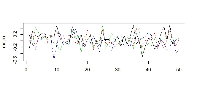
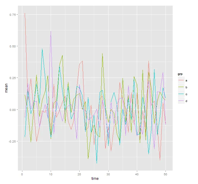
我希望了解绘制组级别摘要的最简单方法,其中包含的数据为:

DT[ , mean(outcome), by = .(grp, time)]

I wanted something like:

dt[ , plot(mean(outcome)), by = .(grp, time)]

但是这根本行不通。
我正在使用的可行选项(可以很容易地进行循环)是:
plot(DT[grp == "a", mean(outcome), by = time])
lines(DT[grp == "b", mean(outcome), by = time])
lines(DT[grp == "c", mean(outcome), by = time])
lines(DT[grp == "d", mean(outcome), by = time])

(为了简洁,省略了颜色等附加参数)

这种方法似乎不是最好的方式——鉴于 data.table 对于处理分组的技能,难道没有更优美的解决方案吗?

其他来源指向了 matplot,但我看不到一个简单的使用方法——我需要重新构造 DT,并且有一个能够完成工作的简单的 reshape 吗?

4个回答

5

使用matplotdcast的基础R解决方案

dt_agg <- dt[ , .(mean = mean(outcome)), by=.(grp,time)]
dt_cast <- dcast(dt_agg, time~grp, value.var="mean")
dt_cast[ , matplot(time, .SD[ , !"time"], type="l", ylab="mean", xlab="")]
# alternative:
dt_cast[ , matplot(time, .SD, type="l", ylab="mean", xlab=""), .SDcols = !"time"]

结果: 在此输入图片描述

5

使用 data.table 库中的 by 参数可以实现此操作,具体方法如下:

DT[ , mean(outcome), by = .(grp, time)
    ][ , {plot(NULL, xlim = range(time),
           ylim = range(V1)); .SD}
       ][ , lines(time, V1, col = .GRP), by = grp]

请注意,中间的 {...; .SD} 部分是必需的以便继续链接。如果 DT[ , mean(outcome), by = .(grp, time)] 已经作为另一个 data.table 存储在 DT_m 中,那么我们只需要执行以下操作:
DT_m[ , plot(NULL, xlim = range(time), ylim = range(V1))]
DT_m[ , lines(time, V1, col = .GRP), by = grp]

带有输出

data.table group by

还有更加华丽的结果可以实现,例如如果我们想为每个组指定特定的颜色:

grp_col <- c(a = "blue", b = "black",
             c = "darkgreen", d = "red")
DT[ , mean(outcome), by = .(grp, time)
    ][ , {plot(NULL, xlim = range(time),
           ylim = range(V1)); .SD}
       ][ , lines(time, V1, col = grp_col[.BY$grp]), by = grp]

注意

RStudio存在一个bug,如果输出发送到RStudio图形设备,则会导致此代码失败。因此,这种方法仅适用于在命令行上使用R或将输出发送到外部设备(我将其发送到png以生成上面的内容)。

请参见data.table问题#1524此RStudio支持票证和这些SO Qs(12)。


4

你非常正确。使用 ggplot 来实现如下:

(dt_agg <- dt[,.(mean = mean(outcome)),by=list(grp,time)]) # Aggregated data.table
     grp time        mean
  1:   a    1  0.75865672
  2:   a    2  0.07244879
 ---

现在,用ggplot对这个聚合的数据表进行可视化。
require(ggplot2)
ggplot(dt_agg, aes(x = time, y = mean, col = grp)) + geom_line()

结果: 这里输入图像描述

0
使用reshape2,您可以将数据集转换为具有平均值的形式:
new_dt <- dcast(dt,time~grp,value.var='outcome',fun.aggregate=mean)

new_dt_molten <- melt(new_dt,id.vars='time')

然后使用ggplot2绘制它,就像这样:

ggplot(new_dt_molten,aes(x=time,y=value,colour=variable)) + geom_line()

或者,(实际上更简单的解决方案)您可以直接使用您拥有的数据集并执行以下操作:

ggplot(dt,aes(x=time,y=outcome,colour=grp)) + geom_jitter() + geom_smooth(method='loess')

或者

ggplot(dt,aes(x=time,y=outcome,colour=grp)) + geom_smooth(method='loess')

网页内容由stack overflow 提供, 点击上面的
可以查看英文原文,
原文链接