有没有办法用CSS实现像下面图片中一样的透明文字从背景上切出来的效果?
如果只用图片替换文本,将会损失宝贵的SEO。
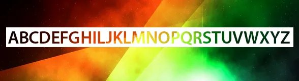
该图片是网站背景,一个绝对定位的
有没有办法用CSS实现像下面图片中一样的透明文字从背景上切出来的效果?
如果只用图片替换文本,将会损失宝贵的SEO。
body,html{height:100%;margin:0;padding:0;}
body{
  background:url('https://farm9.staticflickr.com/8760/17195790401_94fcf60556_c.jpg');
  background-size:cover;
  background-attachment:fixed;
}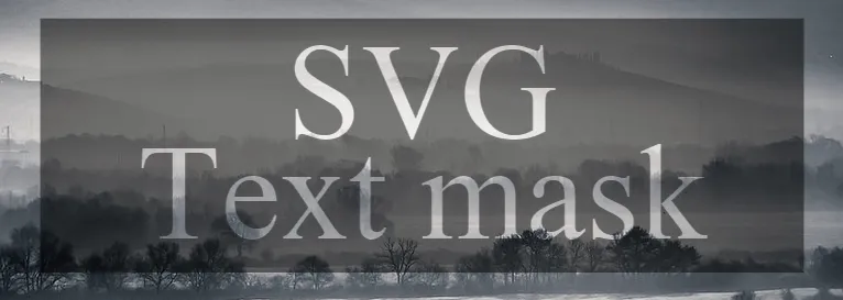
svg{width:100%;}<svg viewbox="0 0 100 60">
<defs>
<mask id="mask" x="0" y="0" width="100" height="50">
<rect x="0" y="0" width="100" height="40" fill="#fff"/>
<text text-anchor="middle" x="50" y="18" dy="1">SVG</text>
<text text-anchor="middle" x="50" y="30" dy="1">Text mask</text>
</mask>
</defs>
<rect x="5" y="5" width="90" height="30" mask="url(#mask)" fill-opacity="0.5"/>
</svg><defs>标签之外。以下示例显示了一种方法,可以使用<use>标签保持透明文本:
body,html{height:100%;margin:0;padding:0;}
body{
  background:url('https://farm9.staticflickr.com/8760/17195790401_94fcf60556_c.jpg');
  background-size:cover;
  background-attachment:fixed;
}
svg{width:100%;}<svg viewbox="0 0 100 60">
<defs>
<g id="text">
<text text-anchor="middle" x="50" y="18" dy="1">SVG</text>
<text text-anchor="middle" x="50" y="30" dy="1">Text mask</text>
</g>
<mask id="mask" x="0" y="0" width="100" height="50">
<rect x="0" y="0" width="100" height="40" fill="#fff"/>
<use xlink:href="#text" />
</mask>
</defs>
<rect x="5" y="5" width="90" height="30" mask="url(#mask)" fill-opacity="0.5"/>
<use xlink:href="#text" mask="url(#mask)" />
</svg><text>包含在<defs>部分之外。(顺便说一句,我不确定SE爬虫如何处理<defs>中的SVG内容)。这里有一种方法可以保持OP想要的功能,并利用可怕的FF漏洞:https://jsfiddle.net/tfneqxxb/ - Kaiido使用 CSS3 是有可能实现的,但并非所有浏览器都支持。
使用 background-clip: text; 可以将背景应用于文本,但需要与页面背景进行对齐。
body {
    background: url(http://www.color-hex.com/palettes/26323.png) repeat;
    margin:10px;
}
h1 {
    background-color:#fff;
    overflow:hidden;
    display:inline-block;
    padding:10px;
    font-weight:bold;
    font-family:arial;
    color:transparent;
    font-size:200px;
}
span {
    background: url(http://www.color-hex.com/palettes/26323.png) -20px -20px repeat;
    -webkit-text-fill-color: transparent;
    -webkit-background-clip: text;
    display:block;
}<h1><span>ABCDEFGHIKJ</span></h1>http://jsfiddle.net/JGPuZ/1337/
使用一些 JavaScript,您可以自动对齐背景:
$(document).ready(function(){
  //Position of the header in the webpage
  var position = $("h1").position();
  var padding = 10; //Padding set to the header
  var left = position.left + padding;
  var top = position.top + padding;
  $("h1").find("span").css("background-position","-"+left+"px -"+top+"px");
});
body {
background: url(http://www.color-hex.com/palettes/26323.png) repeat;
margin:10px;
}
h1 {
background-color:#fff;
overflow:hidden;
display:inline-block;
padding:10px;
font-weight:bold;
font-family:arial;
color:transparent;
font-size:200px;
}
span {
background: url(http://www.color-hex.com/palettes/26323.png) -20px -20px repeat;
-webkit-text-fill-color: transparent;
-webkit-background-clip: text;
display:block;
}<script src="https://ajax.googleapis.com/ajax/libs/jquery/2.1.1/jquery.min.js"></script>
<h1><span>ABCDEFGHIKJ</span></h1>background-clip:text 选项只适用于Webkit浏览器,并非标准选项。CSS3不允许在此属性中使用 text 值(请参见:http://stackoverflow.com/a/17224852)。 - tanius使用纯CSS有一种简单的方法可以做到这一点:
background: black;
color: white;
mix-blend-mode: multiply;
对于黑色背景上的透明文本,或者
background: white;
color: black;
mix-blend-mode: screen;
为了在白色背景上显示透明文本,请在文本元素上应用这些样式,并将任何您想要的背景放置在其后面。
阅读有关mix-blend-mode的内容并尝试使用它来使用不同的颜色。
注意事项:
html元素的背景颜色。mix-blend-mode上使用color-dodge,lighten或screen。 - Imran Bughiohtml 元素上设置背景才能在 Chrome 中工作。 - Nichtml元素上没有设置背景,但在Chrome中它运行良好! - Marco Castanho只需放置该CSS即可。
    .banner-sale-1 .title-box .title-overlay {
      font-weight: 900;
      overflow: hidden;
      margin: 0;
      padding-right: 10%;
      padding-left: 10%;
      text-transform: uppercase;
      color: #080404;
      background-color: rgba(255, 255, 255, .85);

      /* that css is the main think (mix-blend-mode: lighten;)*/
      mix-blend-mode: lighten;

    }
Here's the code: JSFIDDLE
body {
  padding: 0;
  margin: 0;
}

div {
  background: url(http://www.color-hex.com/palettes/26323.png) repeat;
  width: 100vw;
  height: 100vh;
}

body::before {
  content: '$ALPHABET';
  left: 0;
  top: 0;
  position: absolute;
  color: #222;
  background-color: #fff;
  padding: 1rem;
  font-family: Arial;
  z-index: 1;
  mix-blend-mode: screen;
  font-weight: 800;
  font-size: 3rem;
  letter-spacing: 1rem;
}<div></div>在不久的将来,我们可以使用 element() 来实现这一点。
element()函数允许作者使用文档中的元素作为图像。随着引用元素外观的更改,图像也会相应更改 ref
诀窍是创建一个带有文字的普通 div,然后结合使用 element() 和 mask。
下面是一个基本示例,目前只适用于最新版本的 Firefox。
#text {
  font-size:35px;
  font-weight:bold;
  color:#000;
  font-family:sans-serif;
  text-transform: uppercase;
  white-space:nowrap;
  /* we hide it */
  position:fixed;
  right:200vw;
  bottom:200vh
}


body {
  background:url(https://picsum.photos/id/1018/800/800) center/cover;
}

.main {
  margin:50px;
  height:100px;
  background:red;
  -webkit-mask:
    -moz-element(#text) center/contain no-repeat, /* this behave like a background-image*/
    linear-gradient(#fff 0 0);
  mask-composite:exclude;
}<div id="text">
You can put your text here
</div>
<div class="main">
</div>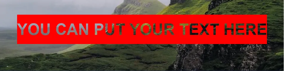
#text {
  font-size:30px;
  font-weight:bold;
  color:#000;
  font-family:sans-serif;
  text-transform: uppercase;
  white-space:nowrap;
  padding:20px;
  /* we hide it */
  position:fixed;
  right:200vw;
  bottom:200vh
}
#text span {
  font-family:cursive;
  font-size:35px;
}


body {
  background:url(https://picsum.photos/id/1018/800/800) center/cover;
}

.main {
  margin:50px;
  height:100px;
  background:red;
  -webkit-mask:
    -moz-element(#text) 0 0/20% auto, /* this behave like a background-image*/
    linear-gradient(#fff 0 0);
  mask-composite:exclude;
}<div id="text">
Your <span>text</span> here
</div>
<div class="main">
</div>
为什么不加入一些动画来创建无限滚动的文本呢:
#text {
  font-size:30px;
  font-weight:bold;
  color:#000;
  font-family:sans-serif;
  text-transform: uppercase;
  white-space:nowrap;
  padding:20px 5px;
  /* we hide it */
  position:fixed;
  right:200vw;
  bottom:200vh
}


body {
  background:url(https://picsum.photos/id/1018/800/800) center/cover;
}

.main {
  margin:50px;
  height:100px;
  padding-right:calc(50% - 50px);
  background:red;
  -webkit-mask:
    -moz-element(#text) 0 50%/200% auto content-box, /* this behave like a background-image*/
    linear-gradient(#fff 0 0);
  mask-composite:exclude;
  animation:m 5s linear infinite;
}

@keyframes m{
  to {-webkit-mask-position:200% 50%}
}<div id="text">
Srolling repeating text here
</div>
<div class="main">
</div>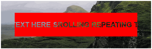
这是可能的,但目前只适用于基于Webkit的浏览器(Chrome,Safari,Rockmelt,任何基于Chromium项目的浏览器)。
诀窍是在白色元素中有一个与body相同背景的元素,然后在内部元素上使用-webkit- background-clip: text;,这基本上意味着“不要将背景延伸到文本之外”,并使用透明文本。
section
{
background: url(http://norcaleasygreen.com/wp-content/uploads/2012/11/turf-grass1.jpg);
width: 100%;
height: 300px;
}
div
{
background: rgba(255, 255, 255, 1);
color: rgba(255, 255, 255, 0);
width: 60%;
heighT: 80%;
margin: 0 auto;
font-size: 60px;
text-align: center;
}
p
{
background: url(http://norcaleasygreen.com/wp-content/uploads/2012/11/turf-grass1.jpg);
-webkit-background-clip: text;
}
box-shadow或border-radius,如果浏览器不支持这些属性,页面仍然可用,只是看起来不那么漂亮。但这个属性不是这种情况。 - cimmanonfont-face="…" CSS规则应用它。您可能需要调整字母间距以避免字母之间出现小的白色间隙。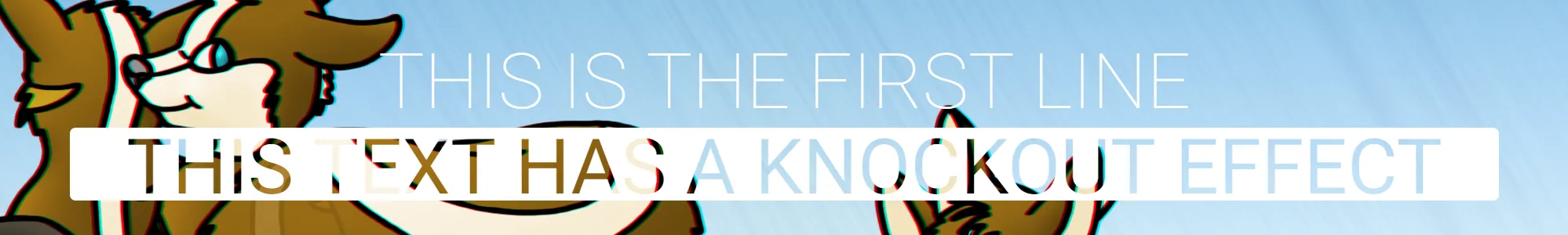
我需要制作与原始帖子完全相同的文本,但我不能仅通过对齐背景来伪造它,因为该元素后面有一些动画效果。似乎还没有人提出这个建议,所以这就是我所做的:(尝试使其尽可能易于阅读。)
var el = document.body; //Parent Element. Text is centered inside.
var mainText = "THIS IS THE FIRST LINE"; //Header Text.
var subText = "THIS TEXT HAS A KNOCKOUT EFFECT"; //Knockout Text.
var fontF = "Roboto, Arial"; //Font to use.
var mSize = 42; //Text size.

//Centered text display:
var tBox = centeredDiv(el), txtMain = mkDiv(tBox, mainText), txtSub = mkDiv(tBox),
ts = tBox.style, stLen = textWidth(subText, fontF, mSize)+5; ts.color = "#fff";
ts.font = mSize+"pt "+fontF; ts.fontWeight = 100; txtSub.style.fontWeight = 400;

//Generate subtext SVG for knockout effect:
txtSub.innerHTML =
"<svg xmlns='http://www.w3.org/2000/svg' width='"+stLen+"px' height='"+(mSize+11)+"px' viewBox='0 0 "+stLen+" "+(mSize+11)+"'>"+
    "<rect x='0' y='0' width='100%' height='100%' fill='#fff' rx='4px' ry='4px' mask='url(#txtSubMask)'></rect>"+
    "<mask id='txtSubMask'>"+
        "<rect x='0' y='0' width='100%' height='100%' fill='#fff'></rect>"+
        "<text x='"+(stLen/2)+"' y='"+(mSize+6)+"' font='"+mSize+"pt "+fontF+"' text-anchor='middle' fill='#000'>"+subText+"</text>"+
    "</mask>"+
"</svg>";

//Relevant Helper Functions:
function centeredDiv(parent) {
    //Container:
    var d = document.createElement('div'), s = d.style;
    s.display = "table"; s.position = "relative"; s.zIndex = 999;
    s.top = s.left = 0; s.width = s.height = "100%";
    //Content Box:
    var k = document.createElement('div'), j = k.style;
    j.display = "table-cell"; j.verticalAlign = "middle";
    j.textAlign = "center"; d.appendChild(k);
    parent.appendChild(d); return k;
}
function mkDiv(parent, tCont) {
    var d = document.createElement('div');
    if(tCont) d.textContent = tCont;
    parent.appendChild(d); return d;
}
function textWidth(text, font, size) {
    var canvas = window.textWidthCanvas || (window.textWidthCanvas = document.createElement("canvas")),
    context = canvas.getContext("2d"); context.font = size+(typeof size=="string"?" ":"pt ")+font;
    return context.measureText(text).width;
}
只需将其放入window.onload中,将body的背景设置为您的图像,然后观看魔术发生!
class="background-clip"添加到您希望将文本绘制为图像模式的HTML元素中,并在其他data-pattern="…"属性中指定图像。请参见演示的源代码。Patternizer将创建一个SVG图像,其中包含填充文本的模式,并将其作为底层呈现到透明渲染的HTML元素下面。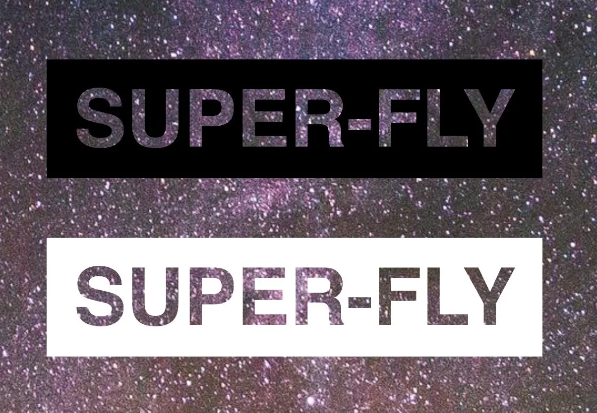
<h1><img alt="Some Text" /></h1>比<h1>Some Text</h1>更不利于SEO。传统上,图像的问题在于它们只是被随意地放置在页面上,没有支持的标记。 - cimmanon