假设我们已经在bootstrap中创建了一行,然后添加了两个列,一个用于博客内容,位于左侧(col-sm-7),另一个用于侧边栏(col-sm-5),位于右侧。是否有一种方法可以使col-sm-7中的内容在col-sm-5的高度小于col-sm-7的高度时扩展到col-sm-12(或换句话说:当侧边栏没有内容时?例如,用户只添加了一个小部件。问题是,侧边栏将占据整个右侧,这不好看)。以下是一张图来说明我的意思:
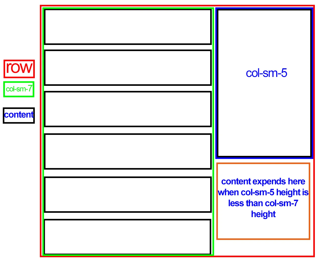
如前所述,使用标准的Bootstrap网格系统无法实现这一点。然而,通过一些CSS调整,可以遵循以下“规则”来实现:
首先放置侧边栏并将其向右浮动。
<div class="col-sm-5 pull-right">
            ..
</div>
col-sm-7的宽度为自适应,并取消浮动。.float-none {
float: none;
width: auto;
}
最后,col-sm-7内的任何子DIV都需要使用overflow: auto...
演示:http://codeply.com/go/njEg31ZG33
据我所知,flexbox 对此无济于事。
content col-7 和您的sidebar col-5。content项目总共达到了400(您的侧边栏的高度)。这意味着从第四个元素开始,您可以将类更改为col-12。var contentItems = $(".content"); // your 'content' items
var sidebar = $(".sidebar");
var contentItemHeight = $(".content").first().height;
var sidebarHeight = $(".sidebar").height;
var smallColumns = sidebarHeight / contentItemHeight; // 4
var $i = 1;
$.each($contents, function(){
if($i <= smallColumns){
// Next to sidebar
$(this).addClass(".col-xs-7");
}else{
// Below sidebar
$(this).addClass(".col-xs-12");
}
})
// Edited to remove accidental switch to PHP
position: relative;z-index:1;。已修复:https://www.codeply.com/go/njEg31ZG33 - Carol Skelly