我希望能够更改MudBlazor UI组件的颜色。然而,我似乎无法覆盖默认样式。请问是否有人可以帮助我?
3个回答
26
在详细介绍如何使用CSS来样式化MudBlazor组件之前,请让我指向主题文档。
如果主题不足以满足您的需求,则有多种选项可以使用CSS更改MudBlazor元素的样式。
请注意,您可能需要应用!important来覆盖MudBlazor的默认样式。
一种方法是在主CSS文件中定义自己的CSS类,并将您的类名传递给组件,如下所示:
<MudButton Class="my-class">Button with custom class</MudButton>
第二种方法是通过
Style属性直接传递CSS样式,就像这里所记录的那样。<MudButton Variant="Variant.Filled" EndIcon="@Icons.Material.ArrowDownward" Style="background-color: yellowgreen; color: white; width: 200px; height: 60px;">
Download Now
</MudButton>
另一种方法是在Razor中嵌入
<style>标签,甚至可以使用C#变量动态修改CSS。以下示例可以在此fiddle中尝试。<style>
button {
background-color: yellowgreen !important;
color: white !important;
height: @(height)px;
}
</style>
<MudSlider @bind-Value="height" Min="30" Max="300"/>
<MudButton Variant="Variant.Filled">
Use Slider to change my height
</MudButton>
@code {
int height=100;
}
最后但并非最不重要的是,如果您想利用Blazor的CSS隔离功能,您必须确保您的页面/组件顶级元素是一个HTML元素,并且您使用
::deep如此讨论。这将使您组件或页面中所有按钮的文本变为红色:::deep .mud-button-text { color: red !important; }
- henon
1
请问您能否更新主题文档链接?谢谢。 - Pawel
18
如果你想要更改默认的Mudblazor颜色,你可以使用自定义的Palette来创建自己的主题。这样你就可以随意更改Palette的任何颜色属性。请查看下面的示例。
更新:新版本的MudBlazor框架引入了新的类:PaletteLight和PaletteDark。Palette类现已过时。你可以使用PaletteLight类来覆盖默认颜色,或者同时使用这两个类为你的应用程序提供浅色和深色主题。
主要布局采用暗色主题:
演示暗模式:
更新:新版本的MudBlazor框架引入了新的类:PaletteLight和PaletteDark。Palette类现已过时。你可以使用PaletteLight类来覆盖默认颜色,或者同时使用这两个类为你的应用程序提供浅色和深色主题。
自定义颜色的主要布局:
MainLayout.razor:
@inherits LayoutComponentBase

<MudThemeProvider Theme="_currentTheme"/>
<MudDialogProvider/>
<MudSnackbarProvider/>

<MudLayout>
    <MudAppBar Elevation="0">
        <MudIconButton Icon="@Icons.Material.Filled.Menu" Color="Color.Inherit" Edge="Edge.Start" OnClick="@(e => DrawerToggle())"/>
        <MudSpacer/>
    </MudAppBar>
    <MudDrawer @bind-Open="_drawerOpen" Elevation="1">
        <MudDrawerHeader>
            <MudText Typo="Typo.h6">MyApplication</MudText>
        </MudDrawerHeader>
        <NavMenu/>
    </MudDrawer>
    <MudMainContent>
        <MudContainer MaxWidth="MaxWidth.ExtraLarge" Class="my-8">
            @Body
        </MudContainer>
    </MudMainContent>
</MudLayout>

@code {
    bool _drawerOpen = true;

    private readonly MudTheme _currentTheme = new()
    {
        Palette = new PaletteLight
        {
            Primary = "#0A7BCF",
            Secondary = "#4CAF50",
            Info = "#64a7e2",
            Success = "#2ECC40",
            Warning = "#FFC107",
            Error = "#FF0000",
            AppbarBackground = "#212121",
            TextPrimary = "#0A7BCF",
            TextSecondary = "#4CAF50",
            // more color properties
        }
    };

    void DrawerToggle() => _drawerOpen = !_drawerOpen;
}
主要布局采用暗色主题:
MainLayout.razor:
@inherits LayoutComponentBase

<MudThemeProvider @ref="@_mudThemeProvider" @bind-IsDarkMode="@_isDarkMode" Theme="_currentTheme"/>
<MudDialogProvider/>
<MudSnackbarProvider/>

<MudLayout>
    <MudAppBar Elevation="0">
        <MudIconButton Icon="@Icons.Material.Filled.Menu" Color="Color.Inherit" Edge="Edge.Start" OnClick="@(e => DrawerToggle())"/>
        <MudSpacer/>
        <MudIconButton Icon="@Icons.Material.Filled.Brightness4"
                       Color="Color.Inherit"
                       Class="nav-button"
                       OnClick="@ThemeToggle"/>
    </MudAppBar>
    <MudDrawer @bind-Open="_drawerOpen" Elevation="1">
        <MudDrawerHeader>
            <MudText Typo="Typo.h6">MyApplication</MudText>
        </MudDrawerHeader>
        <NavMenu/>
    </MudDrawer>
    <MudMainContent>
        <MudContainer MaxWidth="MaxWidth.ExtraLarge" Class="my-8">
            @Body
        </MudContainer>
    </MudMainContent>
</MudLayout>

@code {
    bool _drawerOpen = true;
    private bool _isDarkMode;
    private MudThemeProvider _mudThemeProvider;

    private readonly MudTheme _currentTheme = new()
    {
        Palette = new PaletteLight
        {
            Primary = "#0A7BCF",
            Secondary = "#4CAF50",
            Info = "#64a7e2",
            Success = "#2ECC40",
            Warning = "#FFC107",
            Error = "#FF0000",
            AppbarBackground = "#212121",
            TextPrimary = "#0A7BCF",
            TextSecondary = "#4CAF50",
            // more color properties
        },
        PaletteDark = new PaletteDark
        {
            Primary = "#6585e0",
            Secondary = "#607D8B",
            Info = "#a4c2dd",
            Success = "#2ECC40",
            Warning = "#dc2d7e",
            Error = "#de2000",
            AppbarBackground = "#121212",
            TextPrimary = "#E0E0E0",
            TextSecondary = "#BDBDBD",
            // more color properties
        }
    };

    protected override async Task OnAfterRenderAsync(bool firstRender)
    {
        if (firstRender)
        {
            _isDarkMode = await _mudThemeProvider.GetSystemPreference();
            StateHasChanged();
        }
    }

    void DrawerToggle() => _drawerOpen = !_drawerOpen;
    void ThemeToggle() => _isDarkMode = !_isDarkMode;

}
Index.razor:
@page "/"
<PageTitle>Index</PageTitle>
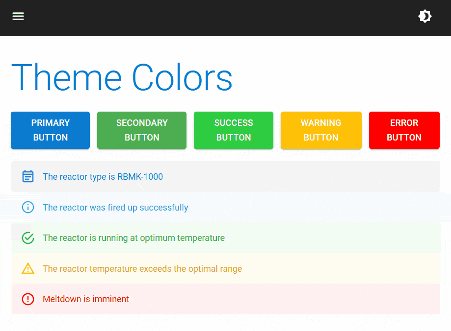
<MudText Typo="Typo.h2" Class="mb-5">Theme Colors</MudText>
<MudStack Row="true">
<MudButton Color="Color.Primary" Variant="Variant.Filled">Primary Button</MudButton>
<MudButton Color="Color.Secondary" Variant="Variant.Filled">Secondary Button</MudButton>
<MudButton Color="Color.Success" Variant="Variant.Filled">Success Button</MudButton>
<MudButton Color="Color.Warning" Variant="Variant.Filled">Warning Button</MudButton>
<MudButton Color="Color.Error" Variant="Variant.Filled">Error Button</MudButton>
</MudStack>
<br/>
<MudAlert Severity="Severity.Normal">The reactor type is RBMK-1000</MudAlert>
<MudAlert Severity="Severity.Info">The reactor was fired up successfully</MudAlert>
<MudAlert Severity="Severity.Success">The reactor is running at optimum temperature</MudAlert>
<MudAlert Severity="Severity.Warning">The reactor temperature exceeds the optimal range</MudAlert>
<MudAlert Severity="Severity.Error">Meltdown is imminent</MudAlert>
演示暗模式:
- Ibrahim Timimi
2
2这绝对是最好的答案。 - spacemonki
是的。MudBlazor根据您在Ibrahim示例中提供的颜色进行程序计算。因此,其他变量,如颜色的“加亮”和“变暗”变化,也将起作用。虽然可以通过CSS覆盖这些变量,但这是一种不明智的(半)解决方案。 - Gabe Szabo
5
如果您想更改整个颜色主题,同时希望保持应用.mud-*类时的一致性(即何时以及如何应用哪种颜色组合),您可以为整个解决方案覆盖MudBlazor的CSS变量(--mud-*)。
例如,当您使用<MudButton Color="Color.Primary"> </MudButton>时,按钮元素将自动应用类组合.mud-button-text.mud-button-text-primary。然后,该类组合应用样式:color: var(--mud-palette-primary);。通过在根级别覆盖--mud-palette-primary的值,您将已经更改了整个解决方案的值;例如,对于具有Color.Primary的MudButton元素,会得到另一种文本颜色。
在全局CSS文件中,可以按以下方式覆盖CSS变量:
:root {
    --mud-palette-primary: violet;
    --mud-palette-primary-text: yellow;
}
十六进制值也可以用作CSS颜色属性的值,就像任何其他CSS颜色属性值一样。
如果要更改整个调色板,则可能需要进行彻底的工作,但是不需要自定义类或!important。
不利的一面是,MudBlazor保证会在新版本中更改它们对CSS变量的使用(并且很可能更改其选择),因此这种变量覆盖将需要随着时间进行维护。 (再次说明,我能想到的任何其他可能的解决方案也是如此。)
快速尝试示例片段的示例在此处。
(注意:在示例代码片段中,Variant属性设置为MudButton元素,除Color外;这会设置不同的一组类,这些类再次使用MudBlazor CSS变量以不同的方式应用样式。)
- Astrid E.
1
2这个方法覆盖了暗色和亮色场景的变量,这意味着如果你执行
--mud-palette-primary: violet;,主题颜色将在暗色和亮色主题中都是紫色。 - Pawel网页内容由stack overflow 提供, 点击上面的可以查看英文原文,
原文链接
原文链接