Android Studio ActionBar宽度/图标位置

3
我有一个关于我的ActionBar的问题,导致我的菜单图标紧贴着屏幕边缘被压缩了! image 
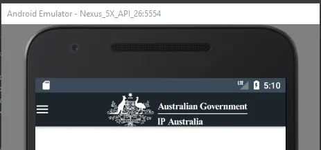
以下是我调整的风格和声明的一些代码片段: HomeActivity.xml
private TextView tvViewAll;
DrawerLayout mDrawerLayout;
private ActionBarDrawerToggle mDrawerToggle;

@Override
public void onCreate(Bundle savedInstanceState) {
    super.onCreate(savedInstanceState);
    setContentView(R.layout.activity_home);

    //Nav Drawer
    mDrawerLayout = findViewById(R.id.drawer_layout);

    //custom shadow for menu drawer
    mDrawerLayout.setDrawerShadow(R.drawable.drawer_shadow, GravityCompat.START);

    // ActionBarDrawerToggle ties together the the proper interactions
    // between the sliding drawer and the action bar app icon
    mDrawerToggle = new ActionBarDrawerToggle (this, mDrawerLayout, R.string.drawer_open, R.string.drawer_close);

    mDrawerLayout.addDrawerListener(mDrawerToggle);
    mDrawerToggle.syncState();

    getSupportActionBar().setDisplayHomeAsUpEnabled(true);

}

@Override
public boolean onOptionsItemSelected(MenuItem item) {

    if(mDrawerToggle.onOptionsItemSelected(item)){
        return true;
    }

    return super.onOptionsItemSelected(item);
}

styles.xml

<resources>

<!-- Base application theme. -->
<style name="AppTheme" parent="Theme.AppCompat.Light.DarkActionBar">
    <item name="android:statusBarColor">@color/colorBackgroundBlack</item>
    <item name="android:navigationBarColor">@color/colorBackgroundBlack</item>
    <item name="actionMenuTextColor">@color/colorBackgroundBlackDark</item>
    <item name="colorPrimary">@color/colorBackgroundBlackDark</item>
    <item name="colorAccent">@color/colorPrimaryDark</item>
    <item name="colorButtonNormal">@color/ipBlue</item>
    <item name="toolbarNavigationButtonStyle">@color/ipGreen</item>
</style>

<style name="ActionBar.Solid.TMSA.NoTitle" parent="@style/Widget.AppCompat.Light.ActionBar.Solid.Inverse">
    <item name="displayOptions">useLogo|showHome</item>
    <item name="logo">@drawable/ic_ipaustralialogo</item>
    <item name="android:contentDescription">@string/ip_logo</item>
</style>

<style name="AppTheme.TMSA" parent="@style/AppTheme">
    <item name="actionBarStyle">@style/ActionBar.Solid.TMSA.NoTitle</item>
</style>

我不记得除了包含政府标志外,我有没有更改过 ActionBar 的格式布局,但我无法想出为什么我会得到这个歪斜的菜单图标。

我已经考虑过使用 Toolbar 方法,但不想进行转换:P

编码愉快 :)


1
toolbarNavigationButtonStyle不仅需要颜色,还需要样式。我猜测它失败了;至少,默认样式中设置的最小宽度值没有被获取到。如果你想修改该样式,应该创建一个以默认样式为父级的自定义样式,并在其中设置所需属性;可以参考此答案中的第一个代码块。 - Mike M.
没问题。顺便说一下,我不确定你想要着色的是哪个部分,但是动画汉堡箭头可绘制对象有自己的样式,你也可以修改它。在这个答案中有一个例子。 - Mike M.
@MikeM 没有想过微调汉堡/箭头!我会试试的 :) 另外-不好意思打扰你,但我正在尝试将您的第一条评论标记为正确答案,但我甚至无法点赞您-这是因为我是新手还是..? - Danielle Orth
是的,我认为在您达到15个声望之前,您无法点赞任何内容。此外,您也无法将评论标记为答案。稍等一下,我会在下面准备一个实际的答案,您可以用勾号接受它。如果您真的想修改它,我会包括一个可设置在drawable上的属性列表。很高兴您已经解决了问题。干杯! - Mike M.
1个回答

1

ActionBarDrawerToggle会在ActionBar的导航按钮上设置其切换图标。在AppCompatActivity中,实际上ActionBar是位于Toolbar下方的,并且该导航按钮是使用主题的toolbarNavigationButtonStyle属性设置的style资源进行样式化处理。

在您的主题中,您已经在该属性上设置了一个color资源,而不是style资源,所有默认样式中的值都将丢失,包括minWidth值,这就是为什么您的切换图标被包裹到可绘制对象的宽度内的原因。

如果您想要修改导航按钮上的某些样式值,您应该创建自己的style资源,以默认的style作为其parent,在那里设置所需的属性,并指定该style作为您的主题的toolbarNavigationButtonStyle。例如:

<style name="AppTheme" parent="Theme.AppCompat.Light.DarkActionBar">
    ...
    <item name="toolbarNavigationButtonStyle">@style/Toolbar.Button.Navigation</item>
</style>

<style name="Toolbar.Button.Navigation" parent="Widget.AppCompat.Toolbar.Button.Navigation">
    <item name="android:background">@color/ipGreen</item>
</style>

如果您想修改的是汉堡箭头可绘制对象,它有自己的样式,您可以“子样式”它,并更改其中某些特征。例如:
<style name="AppTheme" parent="Theme.AppCompat.Light.DarkActionBar">
    ...
    <item name="drawerArrowStyle">@style/DrawerArrowToggle</item>
</style>

<style name="DrawerArrowToggle" parent="Widget.AppCompat.DrawerArrowToggle">
    <item name="color">@color/ipGreen</item>
</style>

以下是可用于修改 drawerArrowStyle 的完整属性列表,如果您想自定义其它任何属性,请使用此列表。
<!-- The drawing color for the bars -->
<attr name="color" format="color"/>
<!-- Whether bars should rotate or not during transition -->
<attr name="spinBars" format="boolean"/>
<!-- The total size of the drawable -->
<attr name="drawableSize" format="dimension"/>
<!-- The max gap between the bars when they are parallel to each other -->
<attr name="gapBetweenBars" format="dimension"/>
<!-- The length of the arrow head when formed to make an arrow -->
<attr name="arrowHeadLength" format="dimension"/>
<!-- The length of the shaft when formed to make an arrow -->
<attr name="arrowShaftLength" format="dimension"/>
<!-- The length of the bars when they are parallel to each other -->
<attr name="barLength" format="dimension"/>
<!-- The thickness (stroke size) for the bar paint -->
<attr name="thickness" format="dimension"/>

网页内容由stack overflow 提供, 点击上面的
可以查看英文原文,
原文链接